Albert Herter Master Palette
Muted Tawny
Muted Deliberately desaturated - chroma pulled toward gray, the restraint of tonal painting.
Tawny Warm orange-brown - a traditional term for the color of tanned leather or lion fur.
Palette Analysis
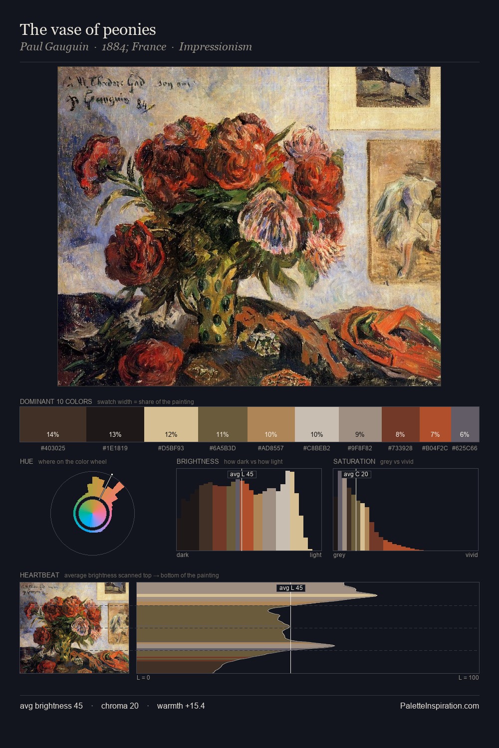
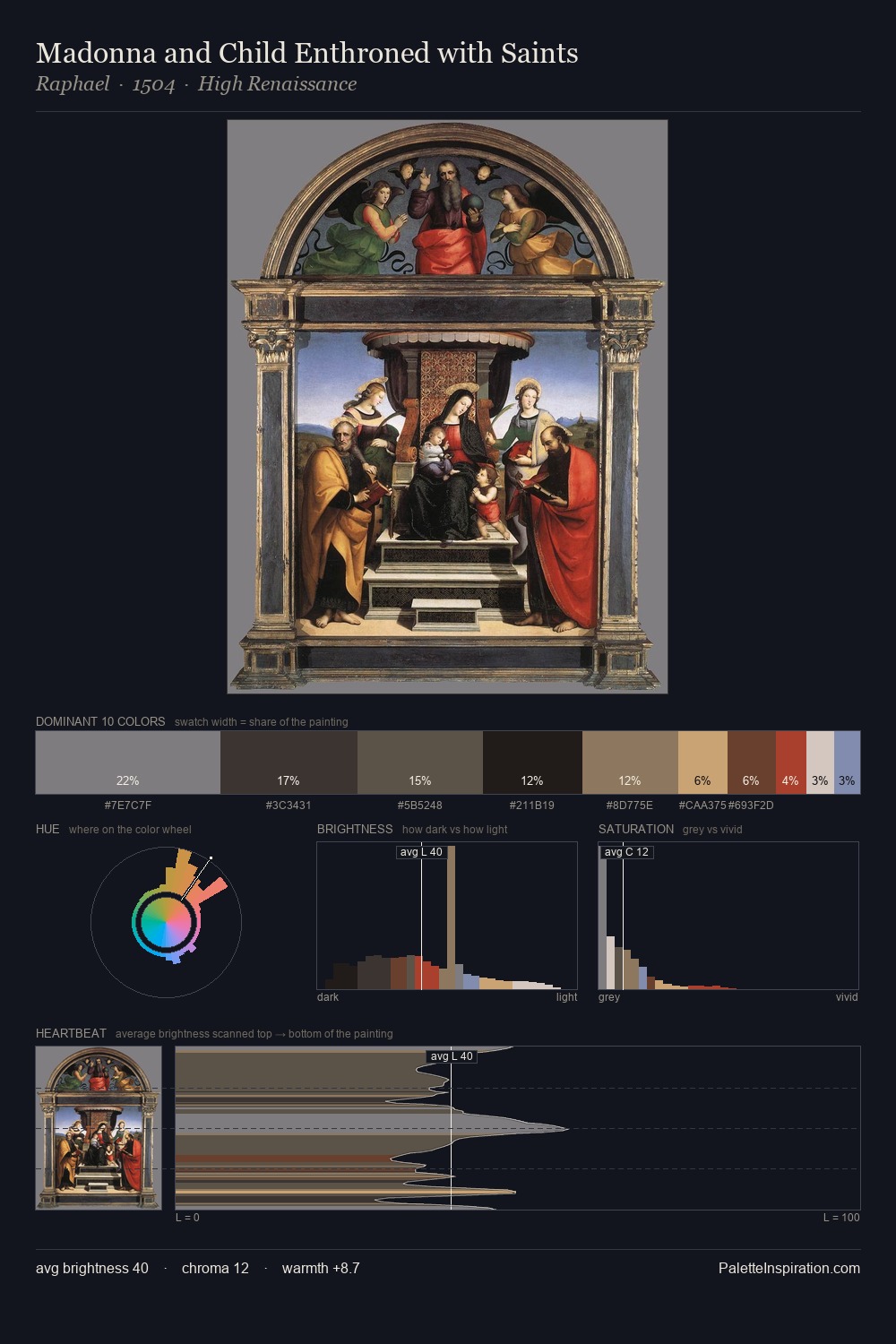
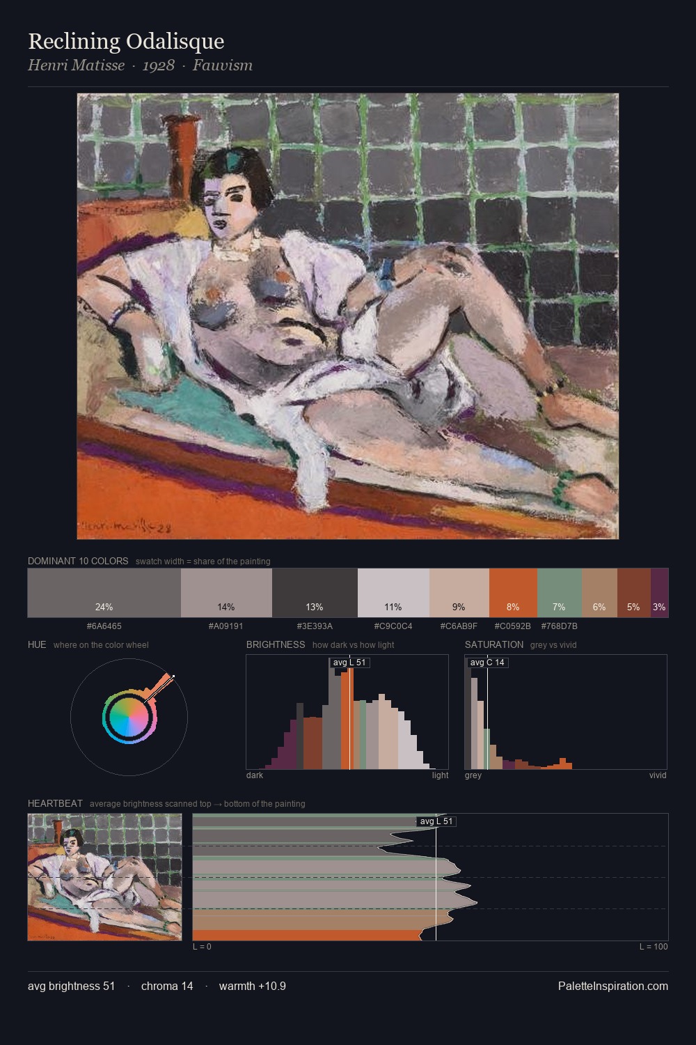
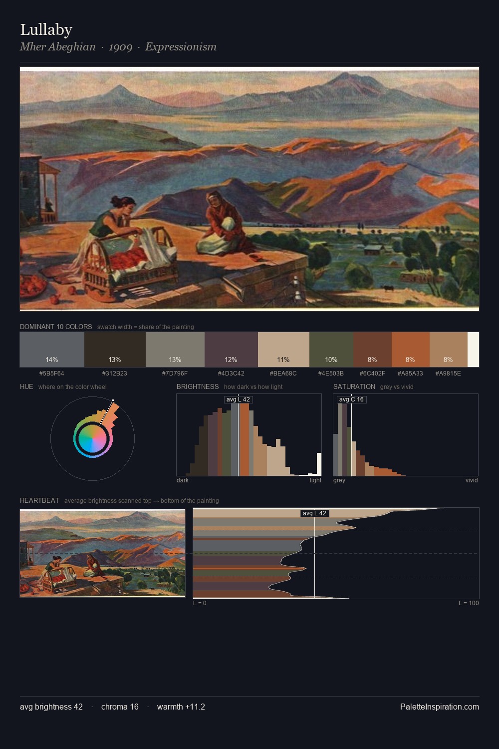
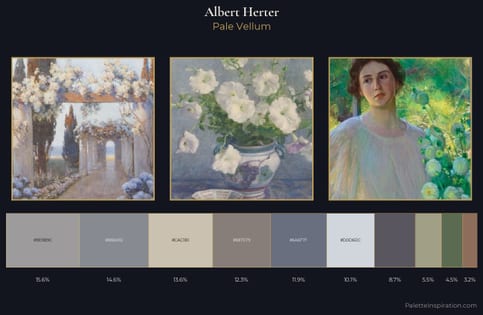
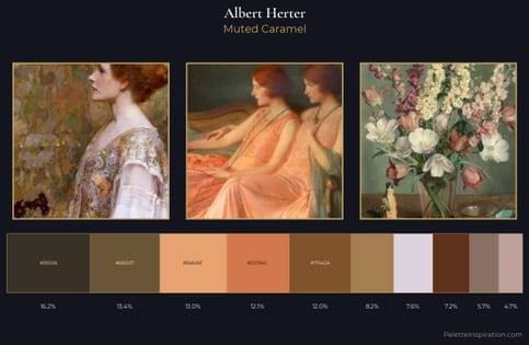
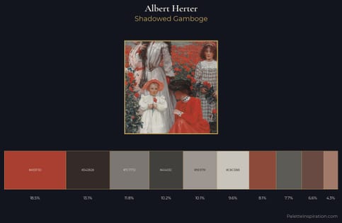
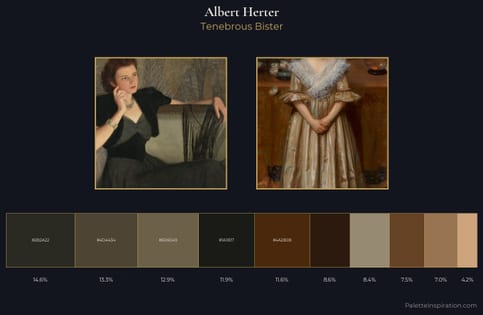
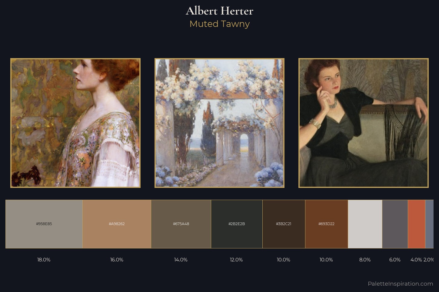
Albert Herter distributes its values across the middle register, creating harmony without high contrast. Warmth dominates - the palette of Albert Herter leans heavily on the yellow-orange-red arc of the colour wheel. Saturation is deliberately withheld - the beauty here lies in the near-monochromatic gradations rather than colour difference. #693D22 delivers the chromatic peak at only 10.0% - a small shot of colour with outsized visual impact. 54 units of value spread create a palette that is varied but unified - contrast in the service of harmony. These proportions encode Albert Herter's instinctive sense of how much of each quality the eye can hold.
Example use cases
- archival print
- university identity
- rare books
- cultural institutions
- nonprofit identity
I Love This!
Use This Palette
Copy, export, or download for your project
Copy, export, or download for your project
Copy:
Download:
Share: