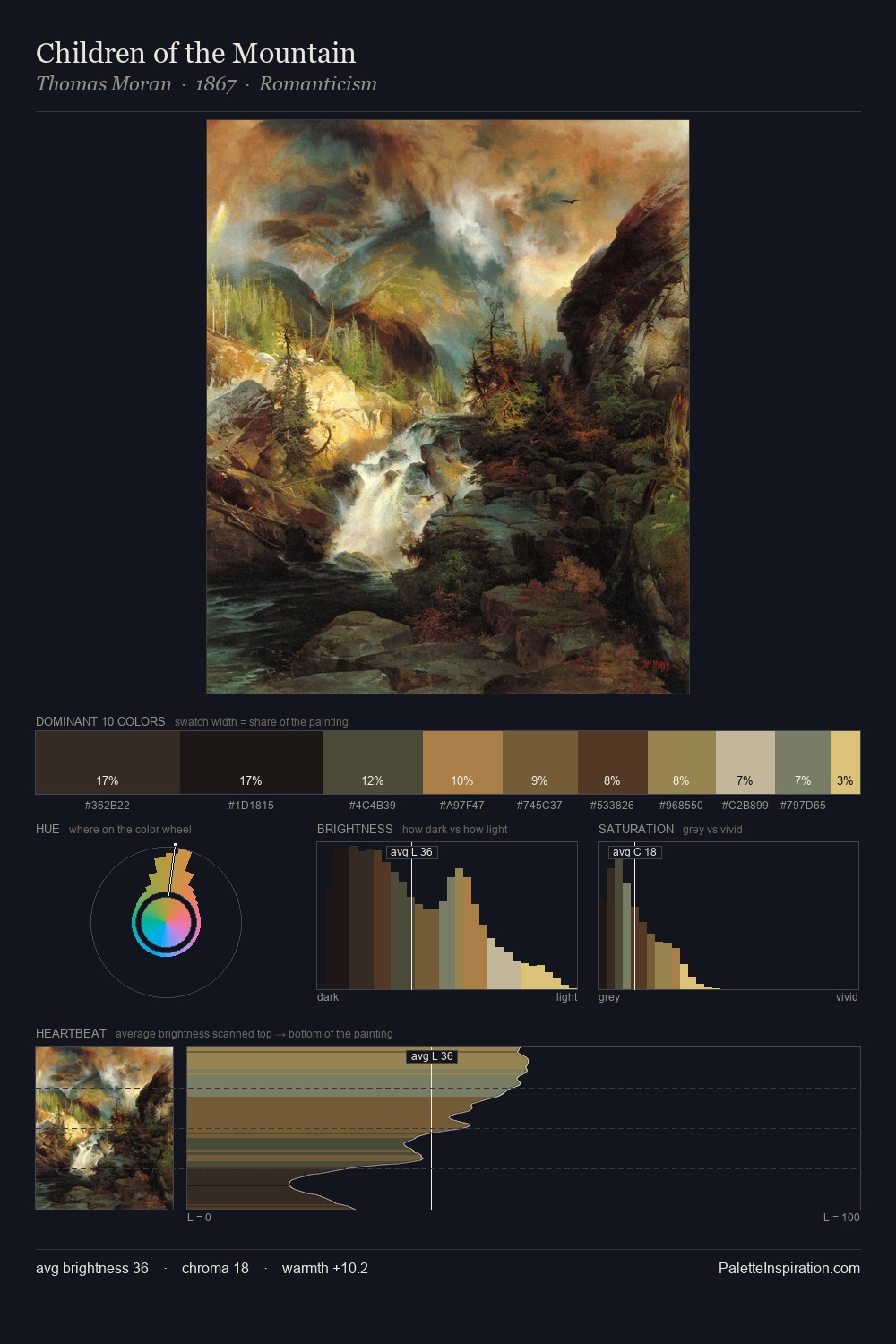
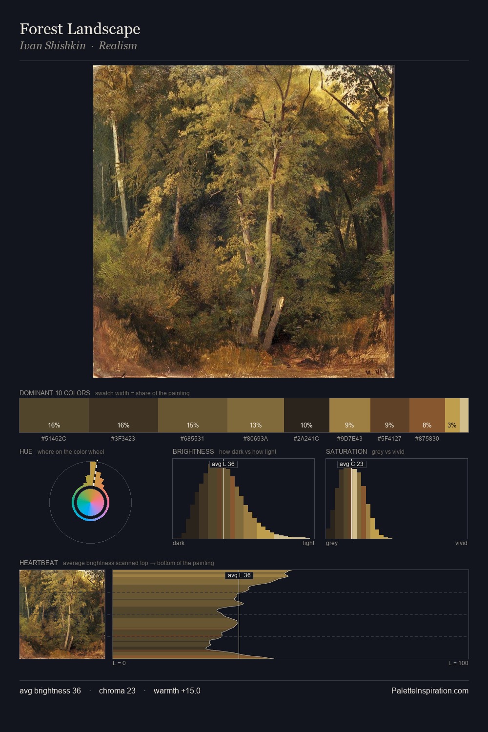
Wildlife Painting Palette 14
Penumbral Bister
Penumbral Partial shadow - the transitional zone between light and full dark, soft-edged.
Bister Dark warm brown - a traditional ink and wash pigment made from wood soot.

Palette Analysis
wildlife painting sits in the centre of the value range, lending the palette a sense of even, sustained light. Temperature reads distinctly warm: the reds and earth tones carry the compositional weight. Saturation is deliberately withheld - the beauty here lies in the near-monochromatic gradations rather than colour difference. Only 10.2% is devoted to #7B532C, yet that small allocation delivers the palette's entire chromatic tension. Value range is moderate at 54 units - enough contrast for legibility, not so much as to fragment the tonal unity.
Example use cases
- theater design
- jewelry brands
- tobacco-adjacent retail
- event branding
- film & entertainment
I Love This!
Use This Palette
Copy, export, or download for your project
Copy, export, or download for your project
Copy:
Download:
Share: