Wassily Kandinsky Master Palette

Palette Analysis
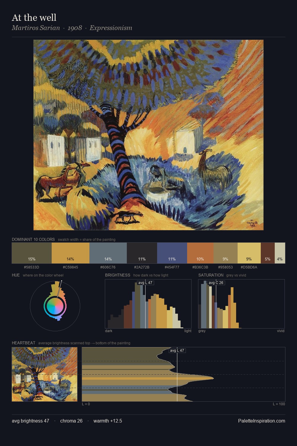
Wassily Kandinsky distributes its values across the middle register, creating harmony without high contrast. Cool hues prevail: blues, greens, and greys anchor the palette's emotional temperature. Every colour is desaturated; the palette proceeds through near-neutrals and gently-coloured greys. The highest-chroma note - #B04937 - appears at just 6.4%, deployed as a precision accent against the quieter ground. A value spread of 59 units gives the palette both depth and air - shadows are genuinely dark, lights genuinely light. The mid-to-high key, cool bias, and moderate chroma point to outdoor observation - sky and diffused daylight as the dominant light source. Taken together, these qualities constitute Wassily Kandinsky's chromatic voice - distinctive enough to be read across an entire body of work.
Example use cases
- ceramics & pottery
- boutique hospitality
- menswear
- heritage food brands
- craft & artisan brands
I Love This!
Copy, export, or download for your project