Wassily Kandinsky Palette 6

Palette Analysis
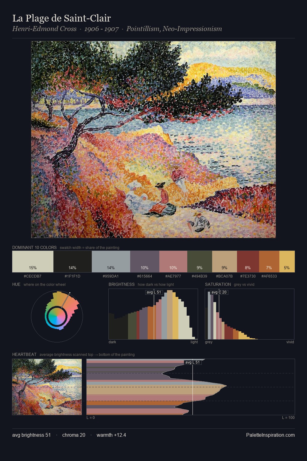
Wassily Kandinsky is high-key - luminous, open, and weighted toward light. Cool tones set the register here - the blues and greens easily outweigh any warm accents. All colours lean toward grey, building depth through value rather than colour punch. A single dominant - #C9C6AF at 26.0% - sets the character of the whole composition. At 3.0%, #7C3731 carries the palette's sharpest chromatic charge: an accent that earns its place precisely because it is withheld. The full value range is 67 units: broad enough to build convincing three-dimensional form. The mid-to-high key, cool bias, and moderate chroma point to outdoor observation - sky and diffused daylight as the dominant light source. Wassily Kandinsky's palette 6 carries its own internal logic while remaining in conversation with the artist's broader colour intelligence.
Example use cases
- design agencies
- product brands
- e-commerce
- editorial sites
- publishing
I Love This!
Copy, export, or download for your project