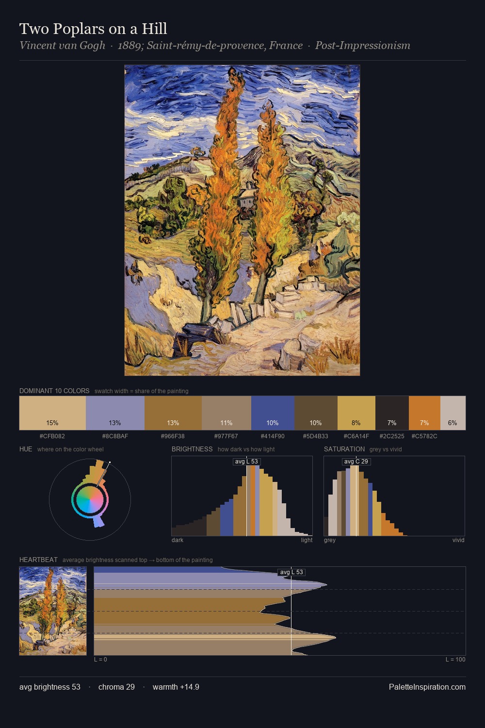
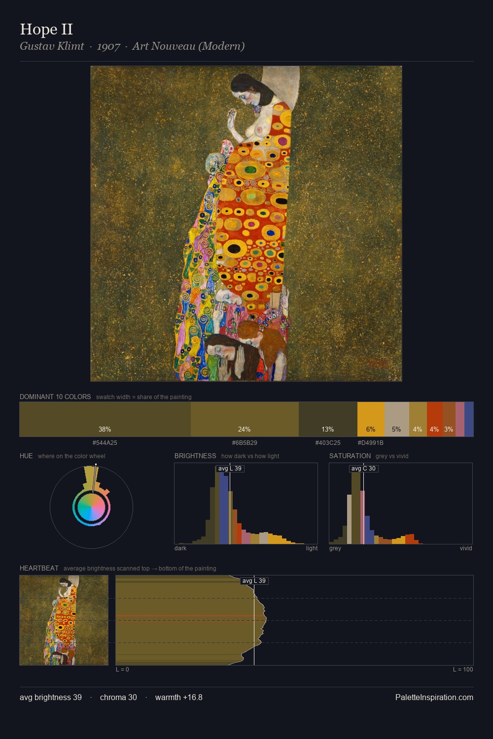
Wassily Kandinsky Palette 11

Palette Analysis
Values in Wassily Kandinsky rest in the mid-range - neither dramatically lit nor steeped in shadow. Warmth dominates - the palette of Wassily Kandinsky leans heavily on the yellow-orange-red arc of the colour wheel. Mid-saturation across the board: the palette has colour character without chromatic excess. 30.4% of the palette belongs to #AB783D, a concentration that makes it the unmistakable visual centre. The most saturated colour, #3F4B88, is reserved to 1.8% of the surface, where it acts as a focal punctuation. A value spread of 59 units gives the palette both depth and air - shadows are genuinely dark, lights genuinely light. Wassily Kandinsky's palette 11 carries its own internal logic while remaining in conversation with the artist's broader colour intelligence.
Example use cases
- ceramics & pottery
- boutique hospitality
- menswear
- heritage food brands
- craft & artisan brands
I Love This!
Copy, export, or download for your project