Vincent van Gogh Palette 20

Palette Analysis
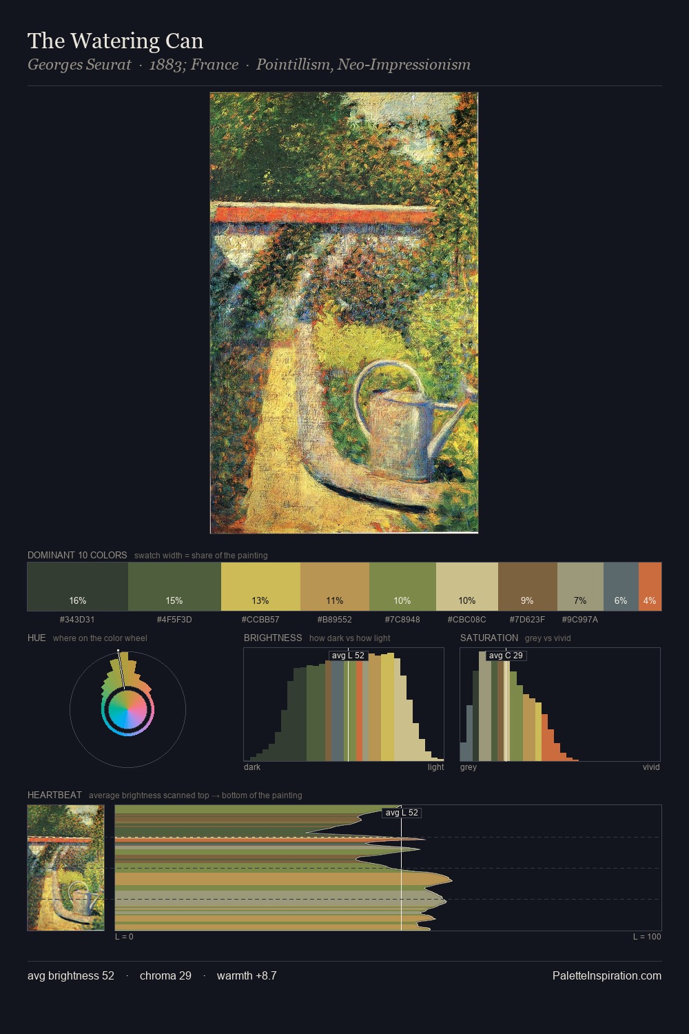
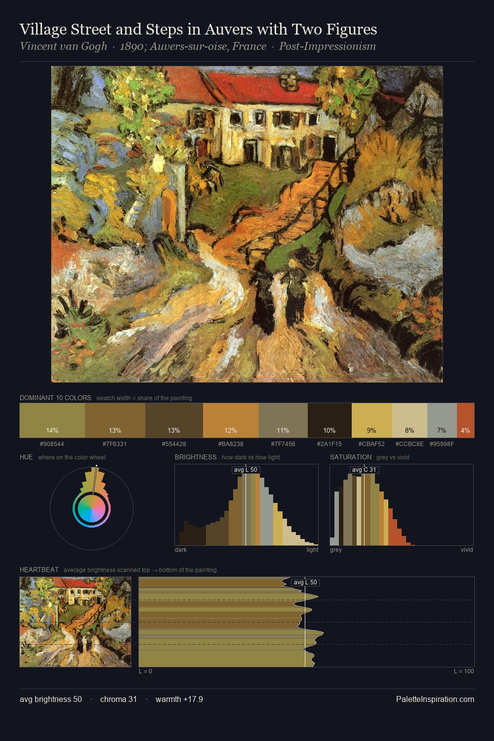
Vincent van Gogh occupies the comfortable middle of the value scale, avoiding both extremes to hold the eye in a sustained middle grey. Vincent van Gogh tilts toward cool - blues and silver-greys carry the structural weight. Colours are neither washed out nor blazing; they occupy the productive middle ground of the chroma scale. #C9AD46 functions as the palette's exclamation mark: highest chroma, lowest percentage (10.7%). 51 units of value spread create a palette that is varied but unified - contrast in the service of harmony. The mid-to-high key, cool bias, and moderate chroma point to outdoor observation - sky and diffused daylight as the dominant light source. In the context of Vincent van Gogh's full range of palettes, group 20 represents one movement in an ongoing chromatic dialogue.
Example use cases
- theater design
- jewelry brands
- tobacco-adjacent retail
- event branding
- film & entertainment
I Love This!
Copy, export, or download for your project