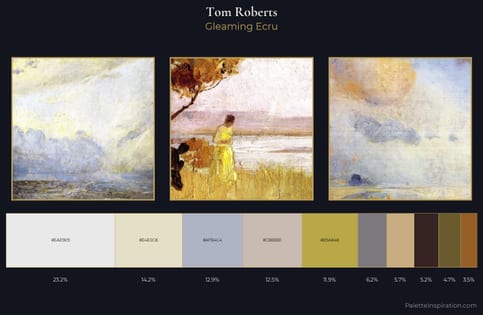
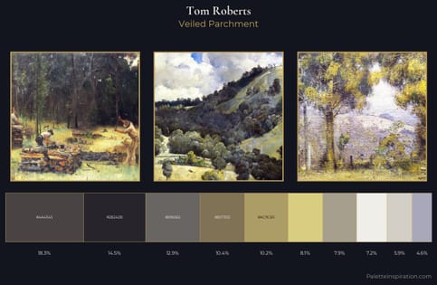
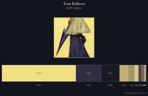
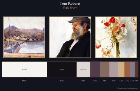
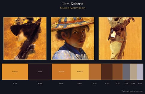
Tom Roberts Palette 3
Muted Apricot
Muted Deliberately desaturated - chroma pulled toward gray, the restraint of tonal painting.
Apricot Soft warm orange - peach-adjacent, the color of ripe stone fruit.
Palette Analysis
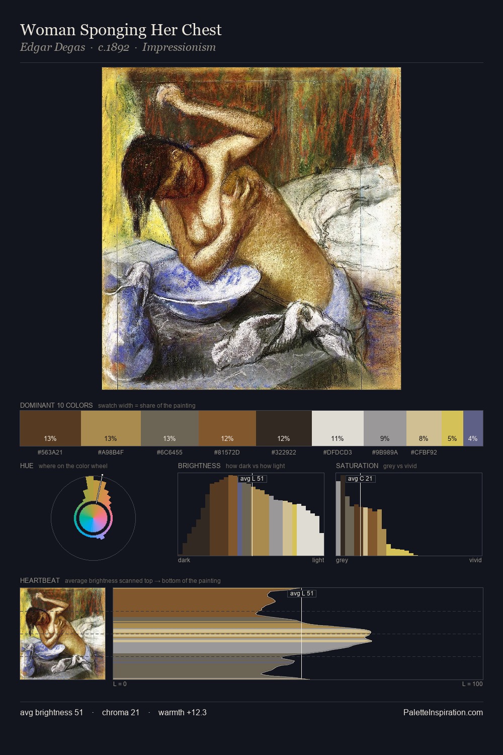
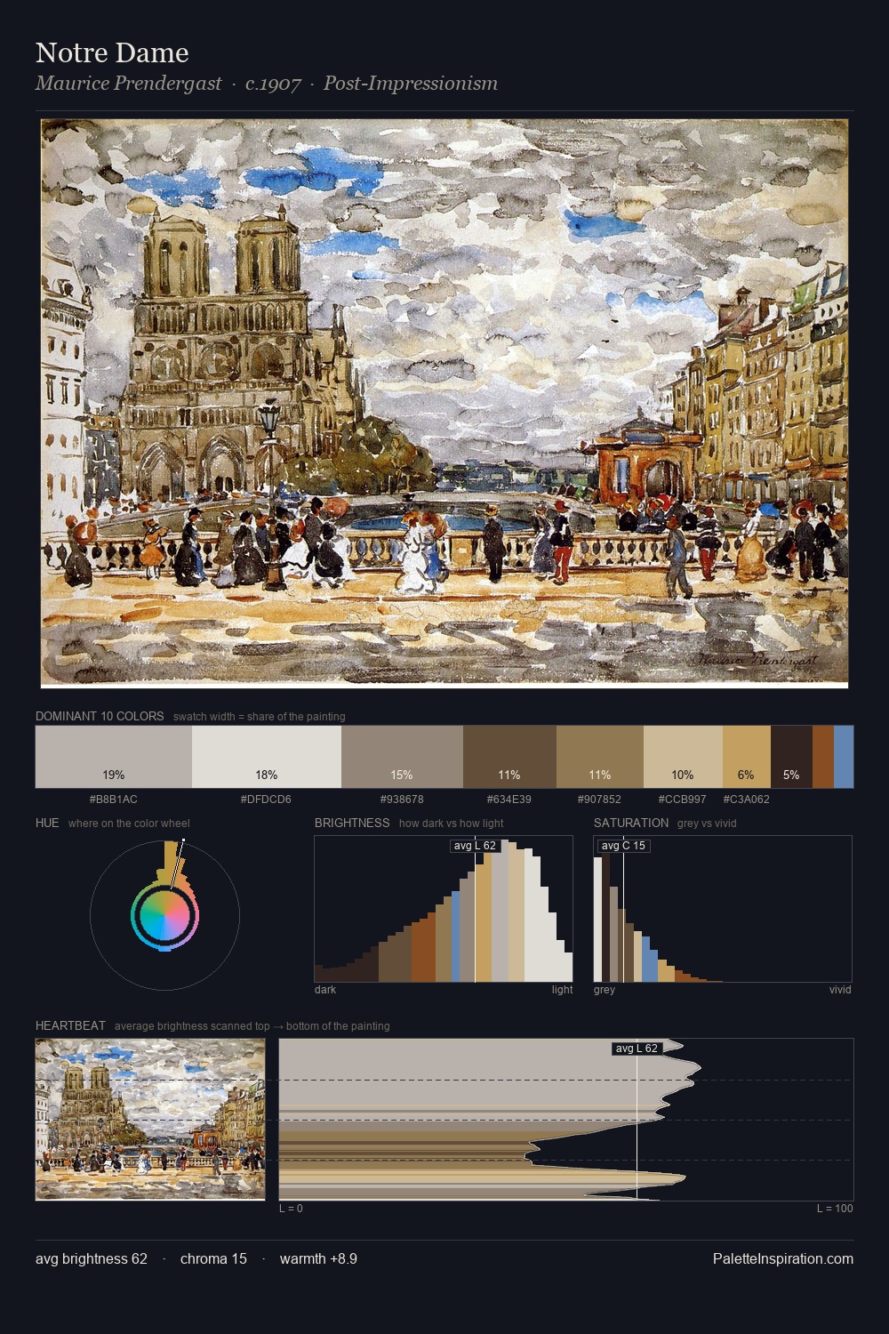
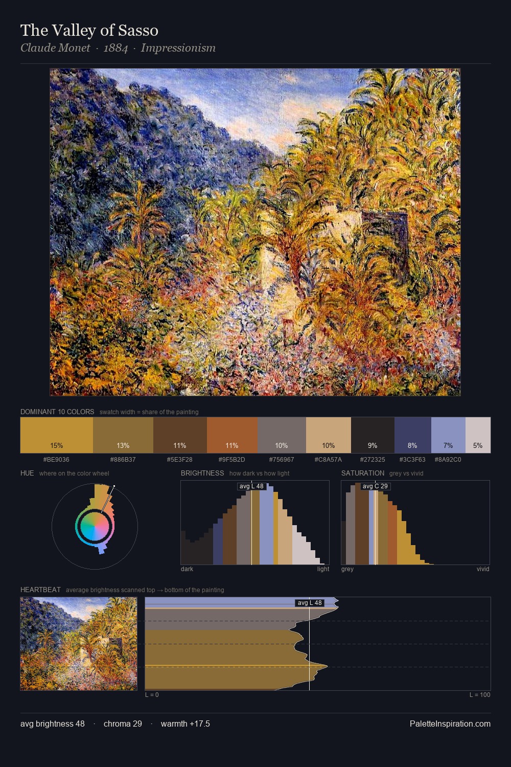
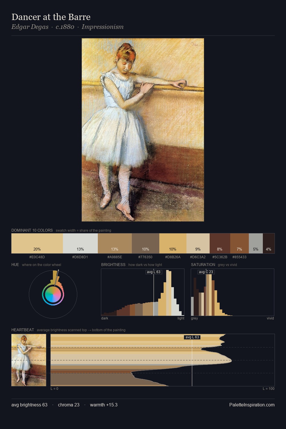
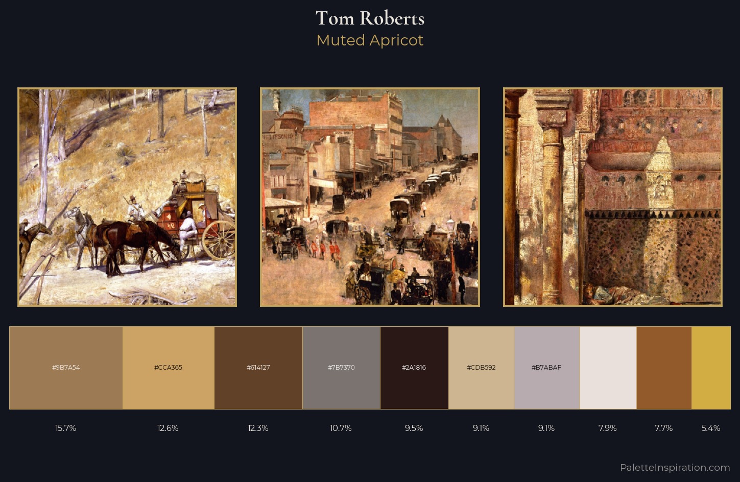
Mid-key values give Tom Roberts its characteristic quietness - nothing blazes, nothing disappears. Tom Roberts orchestrates warmth above all else - reds, ambers, and siennas take the lead. Chroma hovers near zero; colour declares itself through subtle shifts in hue rather than outright saturation. #925A2B functions as the palette's exclamation mark: highest chroma, lowest percentage (7.7%). The full value range is 68 units: broad enough to build convincing three-dimensional form. Tom Roberts's palette 3 carries its own internal logic while remaining in conversation with the artist's broader colour intelligence.
Example use cases
- ceramics & pottery
- boutique hospitality
- menswear
- heritage food brands
- craft & artisan brands
I Love This!
Use This Palette
Copy, export, or download for your project
Copy, export, or download for your project
Copy:
Download:
Share: