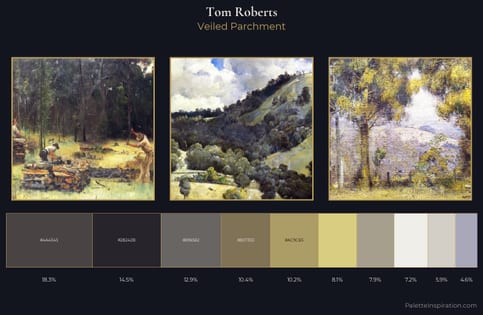
Tom Roberts Palette 1
Gleaming Ecru
Gleaming Bright and polished - high-key, often warm, suggesting reflective or luminous surfaces.
Ecru Unbleached linen - warm mid-neutral, slightly grayed, raw and natural.
Palette Analysis
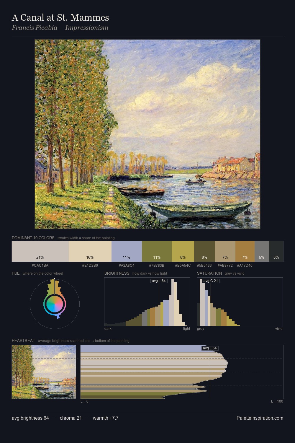
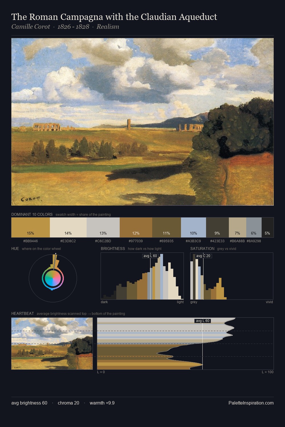
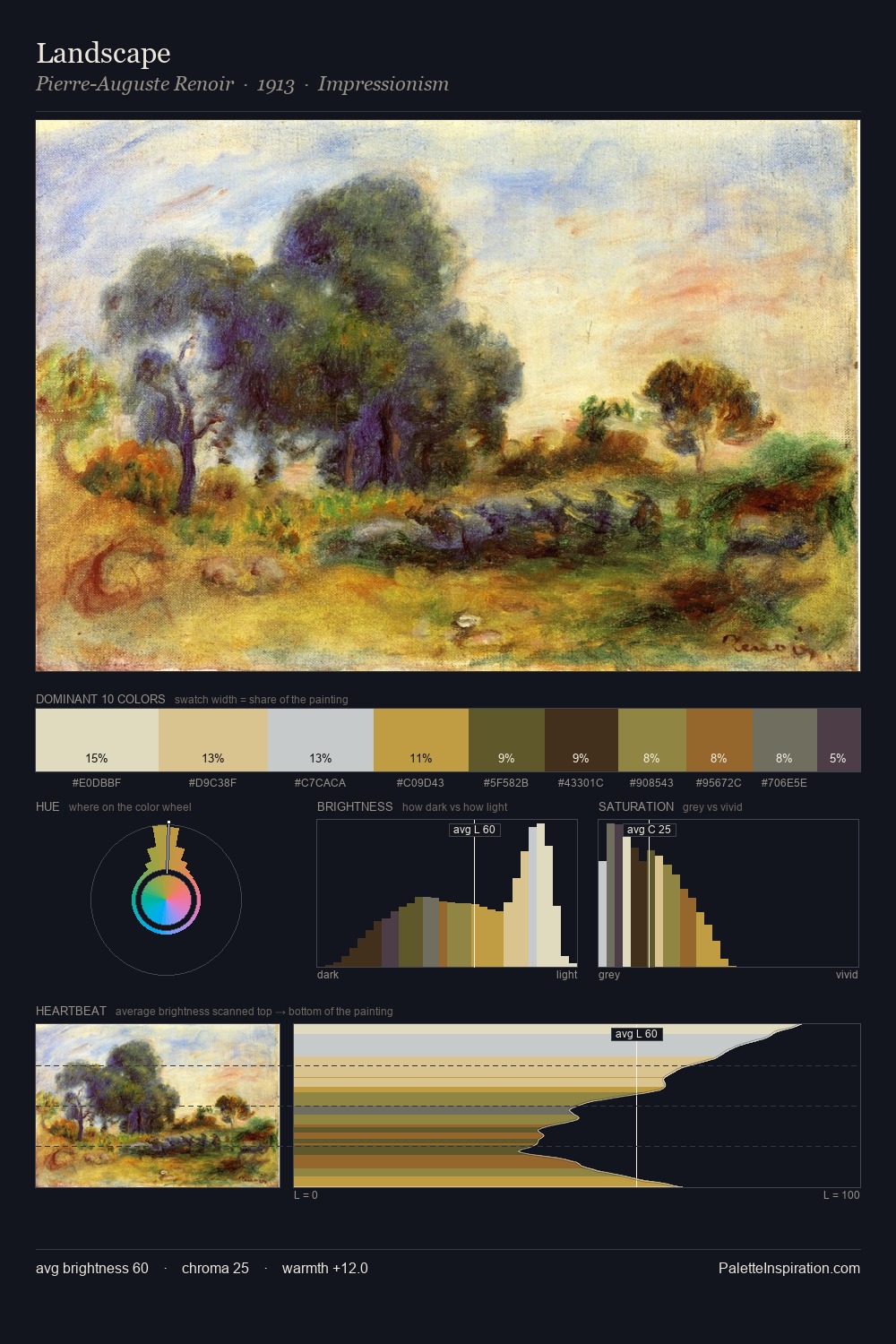
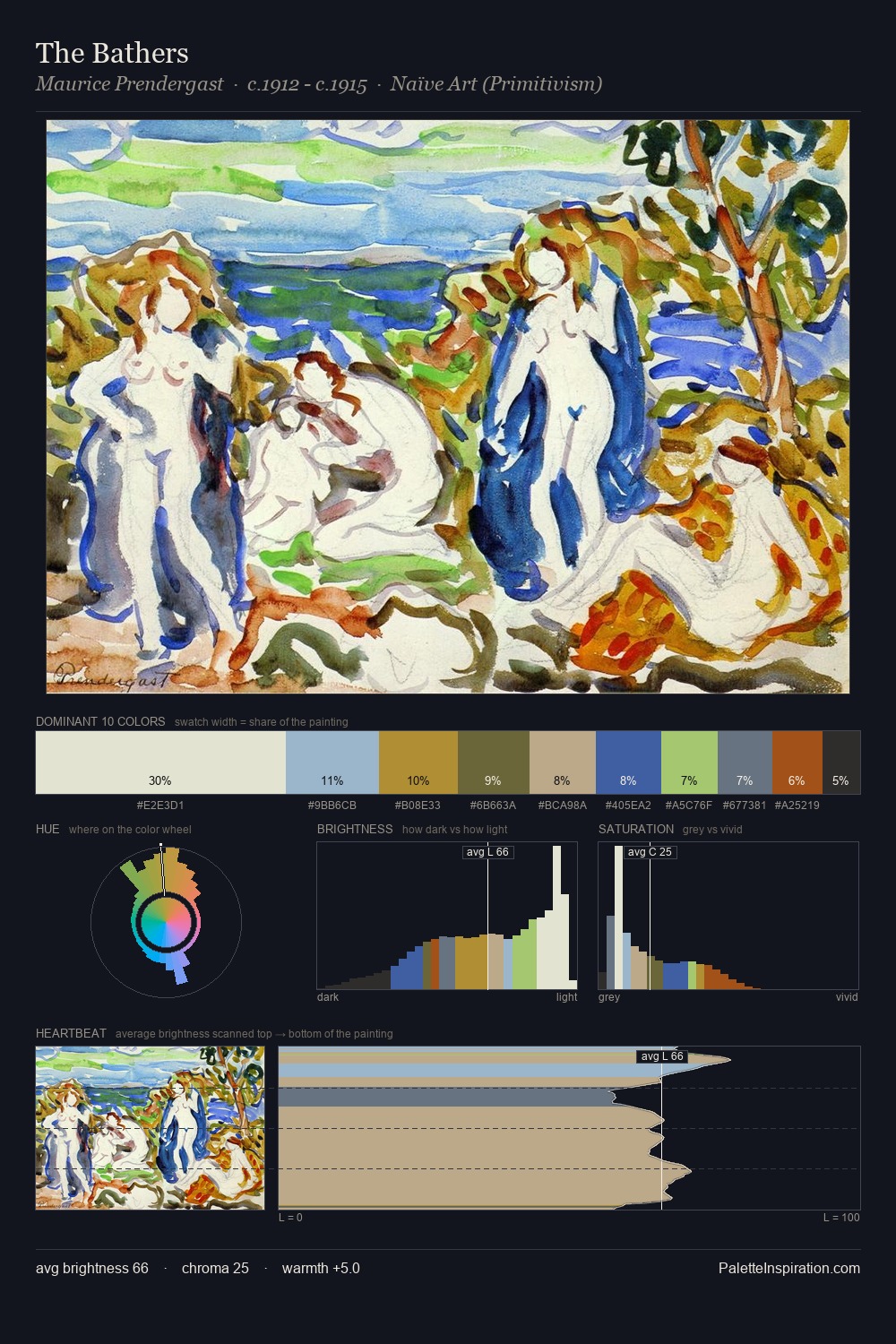
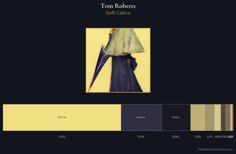
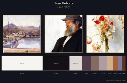
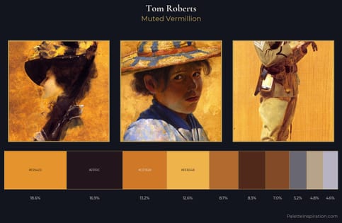
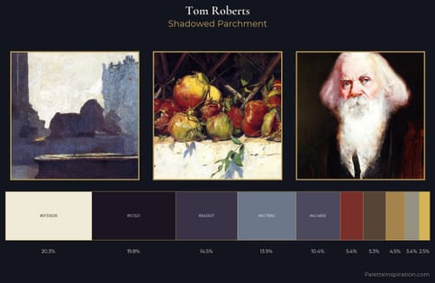
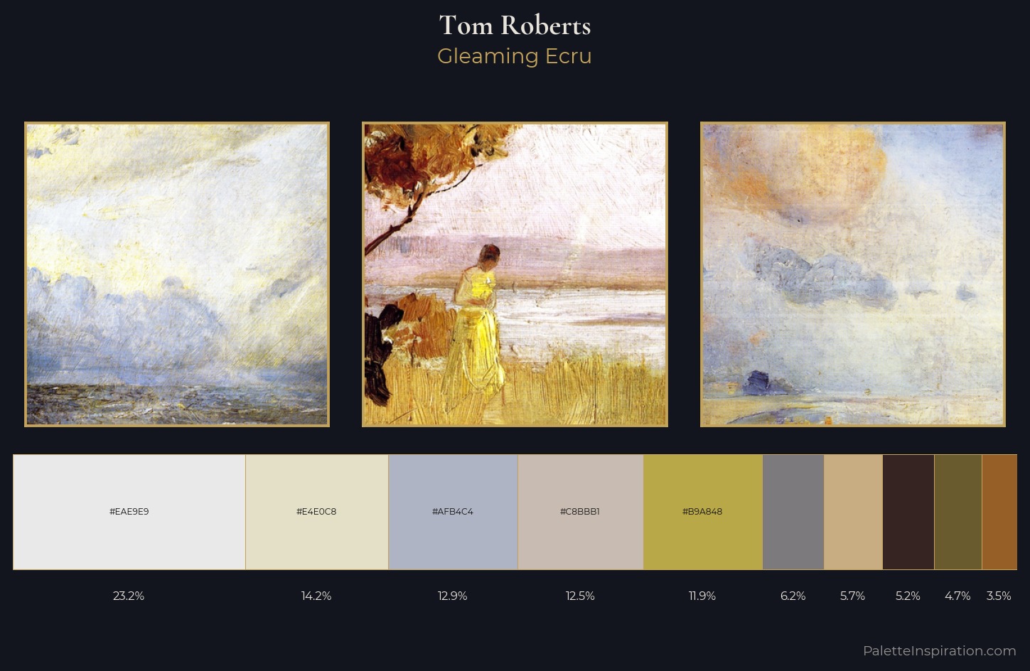
Tom Roberts is high-key - luminous, open, and weighted toward light. Temperature is balanced: the palette pits warm earth against cool sky without declaring a winner. Muted throughout, the palette achieves its effects through value and temperature rather than chromatic force. At 11.9%, #B9A848 carries the palette's sharpest chromatic charge: an accent that earns its place precisely because it is withheld. The full value range is 65 units: broad enough to build convincing three-dimensional form. This is palette 1 of Tom Roberts's sequence - a single chapter in a chromatic story told across many works.
Example use cases
- ceramics & pottery
- boutique hospitality
- menswear
- heritage food brands
- craft & artisan brands
I Love This!
Use This Palette
Copy, export, or download for your project
Copy, export, or download for your project
Copy:
Download:
Share: