Tom Roberts Palette 2
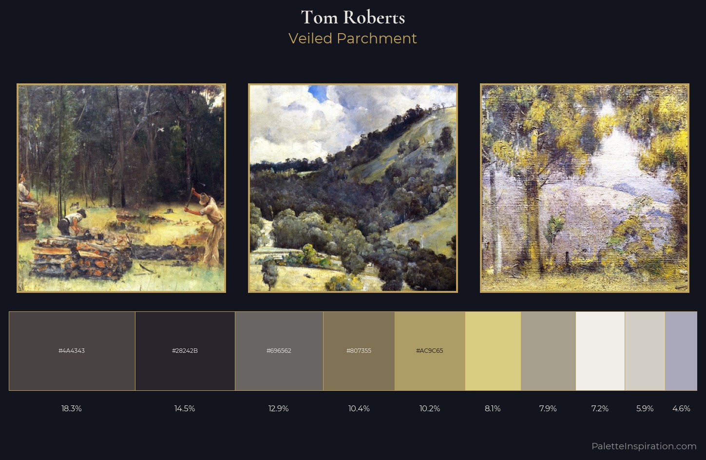
Palette Analysis
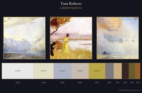
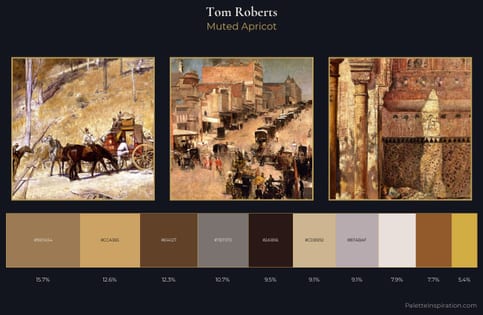
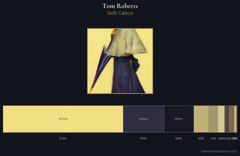
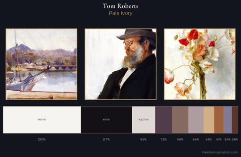
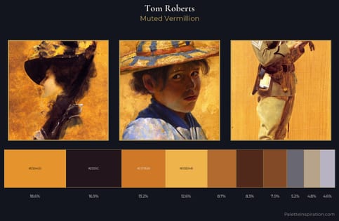
Values in Tom Roberts rest in the mid-range - neither dramatically lit nor steeped in shadow. Blues and teal-greys govern the palette, lending it an aquatic or atmospheric quality. Every colour is desaturated; the palette proceeds through near-neutrals and gently-coloured greys. The saturated accent, #807355, registers at 10.4% - sparse enough to feel like a deliberate surprise. The value range spans 68 units across the palette, providing the full gamut from deep shadow to near-white and ensuring clear tonal hierarchy. The mid-to-high key, cool bias, and moderate chroma point to outdoor observation - sky and diffused daylight as the dominant light source. Tom Roberts's palette 2 carries its own internal logic while remaining in conversation with the artist's broader colour intelligence.
Example use cases
- exhibition design
- foundation branding
- estate management
- art education
- museums & galleries
I Love This!
Copy, export, or download for your project