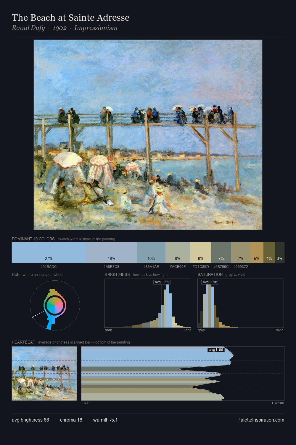
Theodor Severin Kittelsen Palette 6

Palette Analysis
The high-key values of Theodor Severin Kittelsen give it an effulgent, almost bleached quality. Cool hues prevail: blues, greens, and greys anchor the palette's emotional temperature. The absence of saturated colour is itself an expressive choice: this is a palette of restraint and atmosphere. At 26.2%, #D7C39F functions less as a colour accent and more as a complete atmospheric environment. #A2BBCA functions as the palette's exclamation mark: highest chroma, lowest percentage (4.4%). The value range of 49 units sits in the comfortable middle: enough depth, enough light, neither extreme. The palette has the character of outdoor light: cool, mid-bright, with colour rendered faithfully rather than expressively. In the context of Theodor Severin Kittelsen's full range of palettes, group 6 represents one movement in an ongoing chromatic dialogue.
Example use cases
- ceramics & pottery
- boutique hospitality
- menswear
- heritage food brands
- craft & artisan brands
I Love This!
Copy, export, or download for your project