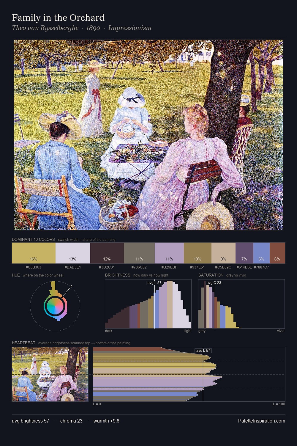
Theo van Rysselberghe Master Palette
Muted Parchment
Muted Deliberately desaturated - chroma pulled toward gray, the restraint of tonal painting.
Parchment Aged warm neutral - the color of old manuscript parchment, tan and slightly yellowed.

Palette Analysis
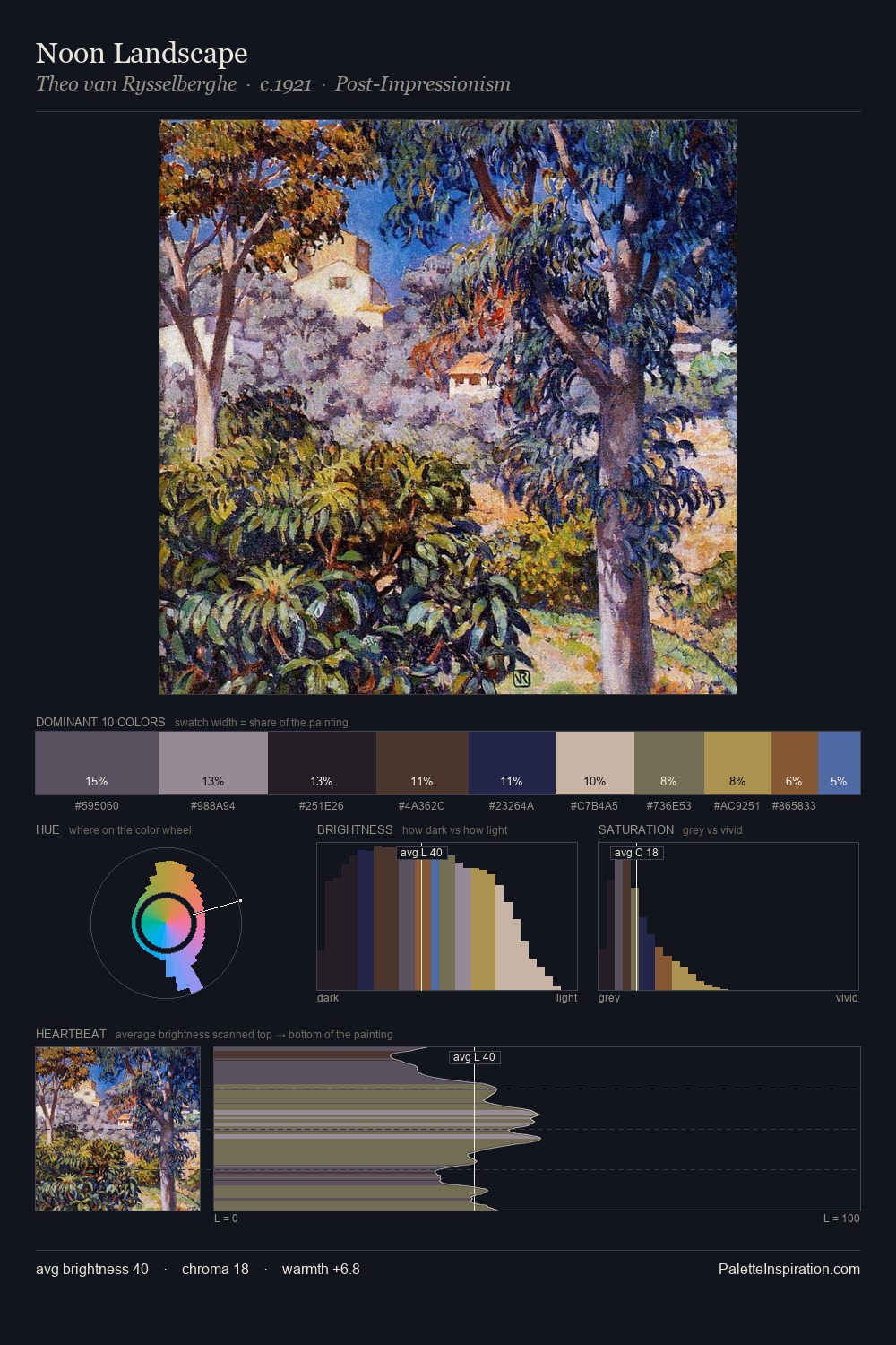
The value structure of Theo van Rysselberghe is mid-key: quiet, controlled, and cohesive. Warm and cool tones are held in careful balance - neither family dominates, creating tension and resolution simultaneously. Every colour is desaturated; the palette proceeds through near-neutrals and gently-coloured greys. At 10.1%, #794F3D carries the palette's sharpest chromatic charge: an accent that earns its place precisely because it is withheld. 54 units of value spread create a palette that is varied but unified - contrast in the service of harmony. The palette is a signature: Theo van Rysselberghe's particular sense of value, warmth, and colour weight made legible.
Example use cases
- ceramics & pottery
- boutique hospitality
- menswear
- heritage food brands
- craft & artisan brands
I Love This!
Use This Palette
Copy, export, or download for your project
Copy, export, or download for your project
Copy:
Download:
Share: