Theo van Rysselberghe Palette 2

Palette Analysis
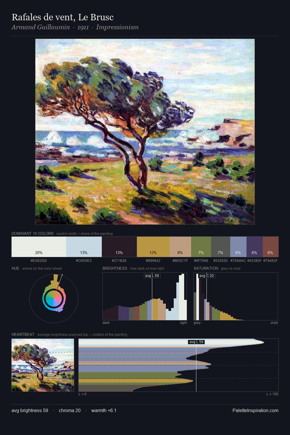
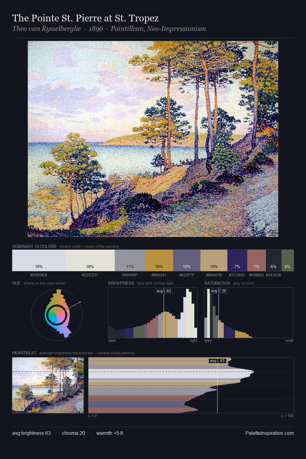
Theo van Rysselberghe works in the upper reaches of the value scale, creating an atmosphere of brightness and expansiveness. Temperature is cool-dominant, with blue and green families claiming the largest areas. All colours lean toward grey, building depth through value rather than colour punch. #8B4C4B delivers the chromatic peak at only 7.9% - a small shot of colour with outsized visual impact. 56 units of value range underpin the palette's structural clarity: the eye always knows where light falls. The mid-to-high key, cool bias, and moderate chroma point to outdoor observation - sky and diffused daylight as the dominant light source. Theo van Rysselberghe's palette 2 carries its own internal logic while remaining in conversation with the artist's broader colour intelligence.
Example use cases
- design agencies
- product brands
- e-commerce
- editorial sites
- publishing
I Love This!
Copy, export, or download for your project