Theo van Rysselberghe Palette 4
Pale Ivory
Pale High-key and low-chroma - delicate, bleached, washed with light.
Ivory Warm creamy white - the color of natural ivory, warmer than pure white.

Palette Analysis
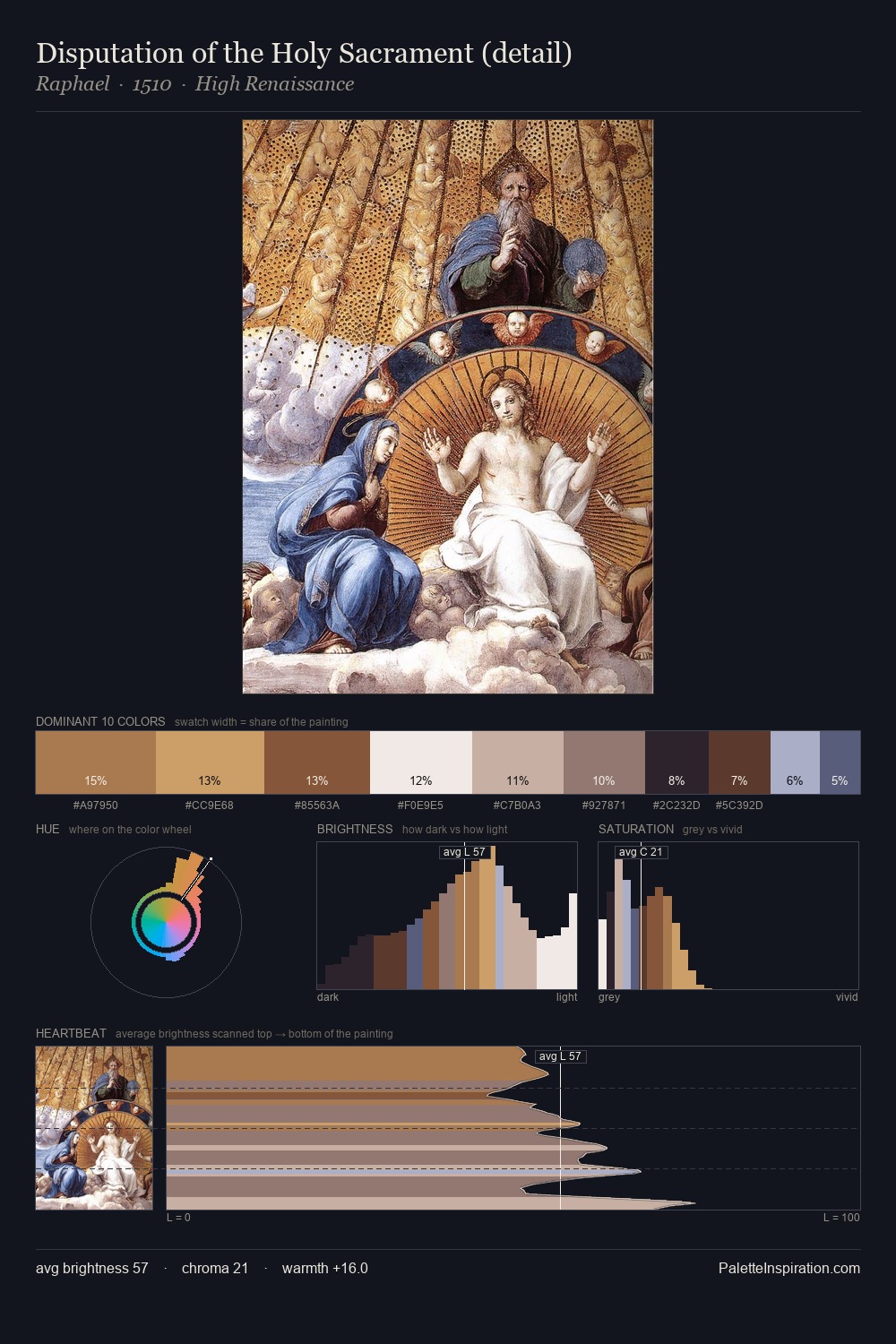
Theo van Rysselberghe is high-key - luminous, open, and weighted toward light. Theo van Rysselberghe orchestrates warmth above all else - reds, ambers, and siennas take the lead. All colours lean toward grey, building depth through value rather than colour punch. #5C392B delivers the chromatic peak at only 7.4% - a small shot of colour with outsized visual impact. The full value range is 61 units: broad enough to build convincing three-dimensional form. Theo van Rysselberghe's palette 4 carries its own internal logic while remaining in conversation with the artist's broader colour intelligence.
Example use cases
- exhibition design
- foundation branding
- estate management
- art education
- museums & galleries
I Love This!
Use This Palette
Copy, export, or download for your project
Copy, export, or download for your project
Copy:
Download:
Share: