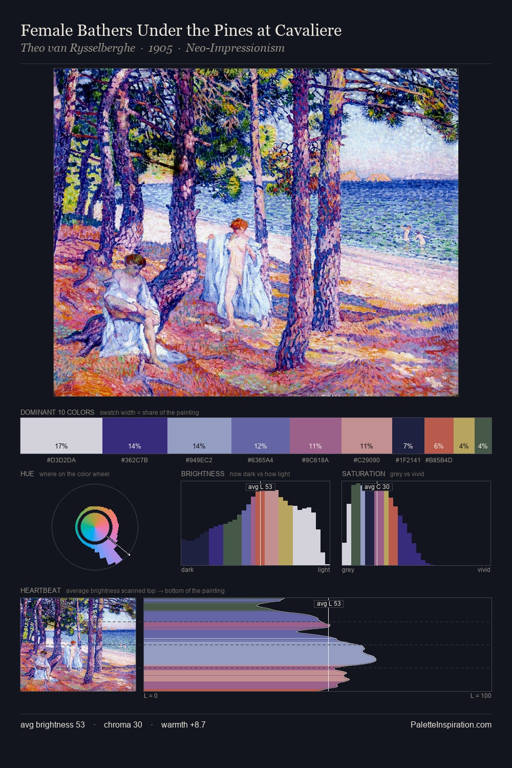
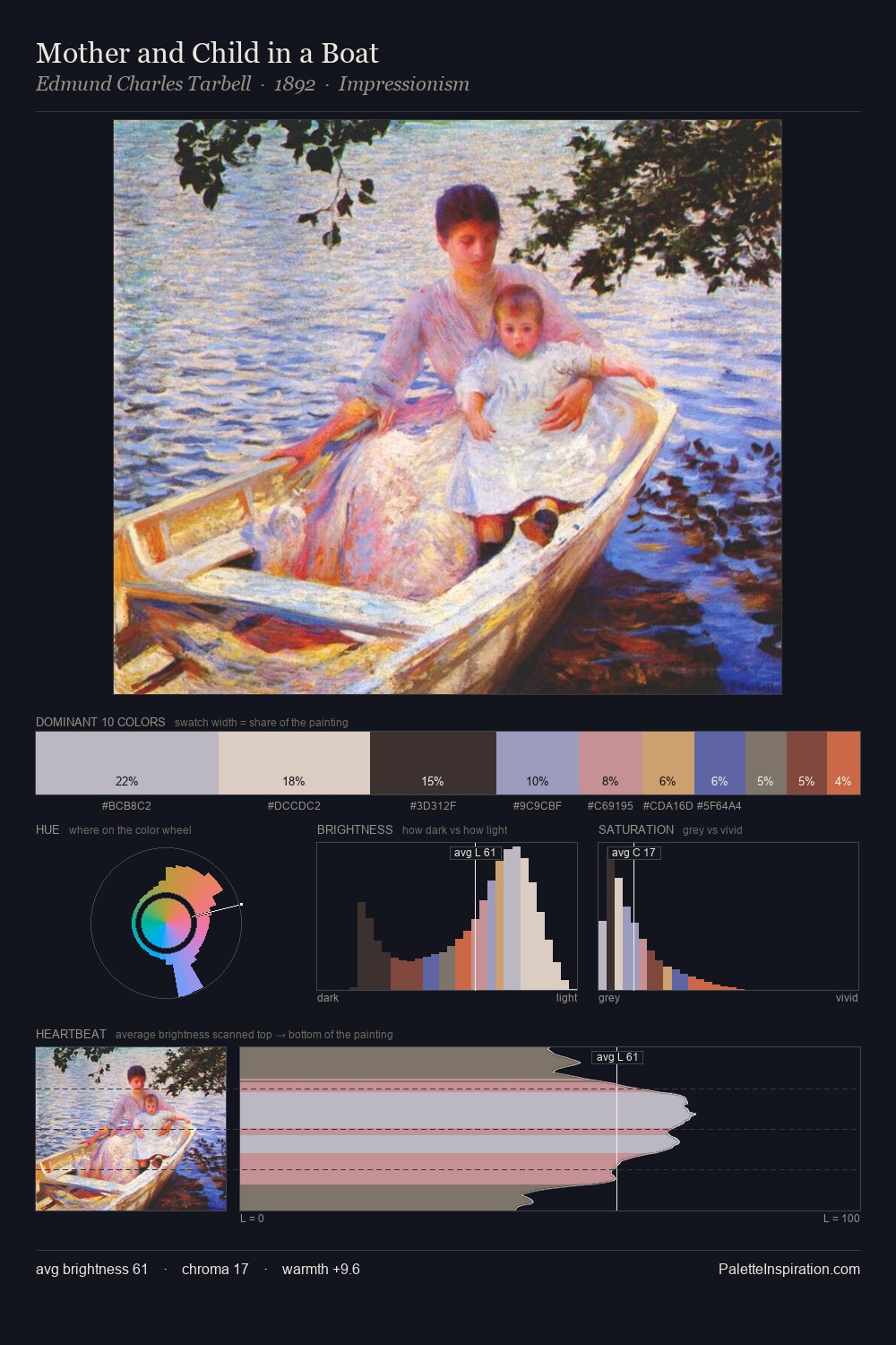
Theo van Rysselberghe Palette 5
Hushed Celadon
Hushed Very low chroma and quiet value - restrained to near-silence, barely present.
Celadon Pale gray-green - the color of Song dynasty celadon glaze, cool and mineral.

Palette Analysis
Theo van Rysselberghe is high in key: pale, luminous, and filled with optical air. Cool hues prevail: blues, greens, and greys anchor the palette's emotional temperature. The absence of saturated colour is itself an expressive choice: this is a palette of restraint and atmosphere. #A04A4E delivers the chromatic peak at only 4.8% - a small shot of colour with outsized visual impact. 54 units of value spread create a palette that is varied but unified - contrast in the service of harmony. The mid-to-high key, cool bias, and moderate chroma point to outdoor observation - sky and diffused daylight as the dominant light source. Palette 5 sits within the larger chromatic argument that Theo van Rysselberghe's complete body of work advances.
Example use cases
- art galleries
- creative studios
- consumer goods
- lifestyle media
- professional services
I Love This!
Use This Palette
Copy, export, or download for your project
Copy, export, or download for your project
Copy:
Download:
Share: