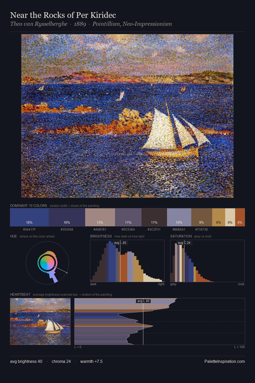
Theo van Rysselberghe Palette 12

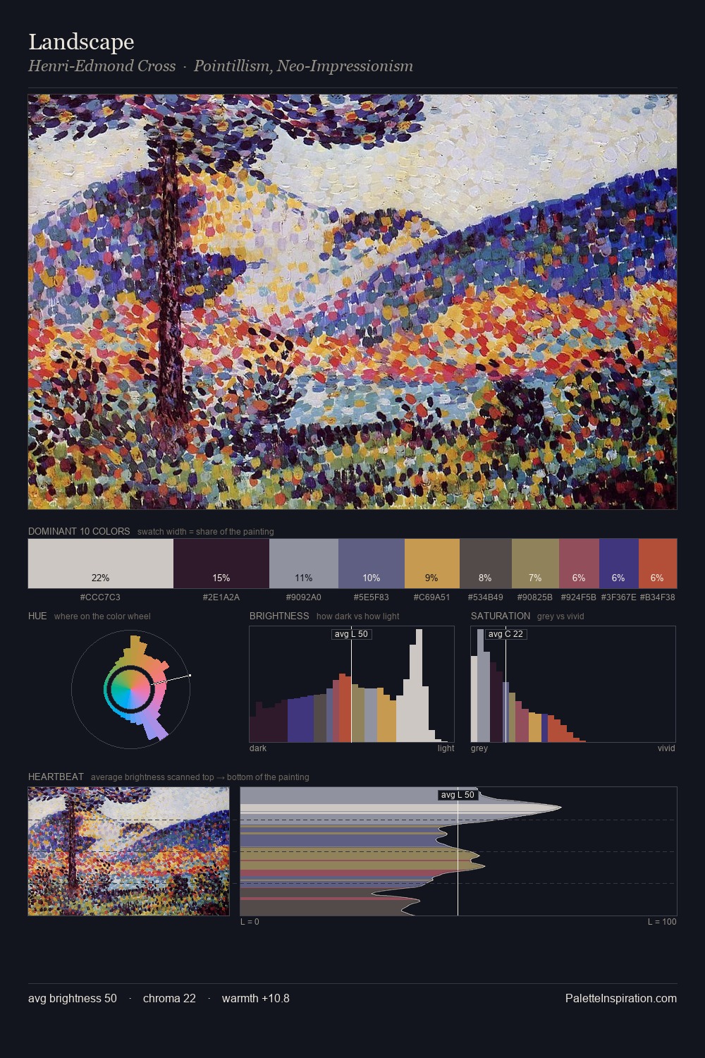
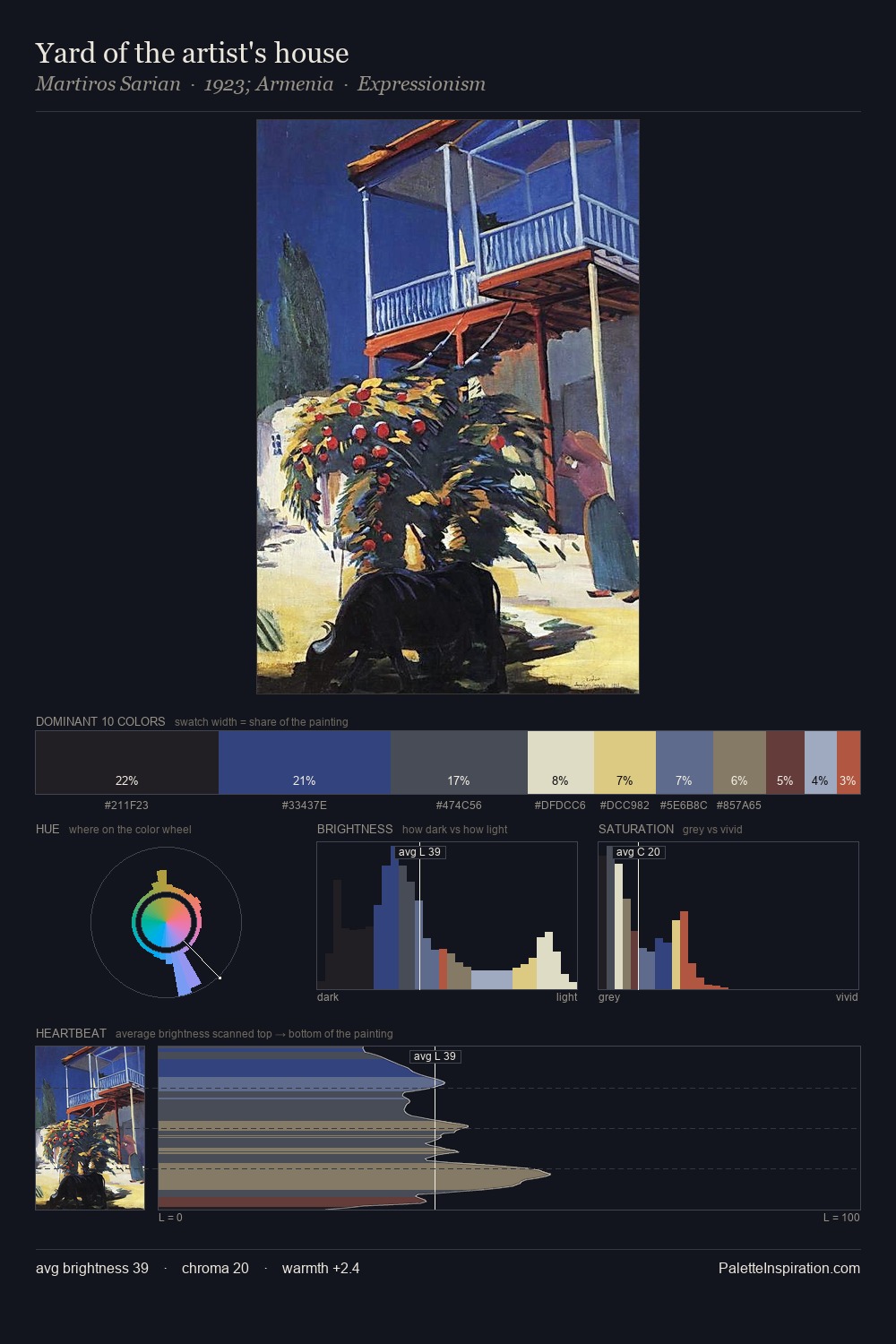
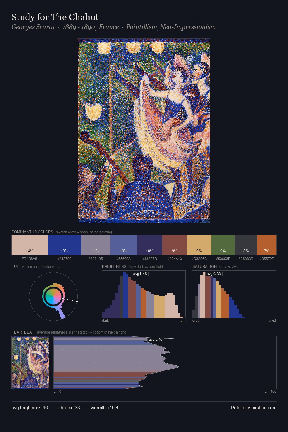
Palette Analysis
Theo van Rysselberghe distributes its values across the middle register, creating harmony without high contrast. Theo van Rysselberghe tilts toward cool - blues and silver-greys carry the structural weight. Colours are neither washed out nor blazing; they occupy the productive middle ground of the chroma scale. At 8.2%, #3B3577 carries the palette's sharpest chromatic charge: an accent that earns its place precisely because it is withheld. 49 units of value spread create a palette that is varied but unified - contrast in the service of harmony. The mid-to-high key, cool bias, and moderate chroma point to outdoor observation - sky and diffused daylight as the dominant light source. In the context of Theo van Rysselberghe's full range of palettes, group 12 represents one movement in an ongoing chromatic dialogue.
Example use cases
- publishing
- corporate identity
- consumer apps
- hospitality
- design agencies
I Love This!
Copy, export, or download for your project