T. C. Steele Palette 7
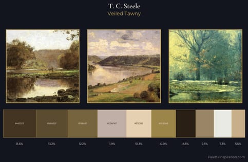
Veiled Tawny
Veiled Partially obscured light - mid-dark with a hazy, scrim-filtered quality.
Tawny Warm orange-brown - a traditional term for the color of tanned leather or lion fur.
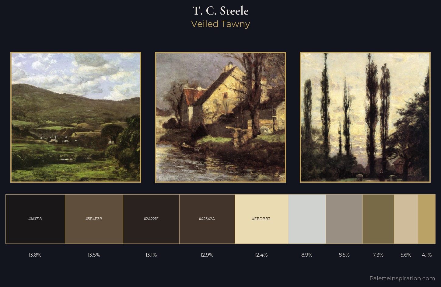
Palette Analysis
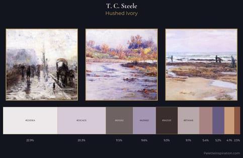
T. C. Steele distributes its values across the middle register, creating harmony without high contrast. Warm hues command this palette; T. C. Steele favours the reds, oranges, and yellows of firelight and earth. The absence of saturated colour is itself an expressive choice: this is a palette of restraint and atmosphere. At 4.0%, #BAA267 carries the palette's sharpest chromatic charge: an accent that earns its place precisely because it is withheld. From deepest dark to palest light, the palette traverses 68 units of the value scale - a span that creates natural depth. This is palette 7 of T. C. Steele's sequence - a single chapter in a chromatic story told across many works.
Example use cases
- ceramics & pottery
- boutique hospitality
- menswear
- heritage food brands
- craft & artisan brands
I Love This!
Use This Palette
Copy, export, or download for your project
Copy, export, or download for your project
Copy:
Download:
Share: