T. C. Steele Palette 10

Palette Analysis
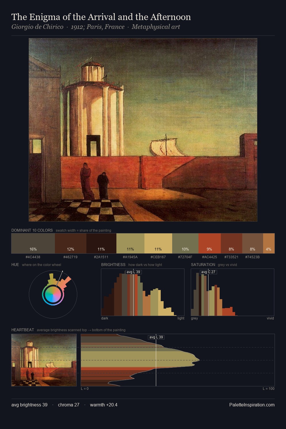
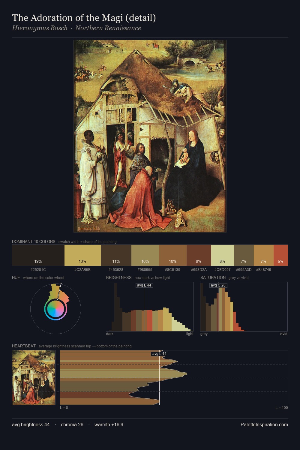
T. C. Steele distributes its values across the middle register, creating harmony without high contrast. Temperature reads distinctly warm: the reds and earth tones from T. C. Steele carry the compositional weight. Muted throughout, the palette achieves its effects through value and temperature rather than chromatic force. At 28.1%, #1D1714 functions less as a colour accent and more as a complete atmospheric environment. The saturated accent, #AA7A3F, registers at 4.9% - sparse enough to feel like a deliberate surprise. From deepest dark to palest light, the palette traverses 60 units of the value scale - a span that creates natural depth. Palette 10 sits within the larger chromatic argument that T. C. Steele's complete body of work advances.
Example use cases
- premium streaming
- cocktail bars
- fashion campaigns
- book covers
- music labels
I Love This!
Copy, export, or download for your project