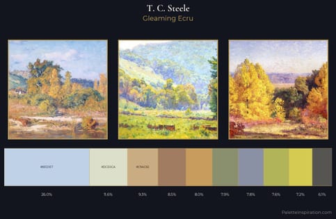
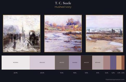
T. C. Steele Palette 3
Pale Ecru
Pale High-key and low-chroma - delicate, bleached, washed with light.
Ecru Unbleached linen - warm mid-neutral, slightly grayed, raw and natural.
Palette Analysis
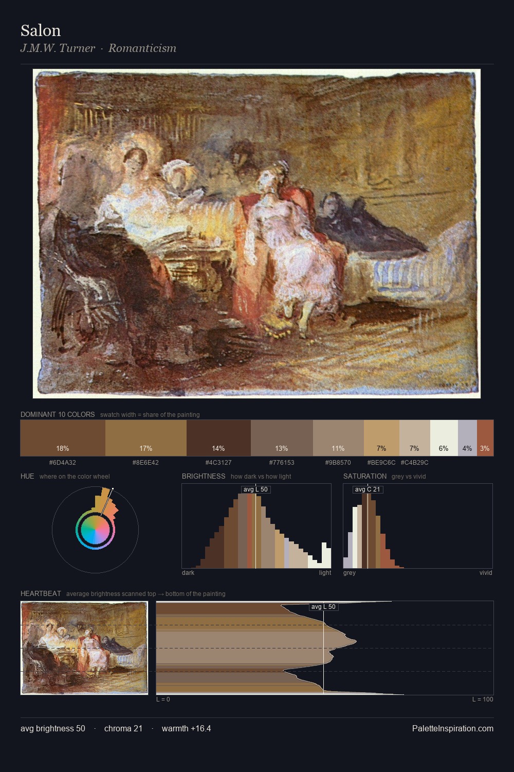
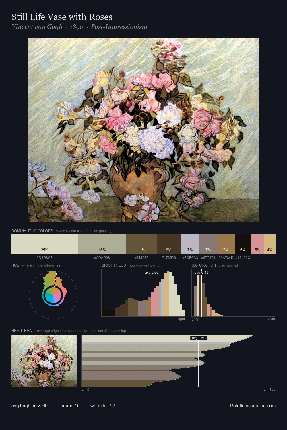
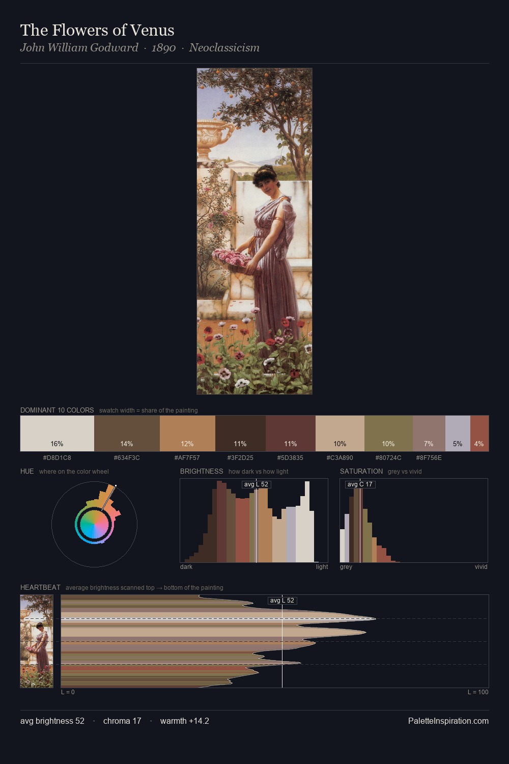
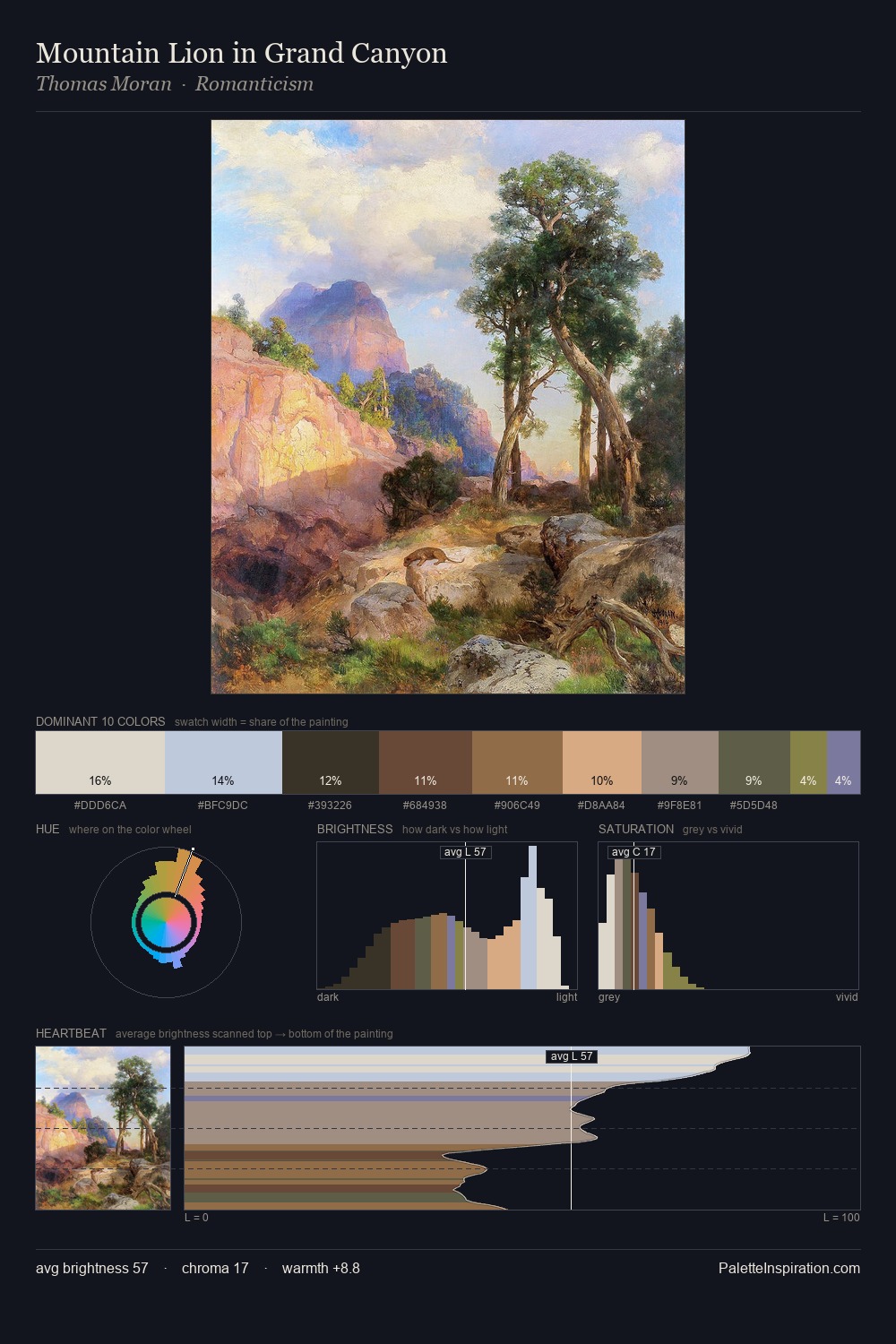
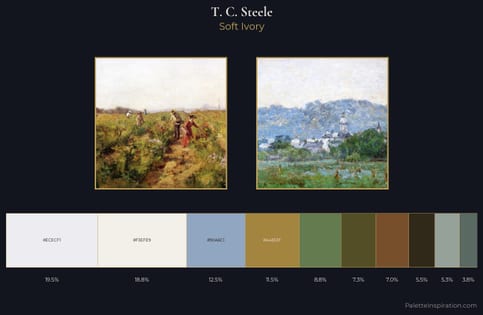
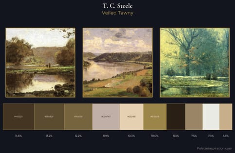
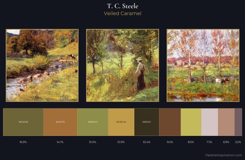
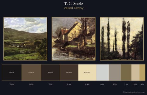
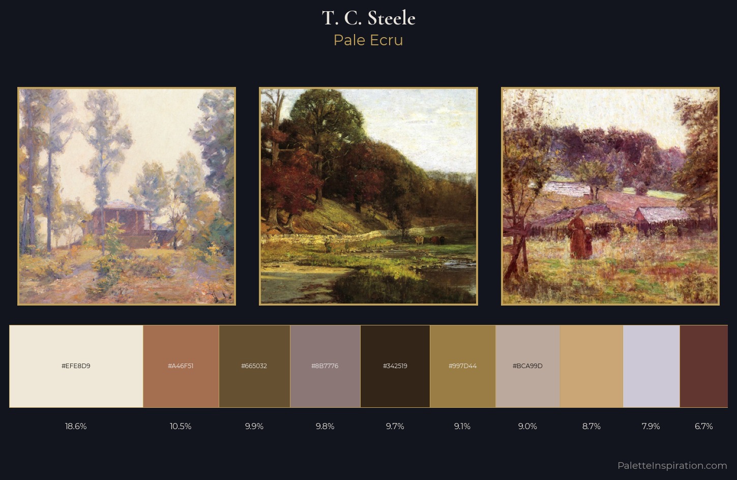
T. C. Steele occupies the comfortable middle of the value scale, avoiding both extremes to hold the eye in a sustained middle grey. The dominant temperature is warm, with earth tones and fire-hues setting the emotional key. All colours lean toward grey, building depth through value rather than colour punch. The highest-chroma note - #997D44 - appears at just 9.1%, deployed as a precision accent against the quieter ground. From deepest dark to palest light, the palette traverses 65 units of the value scale - a span that creates natural depth. This is palette 3 of T. C. Steele's sequence - a single chapter in a chromatic story told across many works.
Example use cases
- ceramics & pottery
- boutique hospitality
- menswear
- heritage food brands
- craft & artisan brands
I Love This!
Use This Palette
Copy, export, or download for your project
Copy, export, or download for your project
Copy:
Download:
Share: