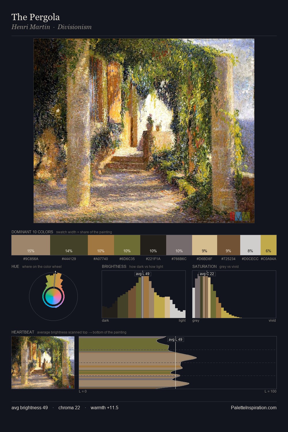
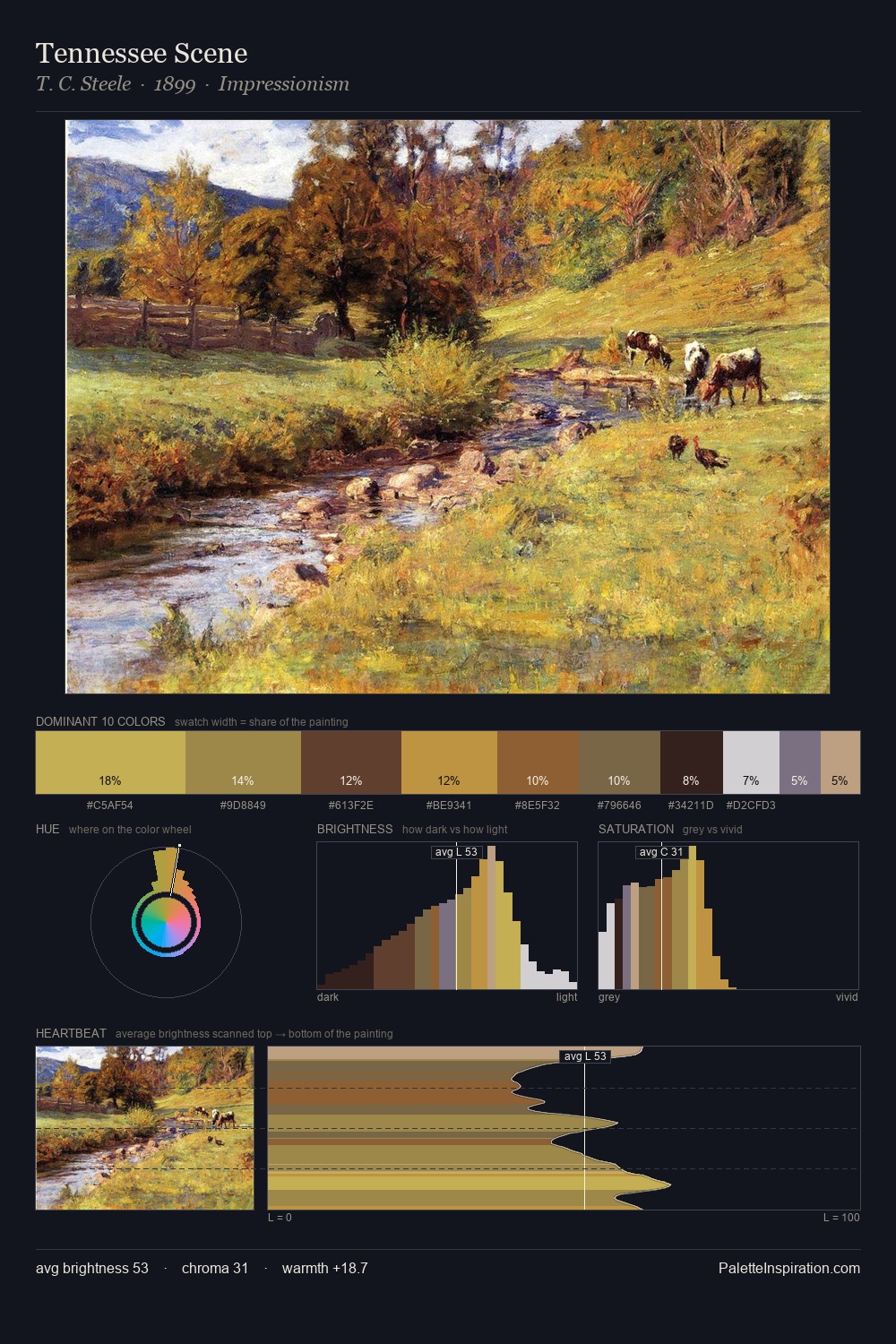
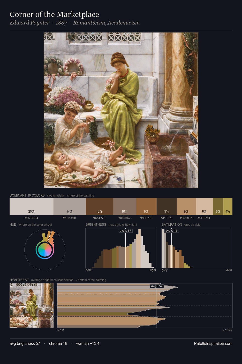
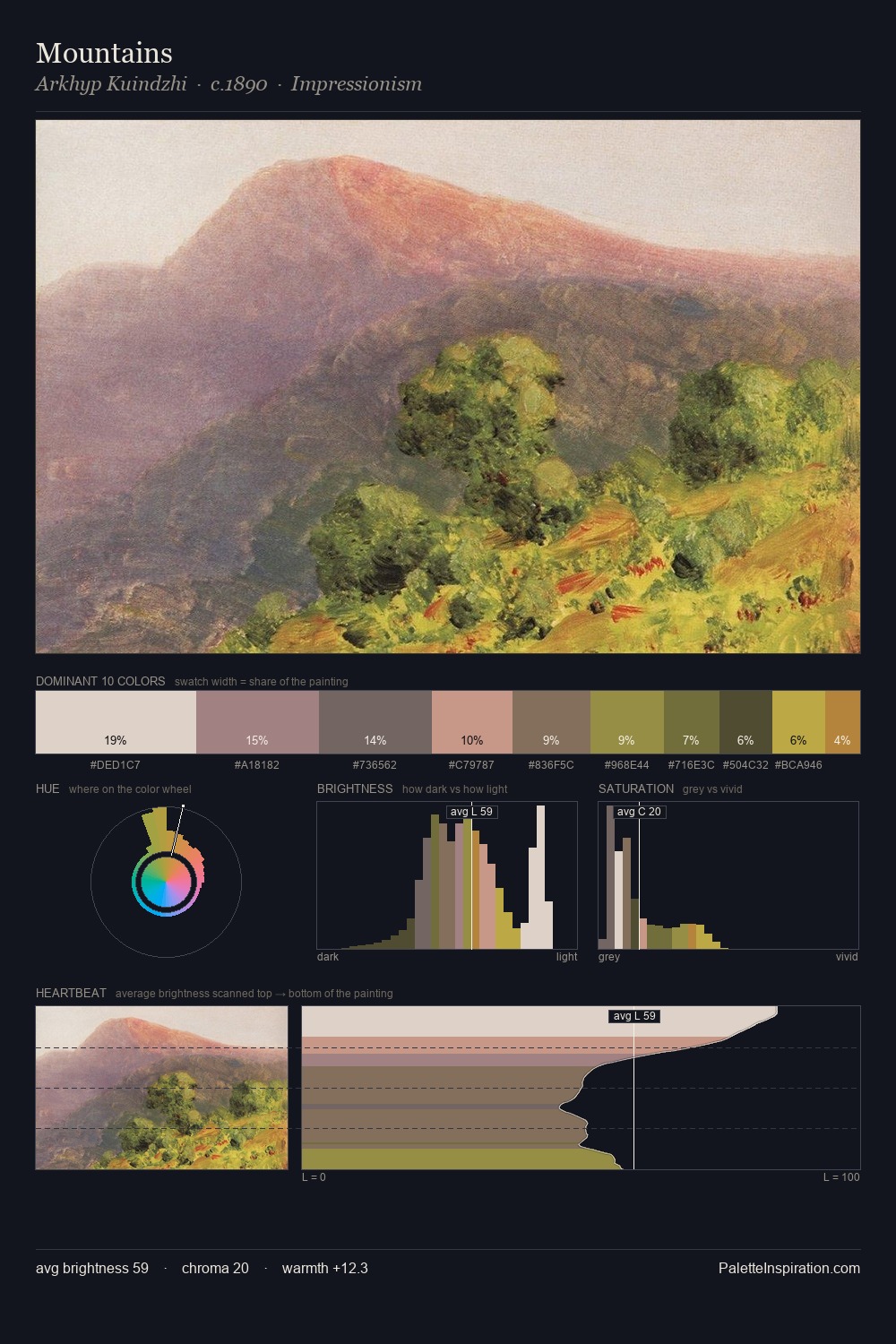
T. C. Steele Palette 6
Veiled Caramel
Veiled Partially obscured light - mid-dark with a hazy, scrim-filtered quality.
Caramel Warm mid-brown - the color of cooked sugar, smooth and amber-toned.

Palette Analysis
The value structure of T. C. Steele is mid-key: quiet, controlled, and cohesive. T. C. Steele tilts toward cool - blues and silver-greys carry the structural weight. A restrained, mid-chroma palette: every hue is present and legible, but nothing shouts. The most saturated colour, #C3BA5B, is reserved to 8.5% of the surface, where it acts as a focal punctuation. Spanning 52 units on the value axis, the palette achieves the balance between tonal flatness and fragmentation. The palette has the character of outdoor light: cool, mid-bright, with colour rendered faithfully rather than expressively. Palette 6 sits within the larger chromatic argument that T. C. Steele's complete body of work advances.
Example use cases
- ceramics & pottery
- boutique hospitality
- menswear
- heritage food brands
- craft & artisan brands
I Love This!
Use This Palette
Copy, export, or download for your project
Copy, export, or download for your project
Copy:
Download:
Share: