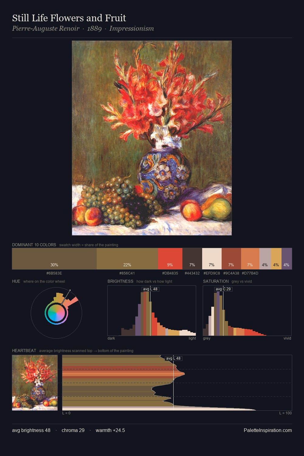
Still Life Palette 14
Muted Vermillion
Muted Deliberately desaturated - chroma pulled toward gray, the restraint of tonal painting.
Vermillion Brilliant red-orange - the classic mercury sulfide pigment, vivid and warm.

Palette Analysis
still life distributes its values across the middle register, creating harmony without high contrast. The palette orchestrates warmth above all else - reds, ambers, and siennas take the lead. Mid-range chroma keeps the palette grounded - colourful but not strident. The chromatic peak belongs to #C03525, and at 24.7% it dominates, not decorates. 52 units of value spread create a palette that is varied but unified - contrast in the service of harmony.
Example use cases
- publishing
- corporate identity
- consumer apps
- hospitality
- design agencies
I Love This!
Use This Palette
Copy, export, or download for your project
Copy, export, or download for your project
Copy:
Download:
Share: