Simon de Vlieger Palette 1

Palette Analysis
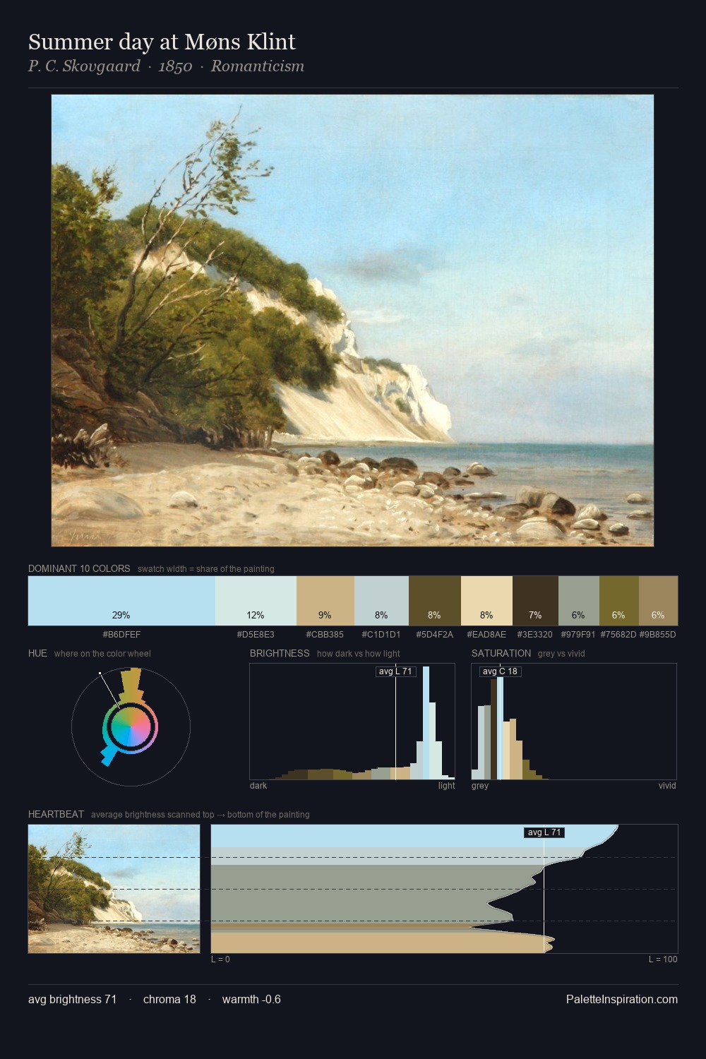
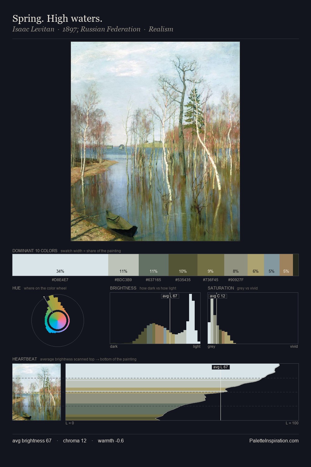
Simon de Vlieger works in the upper reaches of the value scale, creating an atmosphere of brightness and expansiveness. Blues and teal-greys govern the palette, lending it an aquatic or atmospheric quality. Saturation is deliberately withheld - the beauty here lies in the near-monochromatic gradations rather than colour difference. 25.7% of the palette belongs to #D6E1E0, a concentration that makes it the unmistakable visual centre. #2A2616 functions as the palette's exclamation mark: highest chroma, lowest percentage (3.5%). The full value range is 68 units: broad enough to build convincing three-dimensional form. The mid-to-high key, cool bias, and moderate chroma point to outdoor observation - sky and diffused daylight as the dominant light source. Simon de Vlieger's palette 1 carries its own internal logic while remaining in conversation with the artist's broader colour intelligence.
Example use cases
- editorial design
- skincare branding
- architecture portfolios
- wellness apps
- print magazines
I Love This!
Copy, export, or download for your project