Simon de Vlieger Palette 5

Palette Analysis
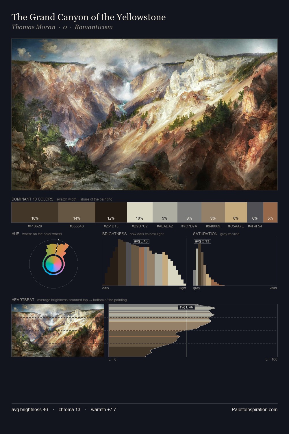
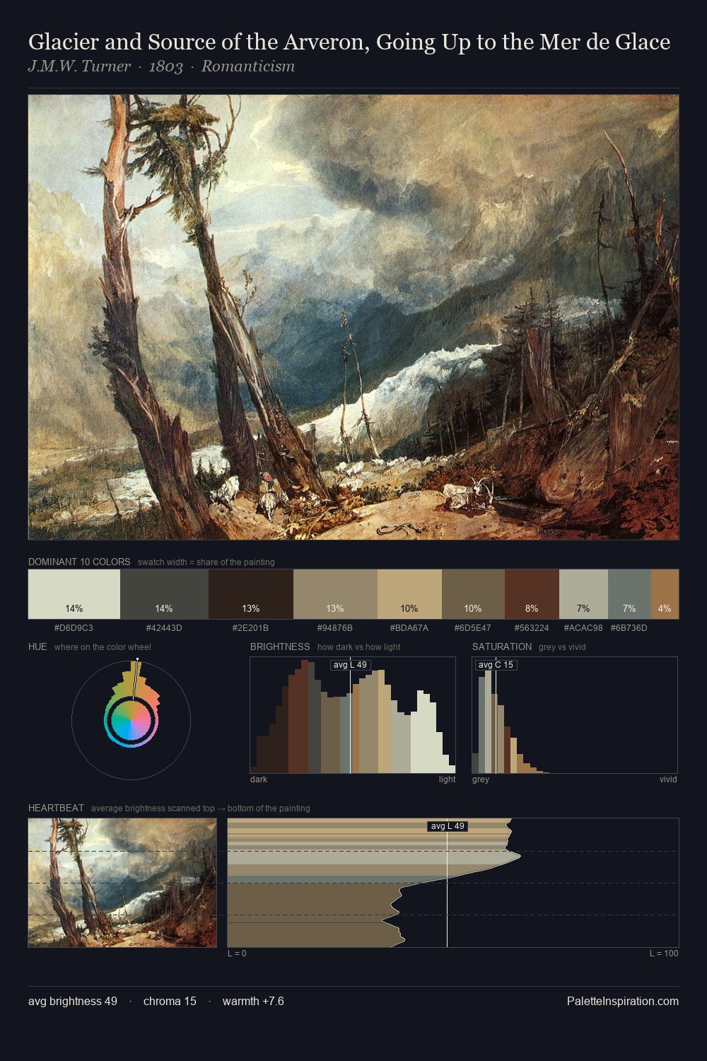
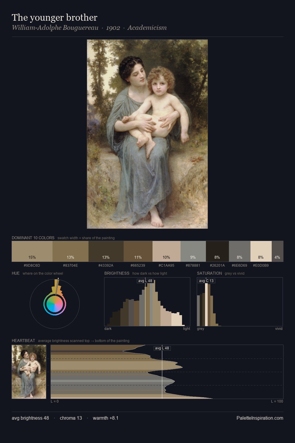
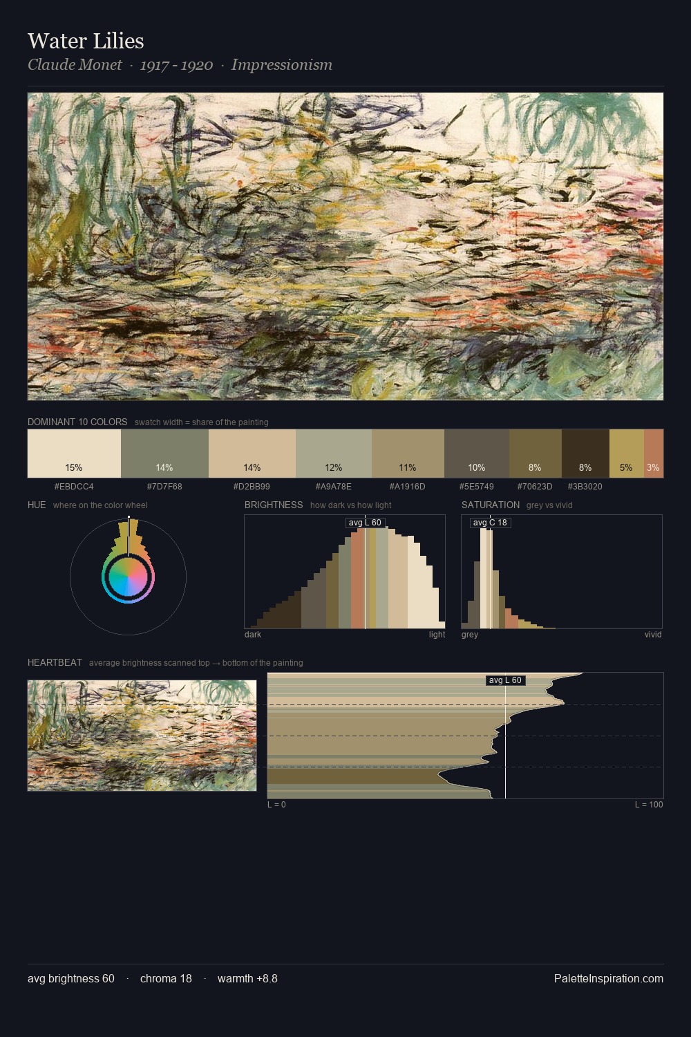
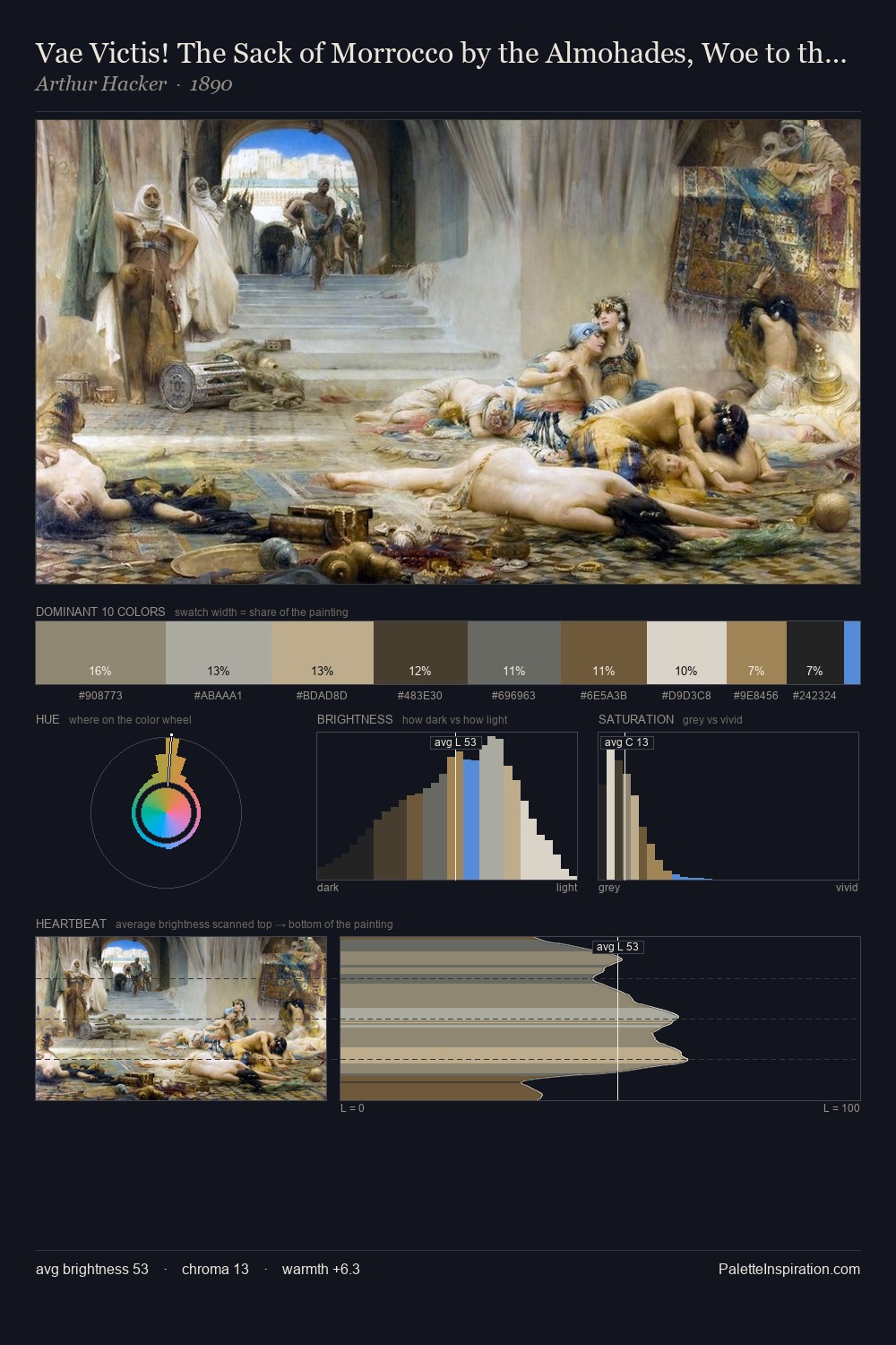
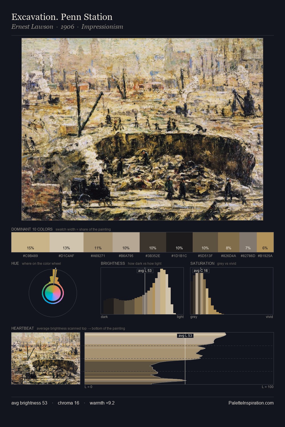
Simon de Vlieger occupies the comfortable middle of the value scale, avoiding both extremes to hold the eye in a sustained middle grey. Blues and teal-greys govern the palette, lending it an aquatic or atmospheric quality. The absence of saturated colour is itself an expressive choice: this is a palette of restraint and atmosphere. The saturated accent, #C7B389, registers at 11.9% - sparse enough to feel like a deliberate surprise. At 57 units of value range, the palette has the tonal breadth to sustain complex spatial readings. The palette has the character of outdoor light: cool, mid-bright, with colour rendered faithfully rather than expressively. Palette 5 sits within the larger chromatic argument that Simon de Vlieger's complete body of work advances.
Example use cases
- exhibition design
- foundation branding
- estate management
- art education
- museums & galleries
I Love This!
Copy, export, or download for your project