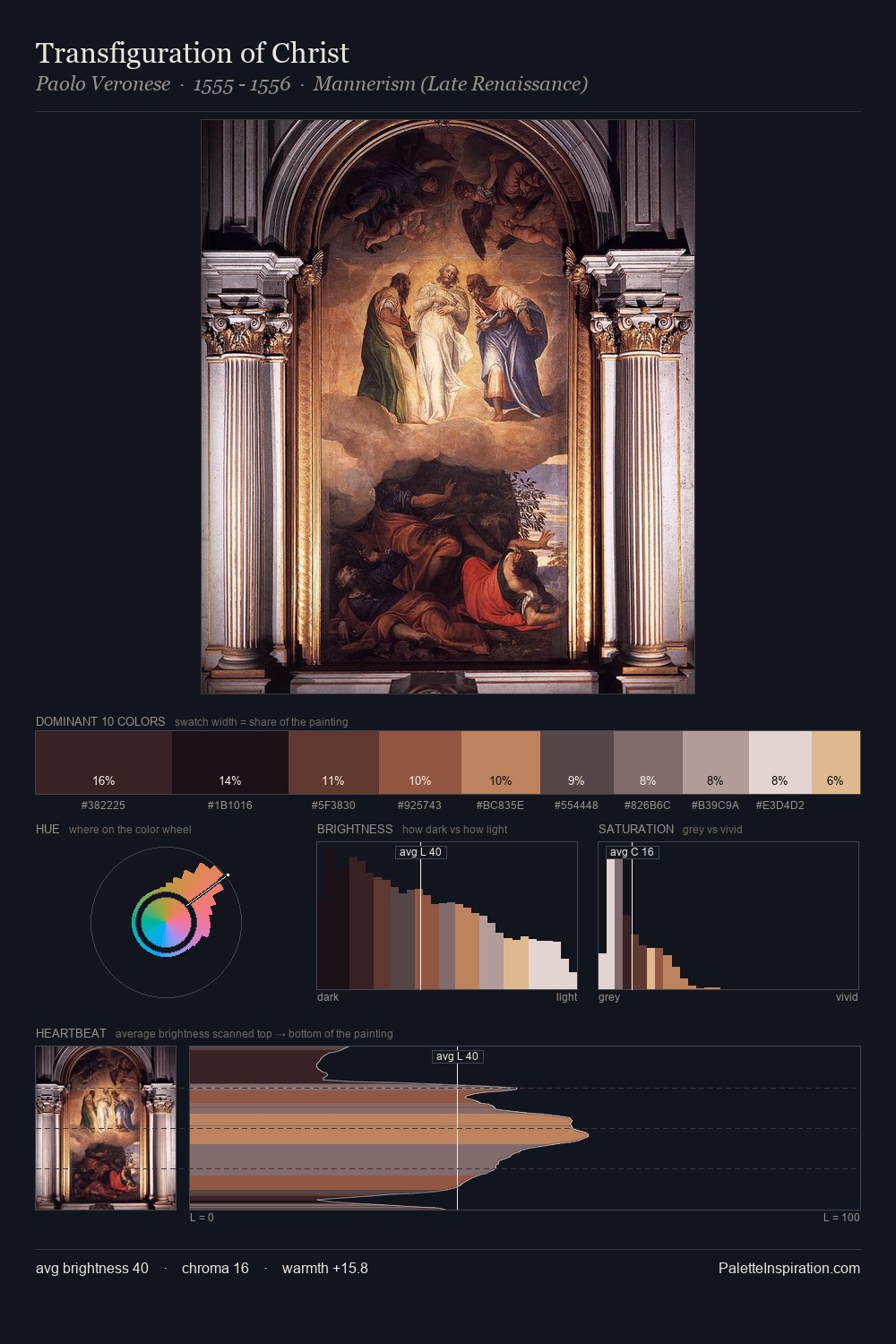
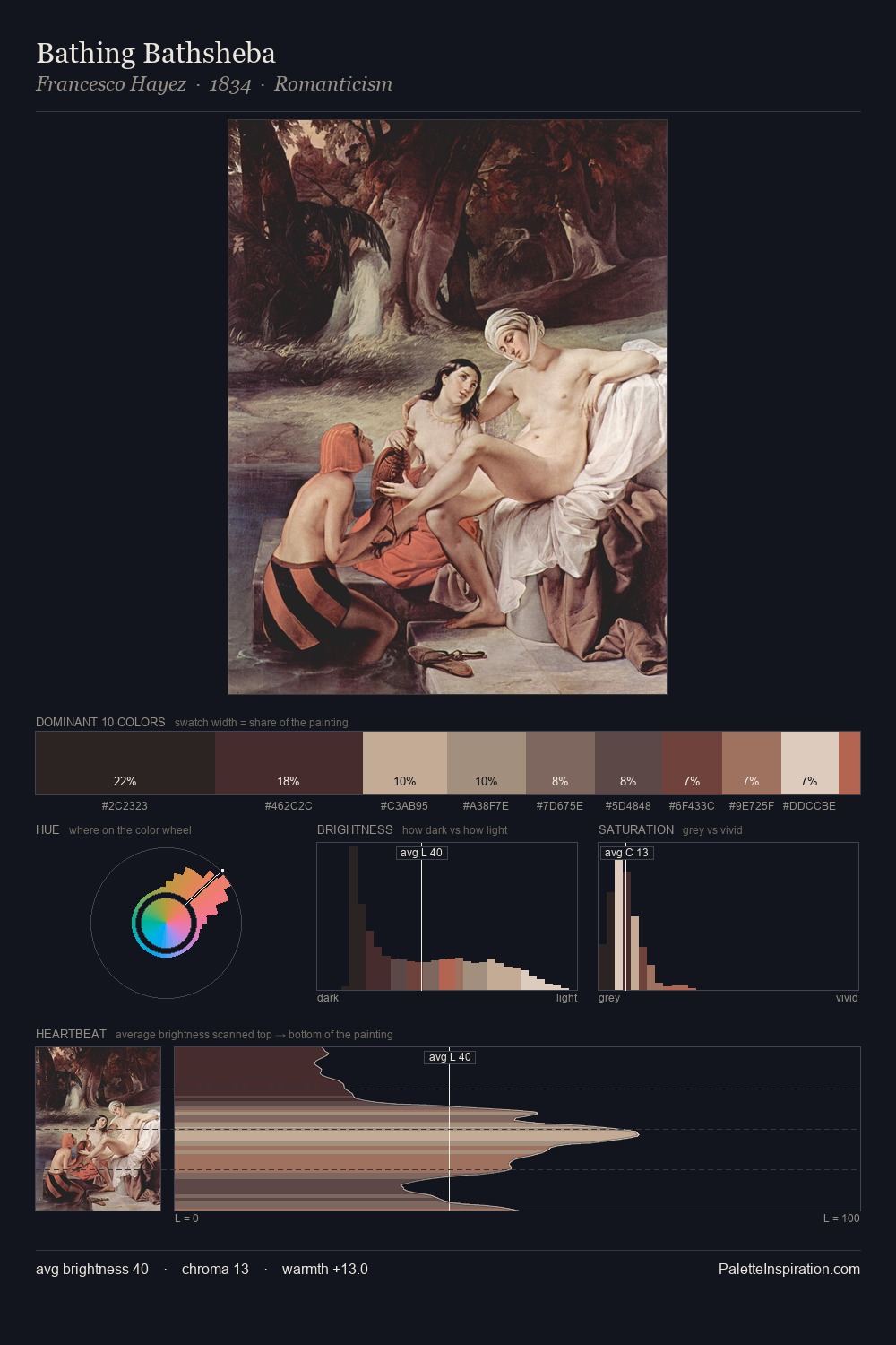
Sandro Botticelli Palette 5
Muted Tawny
Muted Deliberately desaturated - chroma pulled toward gray, the restraint of tonal painting.
Tawny Warm orange-brown - a traditional term for the color of tanned leather or lion fur.

Palette Analysis
Sandro Botticelli distributes its values across the middle register, creating harmony without high contrast. Sandro Botticelli orchestrates warmth above all else - reds, ambers, and siennas take the lead. Saturation is deliberately withheld - the beauty here lies in the near-monochromatic gradations rather than colour difference. At 6.5%, #9D5D48 carries the palette's sharpest chromatic charge: an accent that earns its place precisely because it is withheld. At 63 units of value range, the palette has the tonal breadth to sustain complex spatial readings. Palette 5 sits within the larger chromatic argument that Sandro Botticelli's complete body of work advances.
Example use cases
- exhibition design
- foundation branding
- estate management
- art education
- museums & galleries
I Love This!
Use This Palette
Copy, export, or download for your project
Copy, export, or download for your project
Copy:
Download:
Share: