Giotto Palette 3
Muted Tawny
Muted Deliberately desaturated - chroma pulled toward gray, the restraint of tonal painting.
Tawny Warm orange-brown - a traditional term for the color of tanned leather or lion fur.

Palette Analysis
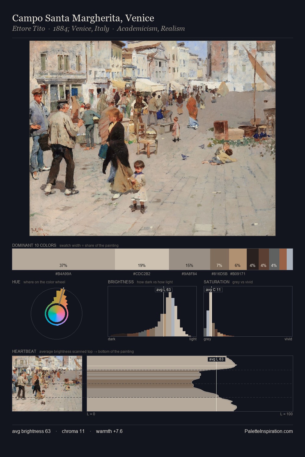
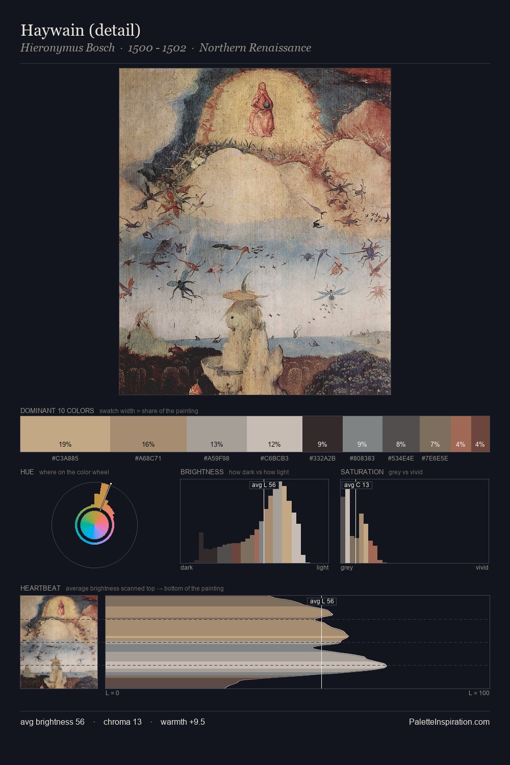
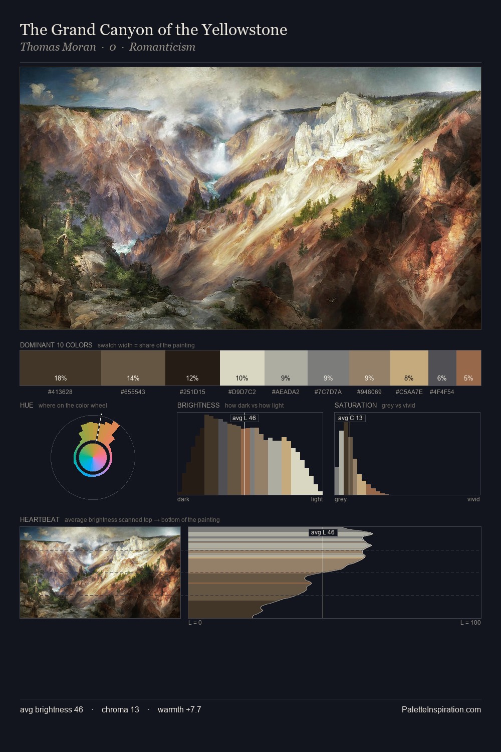
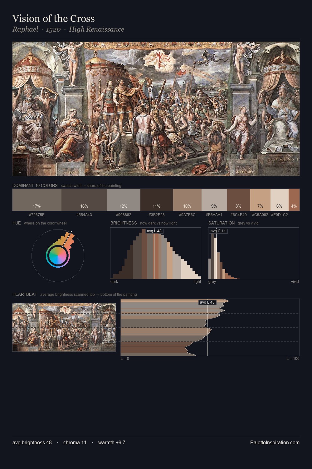
Giotto occupies the comfortable middle of the value scale, avoiding both extremes to hold the eye in a sustained middle grey. Giotto orchestrates warmth above all else - reds, ambers, and siennas take the lead. Saturation is deliberately withheld - the beauty here lies in the near-monochromatic gradations rather than colour difference. At 4.6%, #BF9F6C carries the palette's sharpest chromatic charge: an accent that earns its place precisely because it is withheld. The value range spans 57 units across the palette, providing the full gamut from deep shadow to near-white and ensuring clear tonal hierarchy. Palette 3 sits within the larger chromatic argument that Giotto's complete body of work advances.
Example use cases
- archival print
- university identity
- rare books
- cultural institutions
- nonprofit identity
I Love This!
Use This Palette
Copy, export, or download for your project
Copy, export, or download for your project
Copy:
Download:
Share: