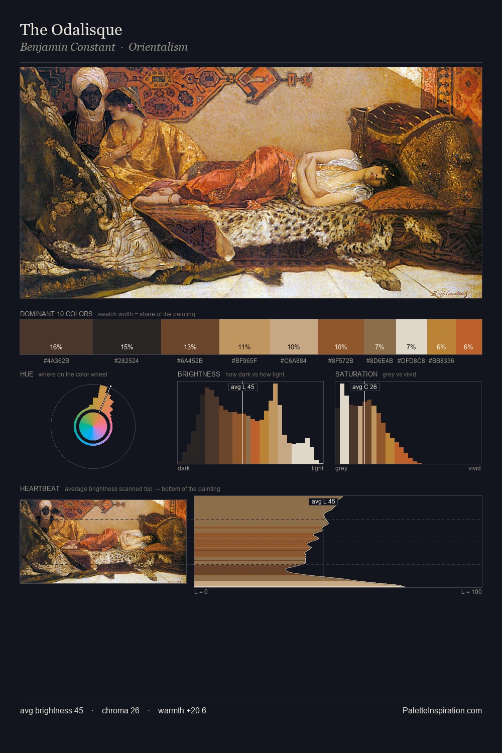
Giotto Palette 10
Muted Tawny
Muted Deliberately desaturated - chroma pulled toward gray, the restraint of tonal painting.
Tawny Warm orange-brown - a traditional term for the color of tanned leather or lion fur.

Palette Analysis
Giotto distributes its values across the middle register, creating harmony without high contrast. Warm hues command this palette; Giotto favours the reds, oranges, and yellows of firelight and earth. Colours are neither washed out nor blazing; they occupy the productive middle ground of the chroma scale. The highest-chroma note - #B55515 - appears at just 5.9%, deployed as a precision accent against the quieter ground. 47 units of value spread create a palette that is varied but unified - contrast in the service of harmony. Giotto's palette 10 carries its own internal logic while remaining in conversation with the artist's broader colour intelligence.
Example use cases
- theater design
- jewelry brands
- tobacco-adjacent retail
- event branding
- film & entertainment
I Love This!
Use This Palette
Copy, export, or download for your project
Copy, export, or download for your project
Copy:
Download:
Share: