Sandro Botticelli Palette 6
Pale Apricot
Pale High-key and low-chroma - delicate, bleached, washed with light.
Apricot Soft warm orange - peach-adjacent, the color of ripe stone fruit.

Palette Analysis
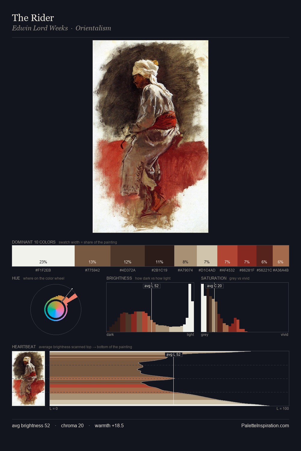
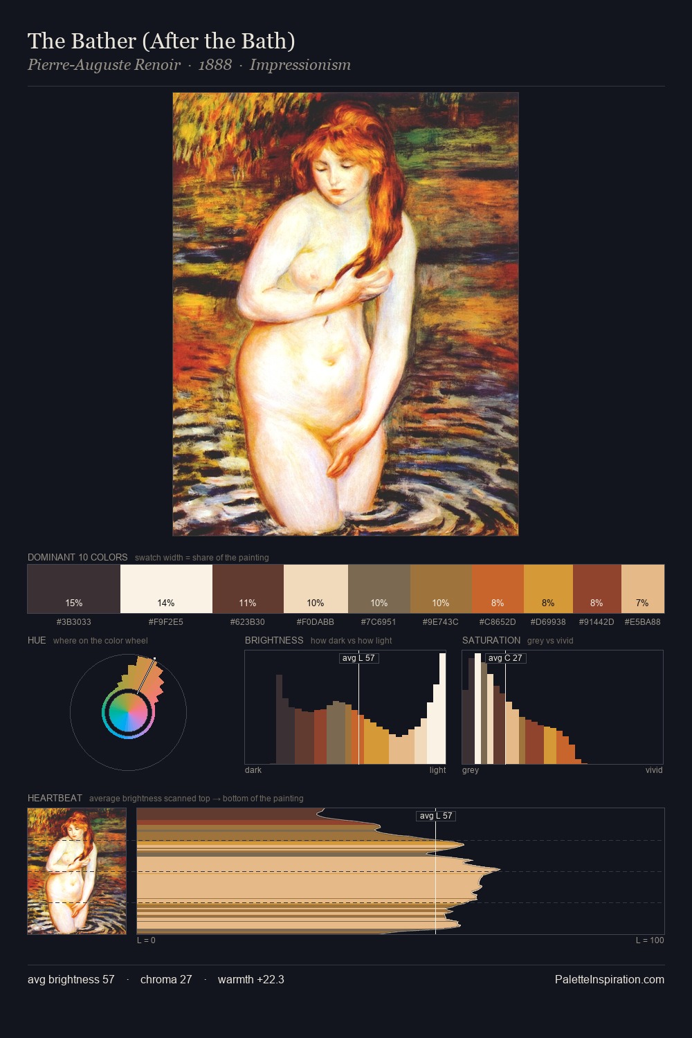
Mid-key values give Sandro Botticelli its characteristic quietness - nothing blazes, nothing disappears. The dominant temperature is warm, with earth tones and fire-hues setting the emotional key. Mid-range chroma keeps the palette grounded - colourful but not strident. #FCFCFA claims 26.9% of the surface, functioning as the work's tonal foundation. #E8CFA4 at 3.3% is both the most chromatic and one of the largest colours in the palette - chroma as mass rather than as highlight. 76 units of value range underpin the palette's structural clarity: the eye always knows where light falls. This is palette 6 of Sandro Botticelli's sequence - a single chapter in a chromatic story told across many works.
Example use cases
- publishing
- corporate identity
- consumer apps
- hospitality
- design agencies
I Love This!
Use This Palette
Copy, export, or download for your project
Copy, export, or download for your project
Copy:
Download:
Share: