Sandor Bortnyik Palette 3

Palette Analysis
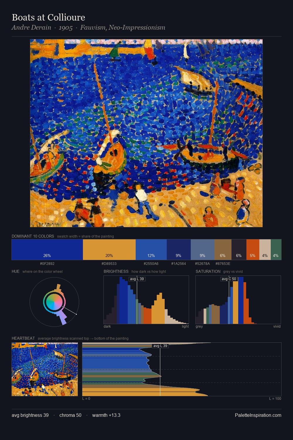
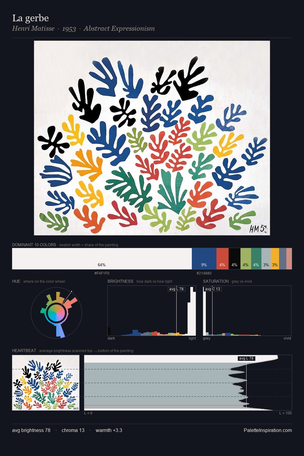
The value structure of Sandor Bortnyik is mid-key: quiet, controlled, and cohesive. Warm and cool tones are held in careful balance - neither family dominates, creating tension and resolution simultaneously. Mid-saturation across the board: the palette has colour character without chromatic excess. The most saturated colour, #1F7559, is reserved to 2.2% of the surface, where it acts as a focal punctuation. From deepest dark to palest light, the palette traverses 60 units of the value scale - a span that creates natural depth. The palette reads as an Impressionist one - light-biased, chromatically direct, and built on temperature contrast rather than value opposition. In the context of Sandor Bortnyik's full range of palettes, group 3 represents one movement in an ongoing chromatic dialogue.
Example use cases
- ceramics & pottery
- boutique hospitality
- menswear
- heritage food brands
- craft & artisan brands
I Love This!
Copy, export, or download for your project