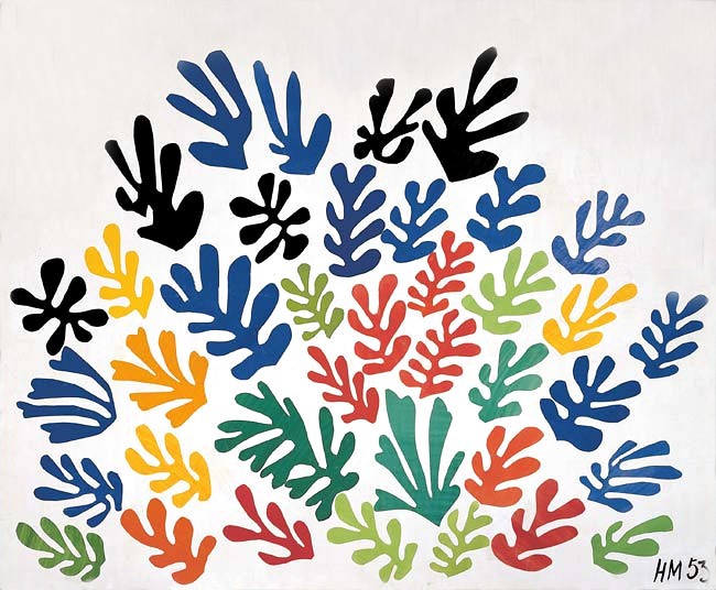
Matisse Color Scheme based on La gerbe
Gleaming Linen
Gleaming Bright and polished - high-key, often warm, suggesting reflective or luminous surfaces.
Linen Warm light neutral - the color of natural linen, slightly warm beige.
Color Palette
✦ Edit in generatorColor Profile
light dark
0
100
78.1
vivid muted
0
100
13.5
warm cool
-30
0
+50
3.5
Distribution
avg L 78.1
darklight
avg C 13.5
grayvivid
Brightness Heartbeat
Average brightness scanned top → bottom of the painting.
avg L 78.1 L = 0 L = 100
Palette Analysis
"La gerbe" (1953) reads as a high-key, mid-saturation warm palette built around Warm Grey and Blue. One color carries 64% of the picture plane, anchoring the composition. A low-prevalence accent at #F2AF2B pulls the eye.
Example use cases
- ceramics & pottery
- boutique hospitality
- menswear
- heritage food brands
- craft & artisan brands
Build a palette inspired by La gerbe
Open in generator with 10 colors pre-loaded
I Love This!
Use This Palette
Copy, export, or download for your project
Copy, export, or download for your project
Copy:
Download:
Share:
Artworks with a similar color profile
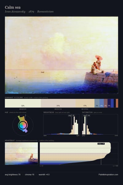
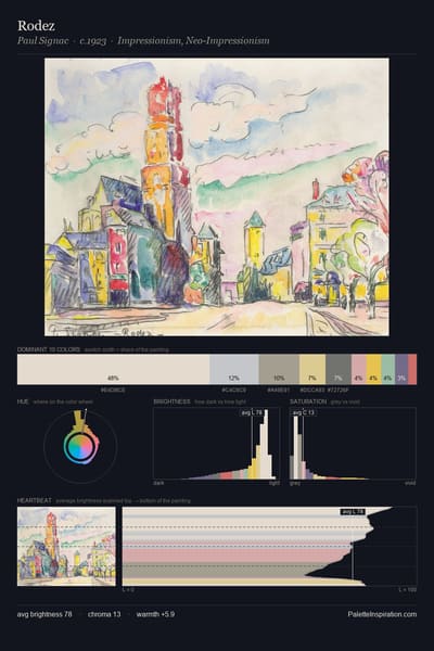
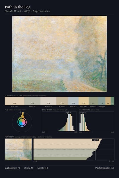
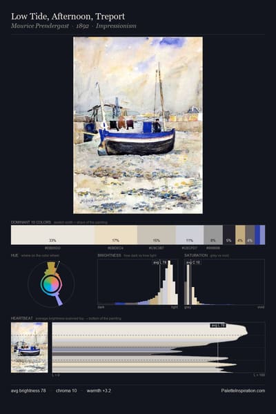
Nearest neighbours by brightness, saturation, warmth and hue across the full corpus.
More by Henri Matisse