Sandor Bortnyik Palette 1

Palette Analysis
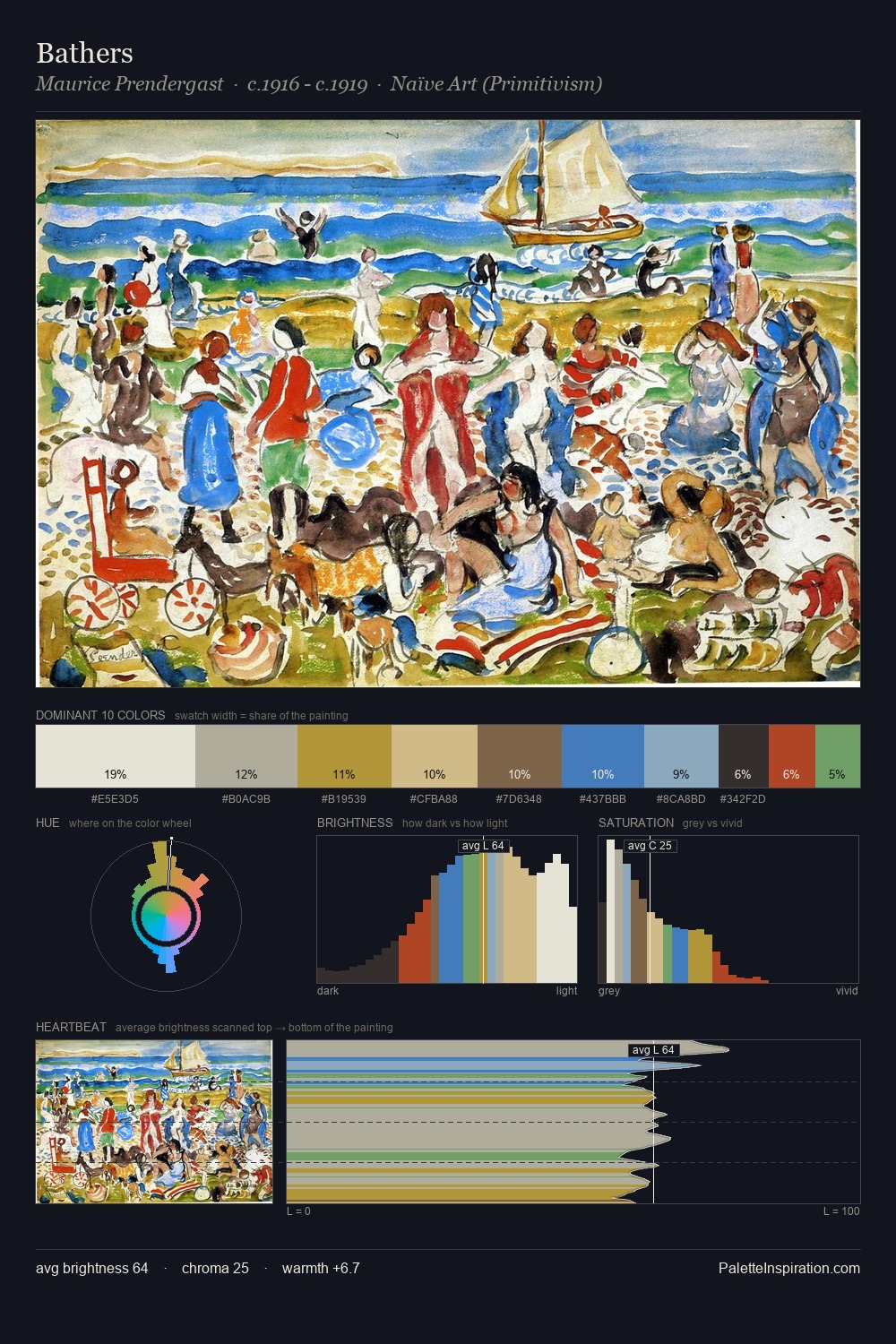
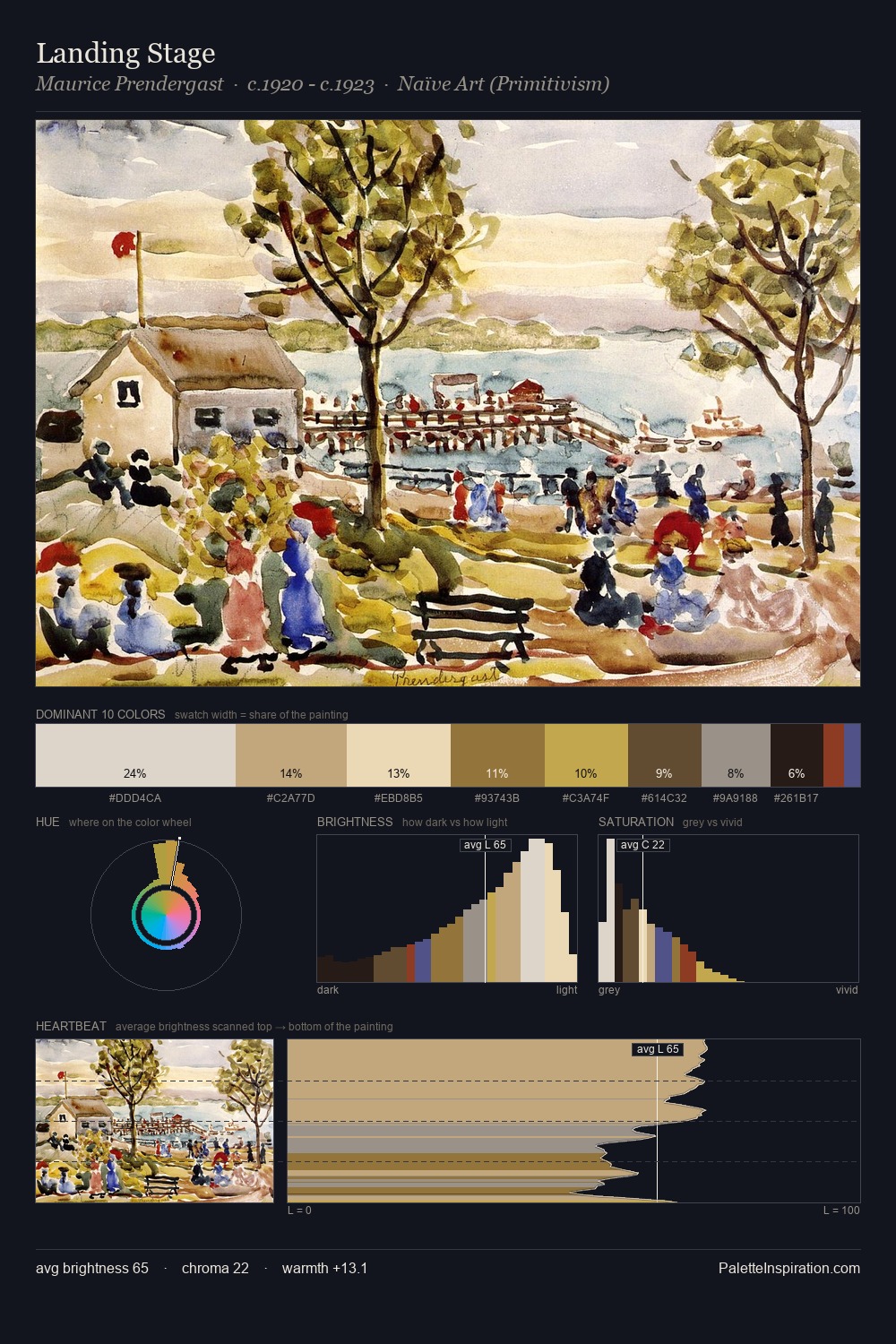
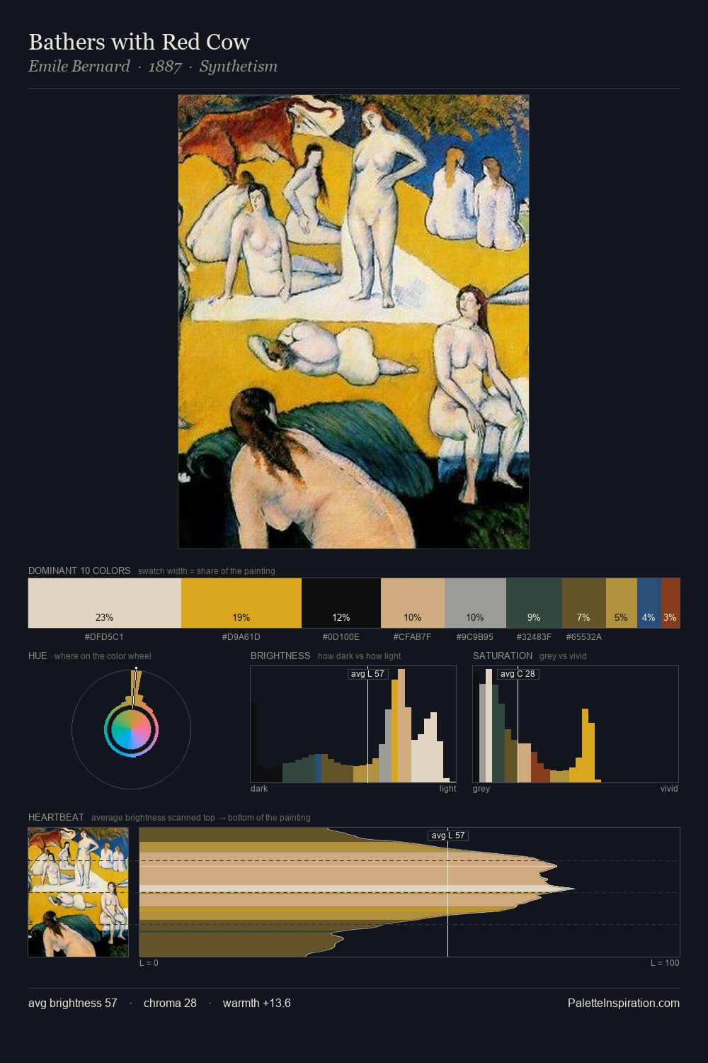
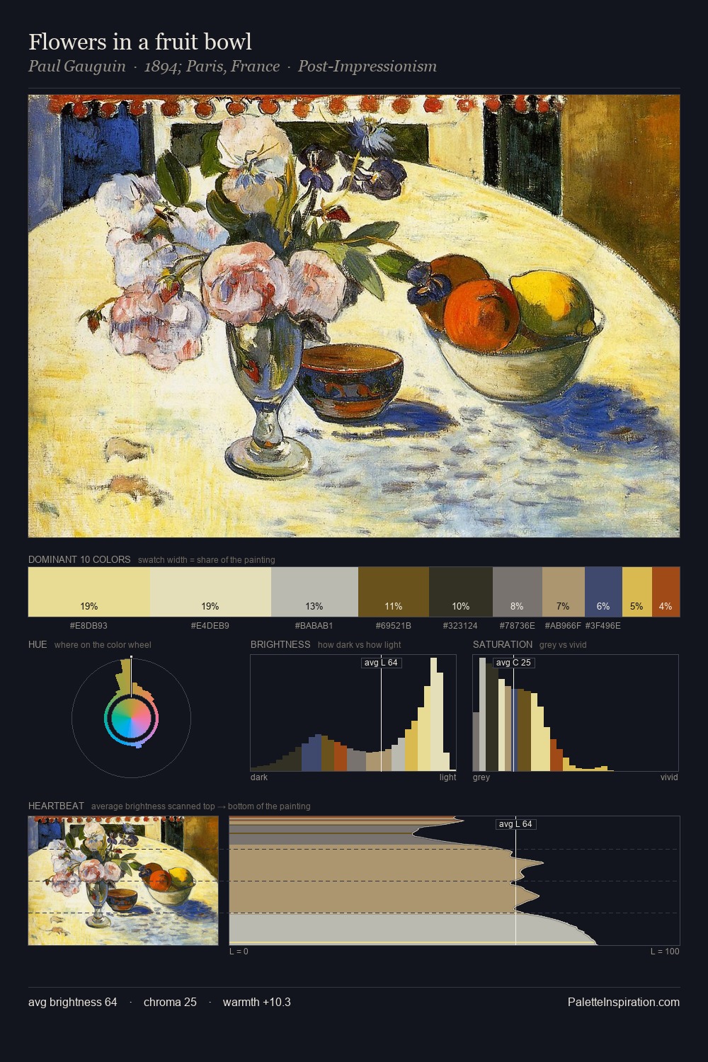
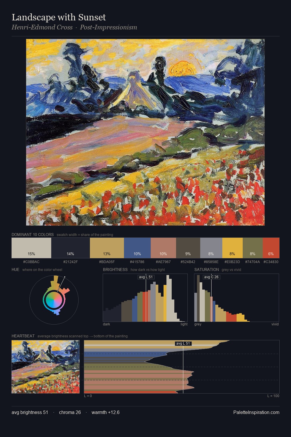
Sandor Bortnyik occupies the comfortable middle of the value scale, avoiding both extremes to hold the eye in a sustained middle grey. Temperature is balanced: the palette pits warm earth against cool sky without declaring a winner. A restrained, mid-chroma palette: every hue is present and legible, but nothing shouts. The saturated accent, #AC3228, registers at 0.8% - sparse enough to feel like a deliberate surprise. From deepest dark to palest light, the palette traverses 61 units of the value scale - a span that creates natural depth. The combination of mid-to-high key, balanced temperature, and elevated chroma is characteristic of Impressionist observation: light broken into its component hues. Sandor Bortnyik's palette 1 carries its own internal logic while remaining in conversation with the artist's broader colour intelligence.
Example use cases
- food packaging
- leather accessories
- travel & outdoor
- natural cosmetics
- interior design
I Love This!
Copy, export, or download for your project