Sandor Bortnyik Palette 2
Palette Analysis
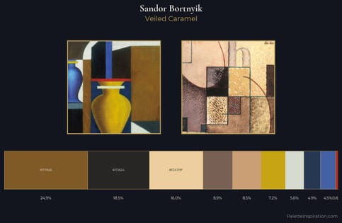
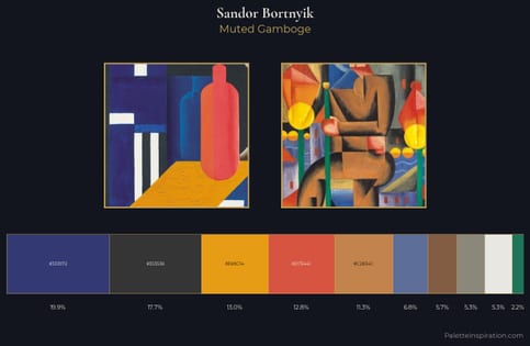
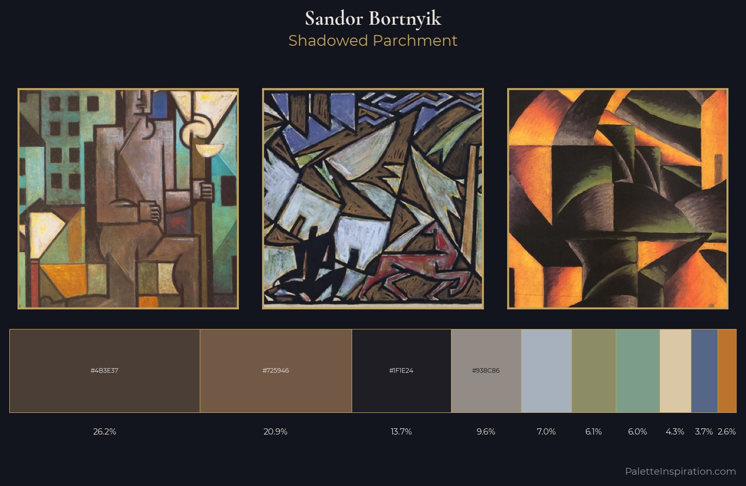
Sandor Bortnyik keeps values measured and balanced, a hallmark of tonal restraint. Warm hues command this palette; Sandor Bortnyik favours the reds, oranges, and yellows of firelight and earth. Chroma is kept low across all colours, producing the soft, enveloping quality that characterises tonal painting. #4B3E37 at 26.2% of the palette: an overwhelming presence that pulls all other colours into its gravitational field. Only 3.7% is devoted to #566686, yet that small allocation delivers the palette's entire chromatic tension. At 60 units of value range, the palette has the tonal breadth to sustain complex spatial readings. In the context of Sandor Bortnyik's full range of palettes, group 2 represents one movement in an ongoing chromatic dialogue.
Example use cases
- theater design
- jewelry brands
- tobacco-adjacent retail
- event branding
- film & entertainment
I Love This!
Copy, export, or download for your project