Samuel Morse Palette 9

Palette Analysis
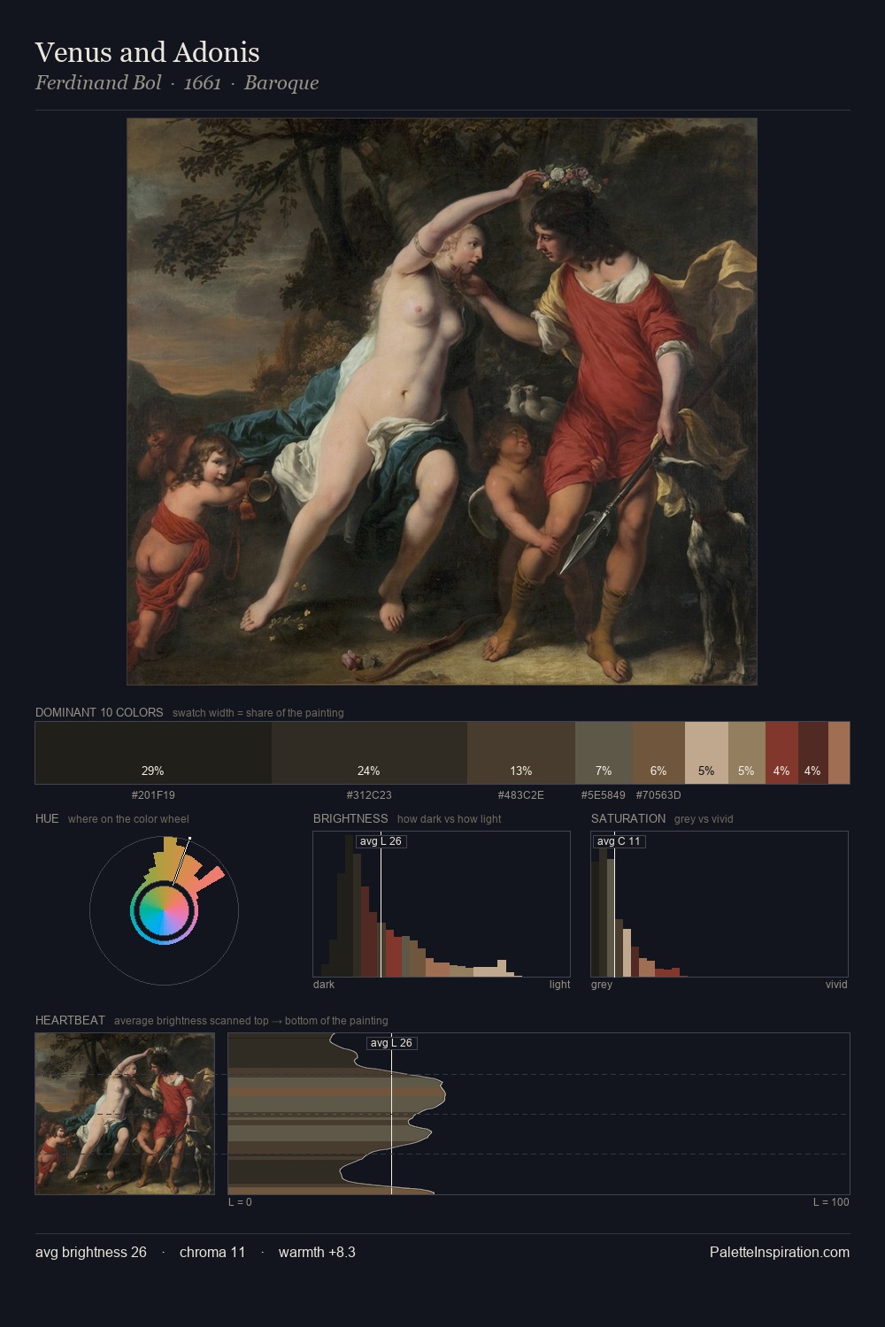
Samuel Morse is built on dark foundations, with values clustered toward shadow. Cool hues prevail: blues, greens, and greys anchor the palette's emotional temperature. The absence of saturated colour is itself an expressive choice: this is a palette of restraint and atmosphere. The dominant colour, #232220, takes 34.7% of the total area, establishing the overall mood before any other hue is introduced. #4E2D1E functions as the palette's exclamation mark: highest chroma, lowest percentage (2.2%). At 55 units of value range, the palette has the tonal breadth to sustain complex spatial readings. Together these qualities place Samuel Morse firmly in the tonal tradition - concerned with mood and atmosphere rather than chromatic display. In the context of Samuel Morse's full range of palettes, group 9 represents one movement in an ongoing chromatic dialogue.
Example use cases
- music labels
- luxury hospitality
- editorial photography
- leather goods
- premium streaming
I Love This!
Copy, export, or download for your project