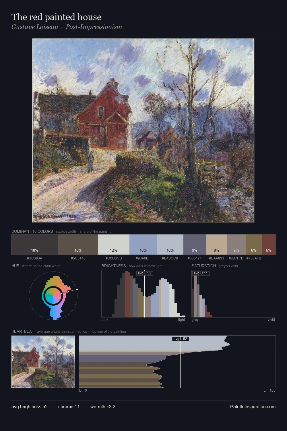
Samuel Morse Palette 1
Veiled Parchment
Veiled Partially obscured light - mid-dark with a hazy, scrim-filtered quality.
Parchment Aged warm neutral - the color of old manuscript parchment, tan and slightly yellowed.

Palette Analysis
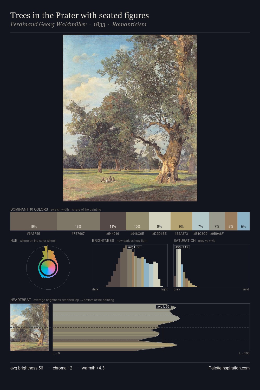
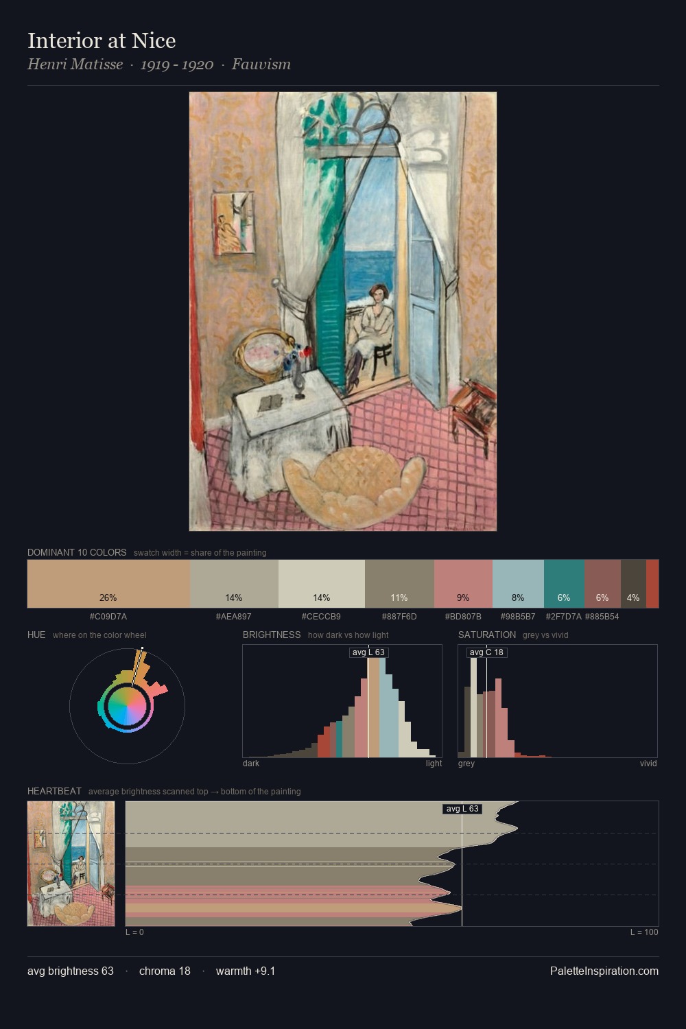
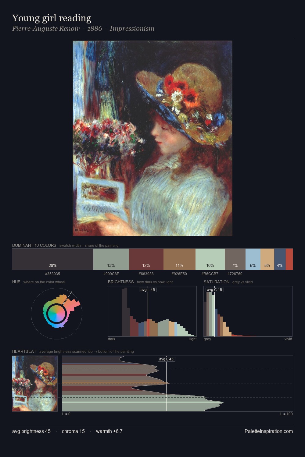
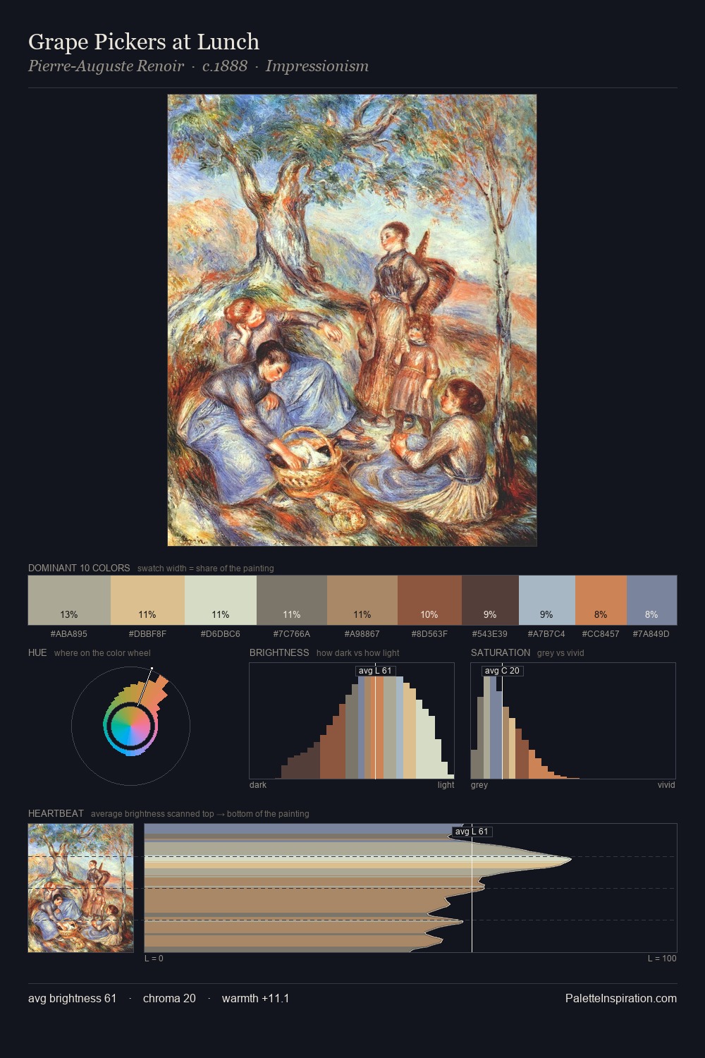
Samuel Morse sits in the centre of the value range, lending the palette a sense of even, sustained light. Neither warm nor cool has the upper hand here; the equilibrium between the two generates the palette's visual energy. All colours lean toward grey, building depth through value rather than colour punch. Only 4.5% is devoted to #443D2C, yet that small allocation delivers the palette's entire chromatic tension. Value range is moderate at 52 units - enough contrast for legibility, not so much as to fragment the tonal unity. In the context of Samuel Morse's full range of palettes, group 1 represents one movement in an ongoing chromatic dialogue.
Example use cases
- archival print
- university identity
- rare books
- cultural institutions
- nonprofit identity
I Love This!
Use This Palette
Copy, export, or download for your project
Copy, export, or download for your project
Copy:
Download:
Share: