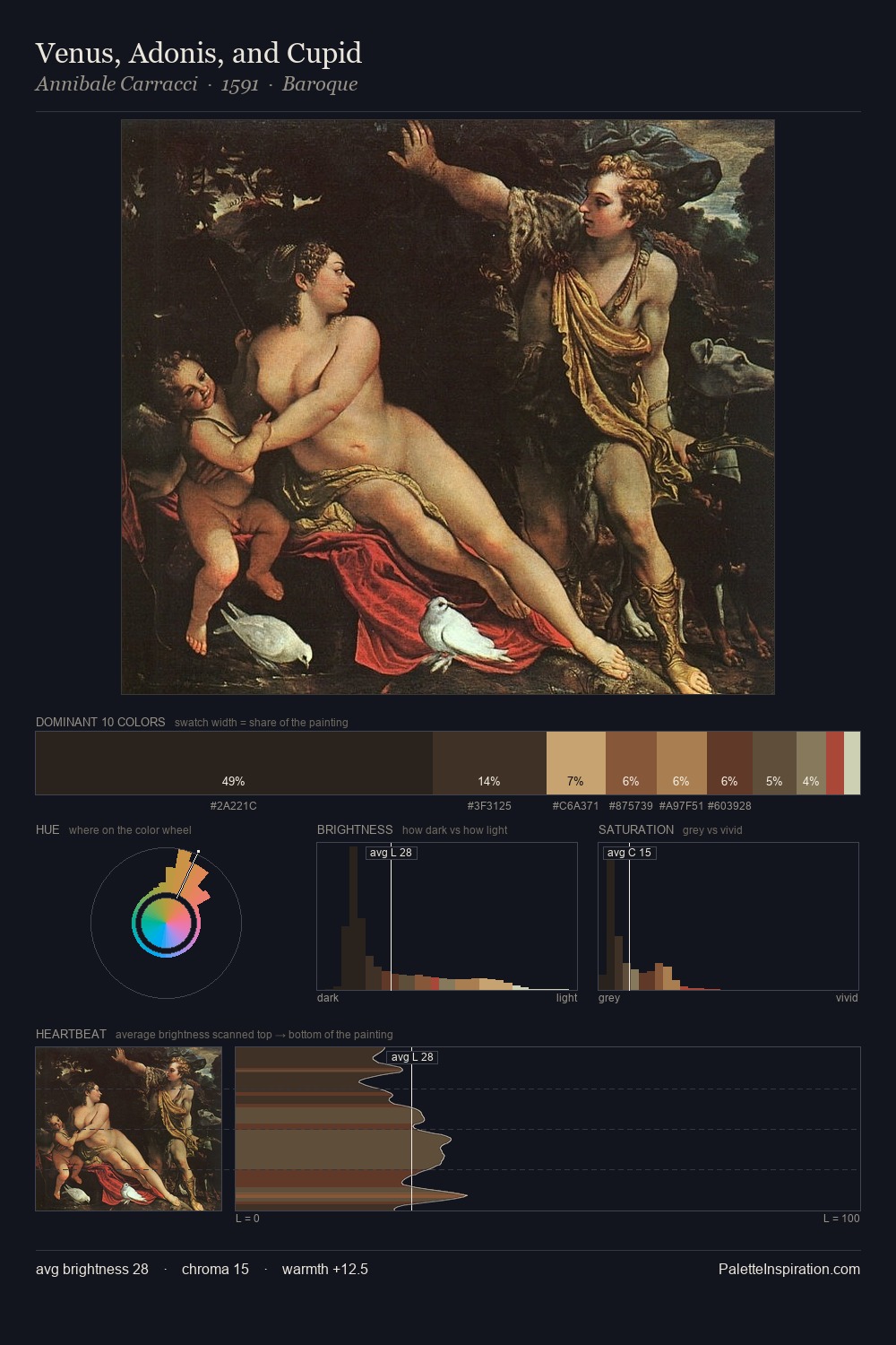
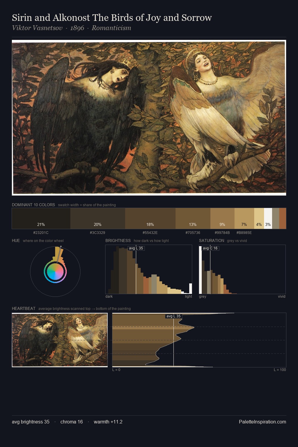
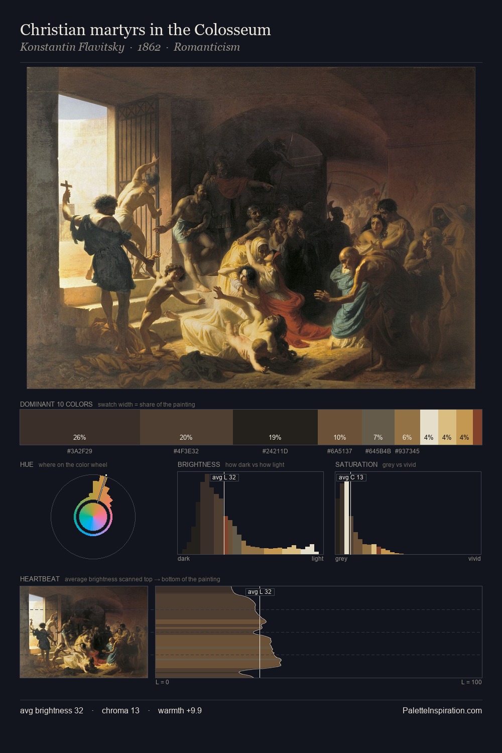
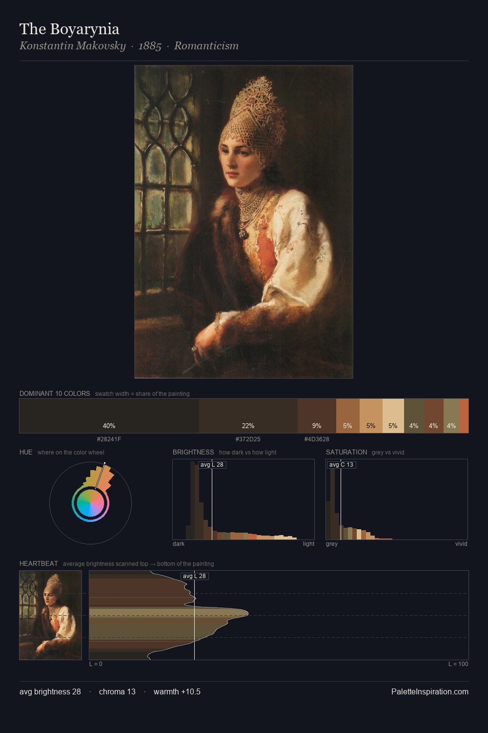
Pranciskus Smuglevičius Palette 5
Palette Analysis
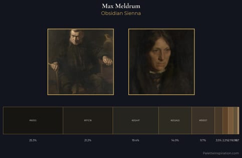
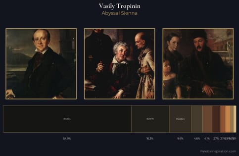
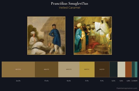
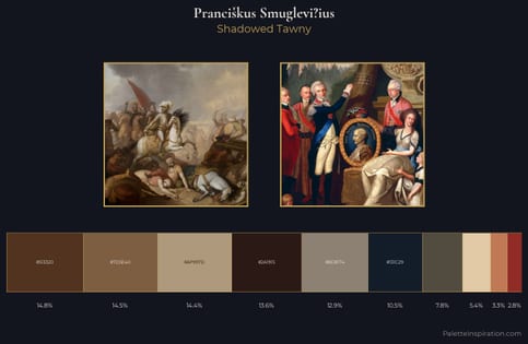
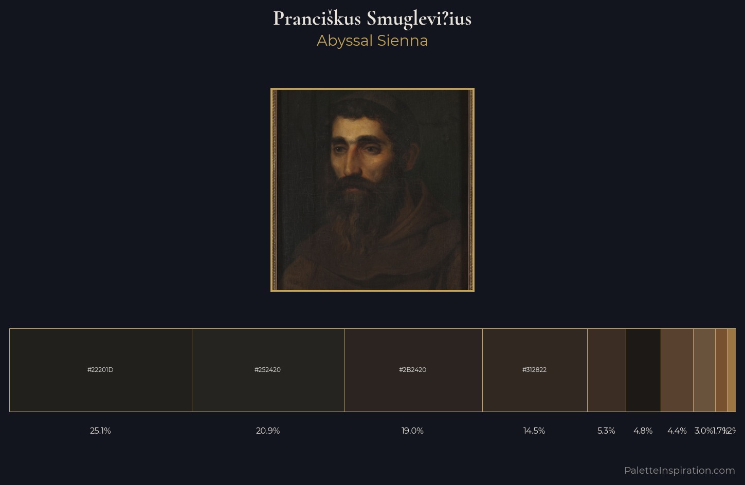
Prancikus Smuglevi?ius works almost entirely in the lower half of the value scale, privileging depth over brilliance. The palette achieves thermal balance - reds and blues, ochres and greens, each holding the other in check. Every colour is desaturated; the palette proceeds through near-neutrals and gently-coloured greys. #22201D claims 25.1% of the surface, functioning as the work's tonal foundation. The highest-chroma note - #58412E - appears at just 4.5%, deployed as a precision accent against the quieter ground. 37 units of value spread create a palette that is varied but unified - contrast in the service of harmony. This tonal restraint is characteristic of the Prancikus Smuglevi?ius approach: colour serves light, not the reverse. In the context of Prancikus Smuglevi?ius's full range of palettes, group 5 represents one movement in an ongoing chromatic dialogue.
Example use cases
- theater design
- jewelry brands
- tobacco-adjacent retail
- event branding
- film & entertainment
I Love This!
Copy, export, or download for your project