Pranciskus Smuglevičius Master Palette
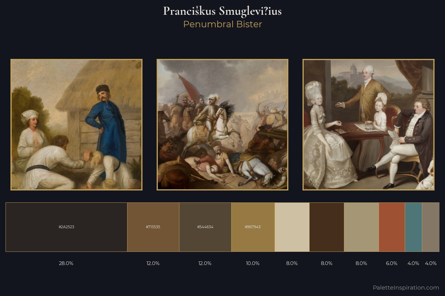
Palette Analysis
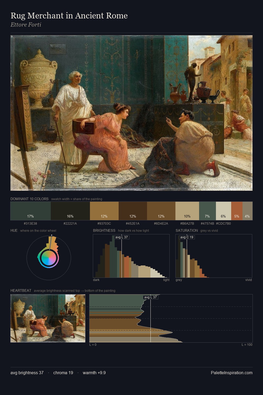
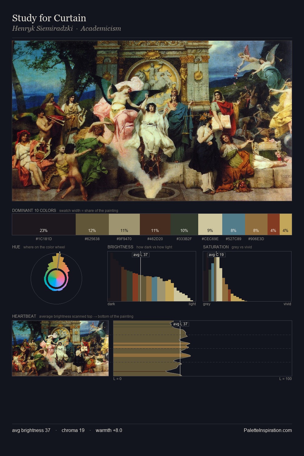
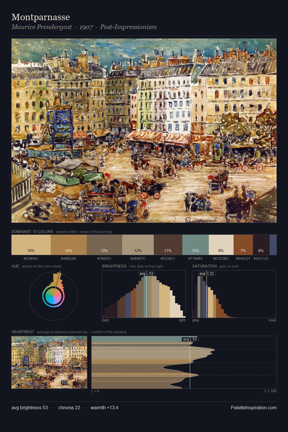
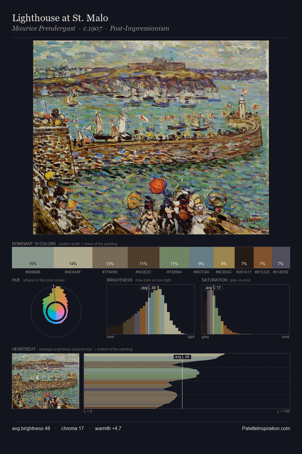
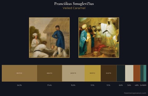
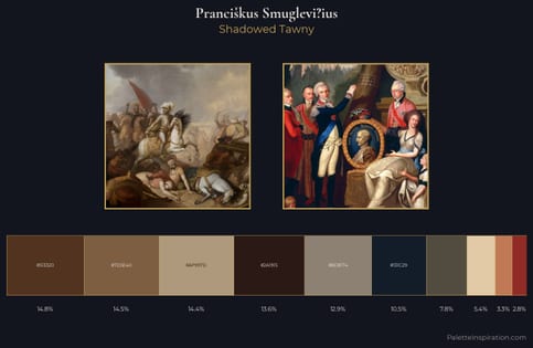
Values in Prancikus Smuglevi?ius rest in the mid-range - neither dramatically lit nor steeped in shadow. Prancikus Smuglevi?ius orchestrates warmth above all else - reds, ambers, and siennas take the lead. Saturation is deliberately withheld - the beauty here lies in the near-monochromatic gradations rather than colour difference. #2A2523 at 28.0% of the palette: an overwhelming presence that pulls all other colours into its gravitational field. At 10.0%, #967943 carries the palette's sharpest chromatic charge: an accent that earns its place precisely because it is withheld. At 54 units across the value scale, the palette keeps contrast readable without letting it dominate. This is the light Prancikus Smuglevi?ius preferred, made measurable.
Example use cases
- premium streaming
- cocktail bars
- fashion campaigns
- book covers
- music labels
I Love This!
Copy, export, or download for your project