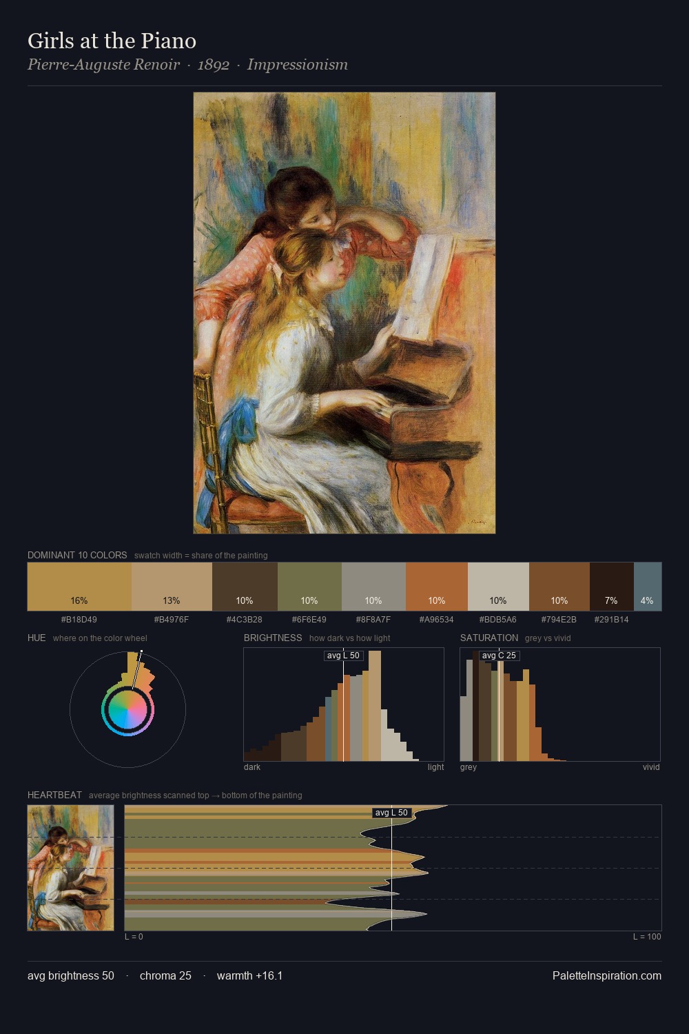
Samuel Dirksz van Hoogstraten Palette 3

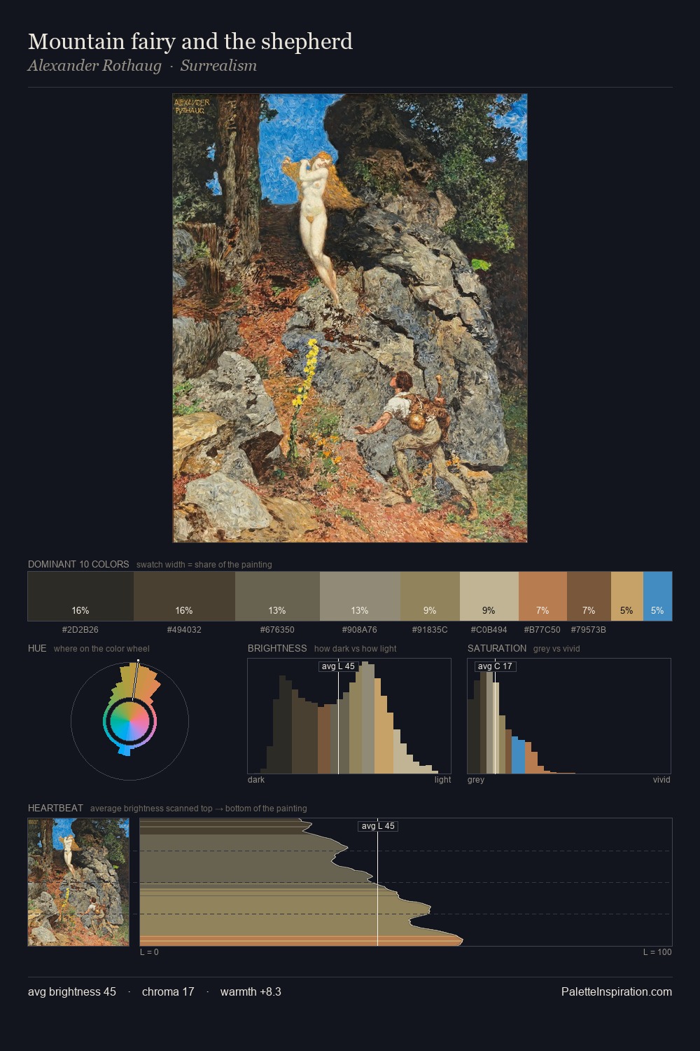
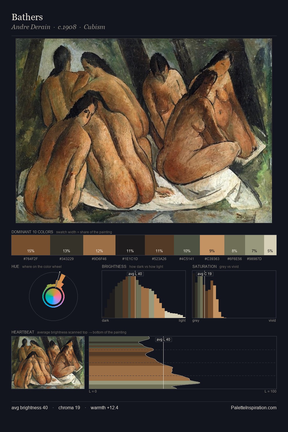
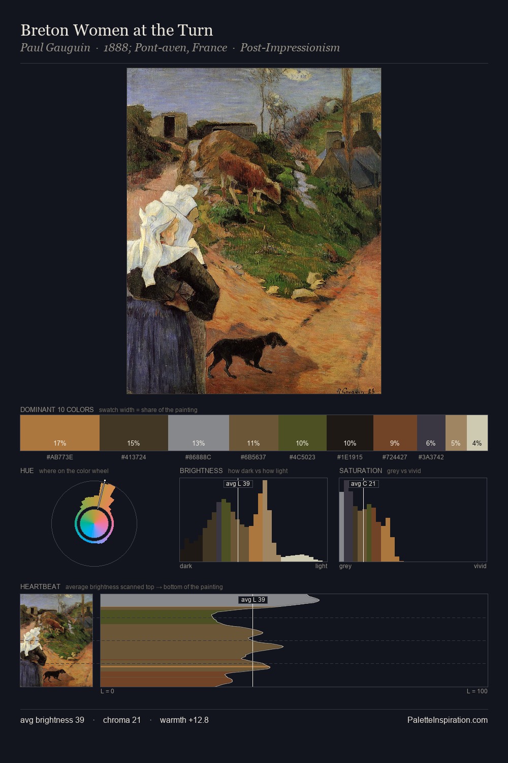
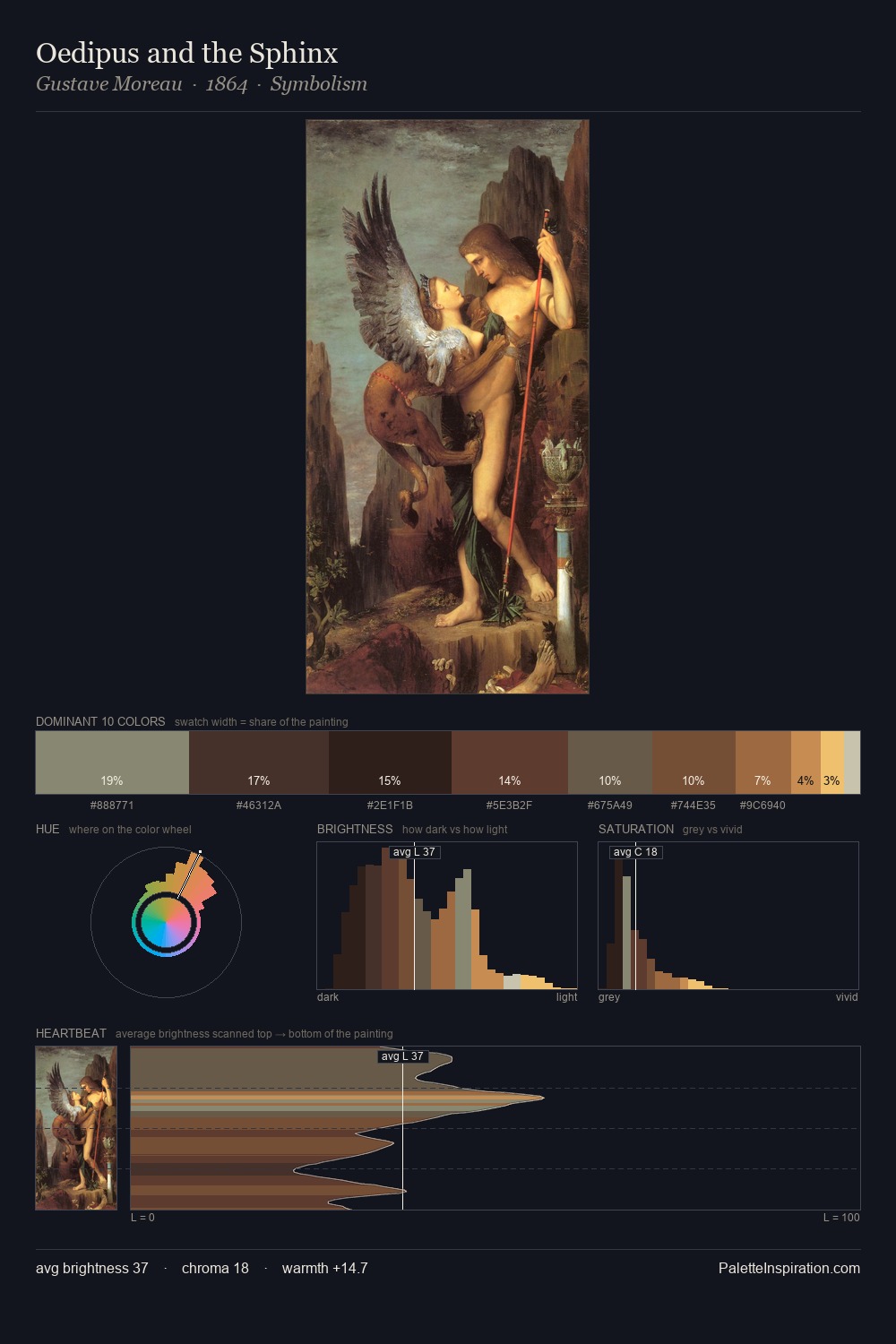
Palette Analysis
Mid-key values give Samuel Dirksz van Hoogstraten its characteristic quietness - nothing blazes, nothing disappears. Temperature reads distinctly warm: the reds and earth tones from Samuel Dirksz van Hoogstraten carry the compositional weight. Saturation is deliberately withheld - the beauty here lies in the near-monochromatic gradations rather than colour difference. The dominant colour, #3D342A, takes 30.6% of the total area, establishing the overall mood before any other hue is introduced. The highest-chroma note - #A56B37 - appears at just 3.2%, deployed as a precision accent against the quieter ground. From deepest dark to palest light, the palette traverses 59 units of the value scale - a span that creates natural depth. Palette 3 sits within the larger chromatic argument that Samuel Dirksz van Hoogstraten's complete body of work advances.
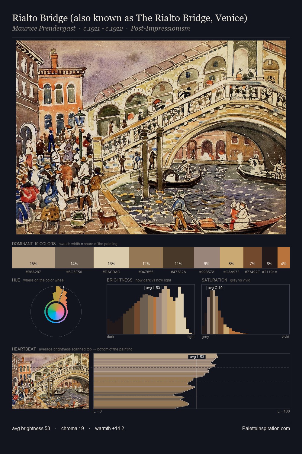
Example use cases
- theater design
- jewelry brands
- tobacco-adjacent retail
- event branding
- film & entertainment
I Love This!
Copy, export, or download for your project