Rococo Palette 44

Palette Analysis
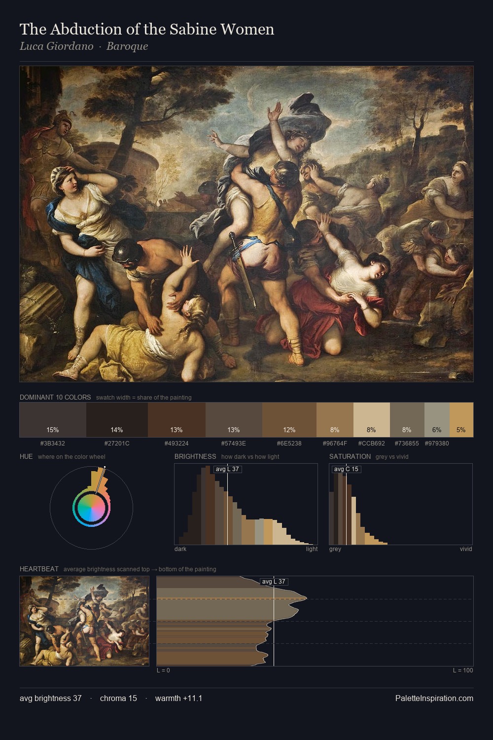
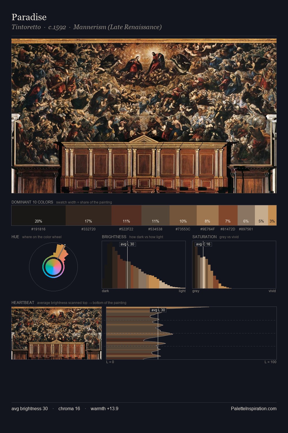
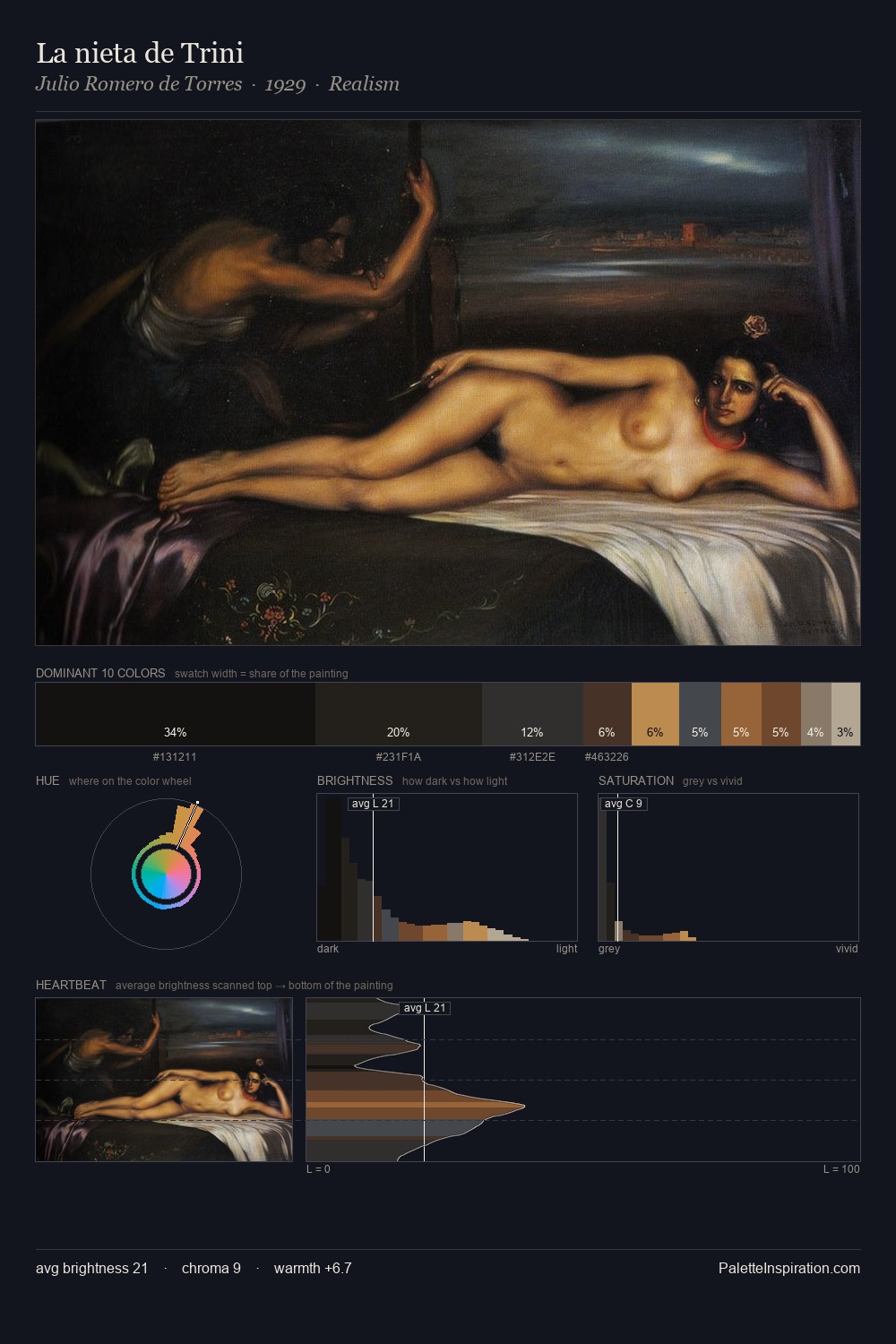
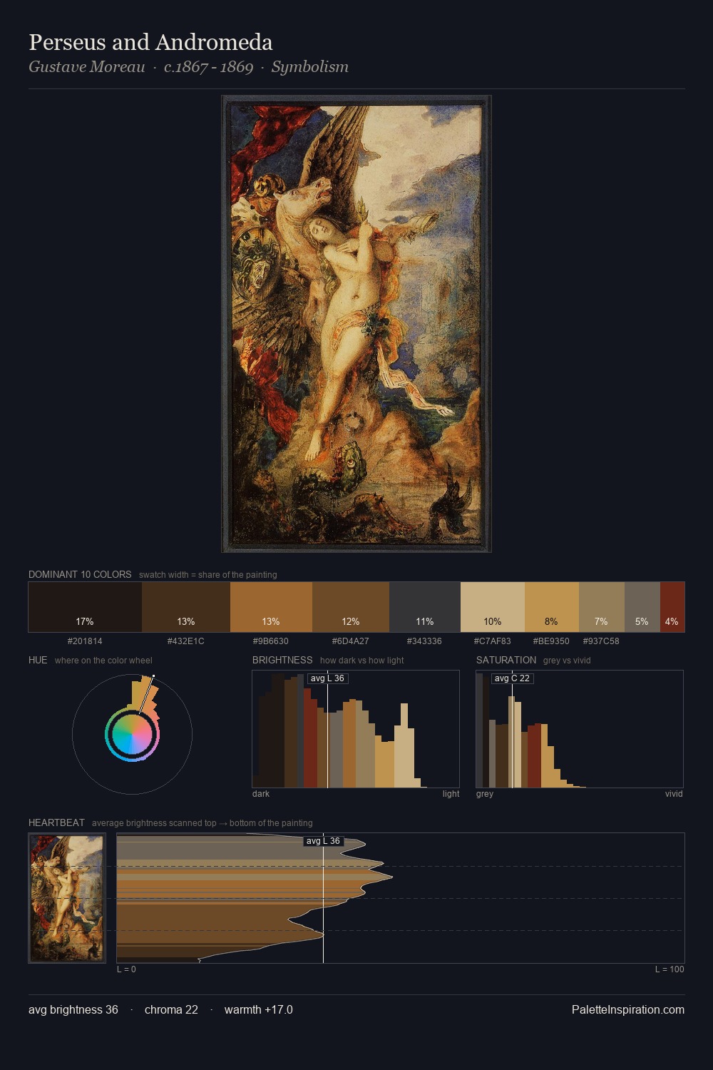
The palette of Rococo sits in the lower register of the value scale - dense, contained, and weighted. Warm hues command this palette; it favours the reds, oranges, and yellows of firelight and earth. Chroma hovers near zero; colour declares itself through subtle shifts in hue rather than outright saturation. 41.1% of the palette belongs to #121010, a concentration that makes it the unmistakable visual centre. Only 2.9% is devoted to #734628, yet that small allocation delivers the palette's entire chromatic tension. From deepest dark to palest light, the palette traverses 59 units of the value scale - a span that creates natural depth. Together these qualities place the palette firmly in the tonal tradition - concerned with mood and atmosphere rather than chromatic display.
Example use cases
- premium streaming
- cocktail bars
- fashion campaigns
- book covers
- music labels
I Love This!
Copy, export, or download for your project