Rococo Palette 41
Nocturnal Umber
Nocturnal Night-register palette - very low values, the world after dark.
Umber Dark earthy brown - raw or burnt umber, a foundational old-master earth pigment.

Palette Analysis
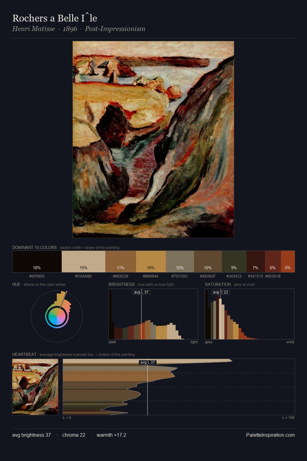
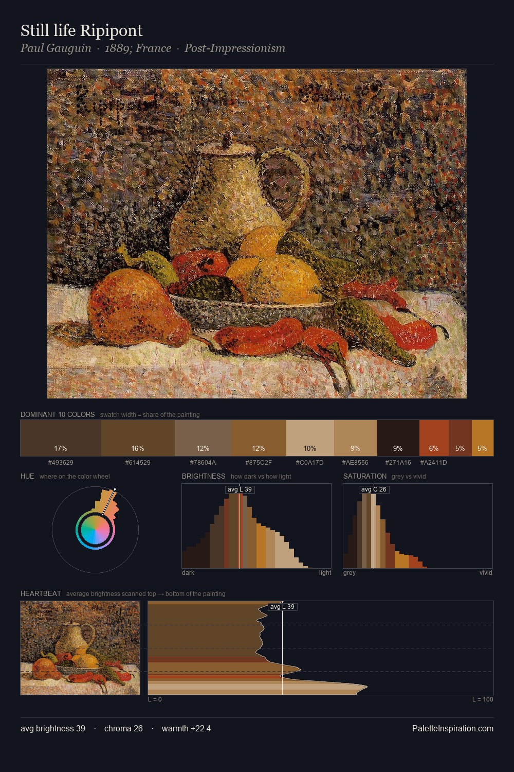
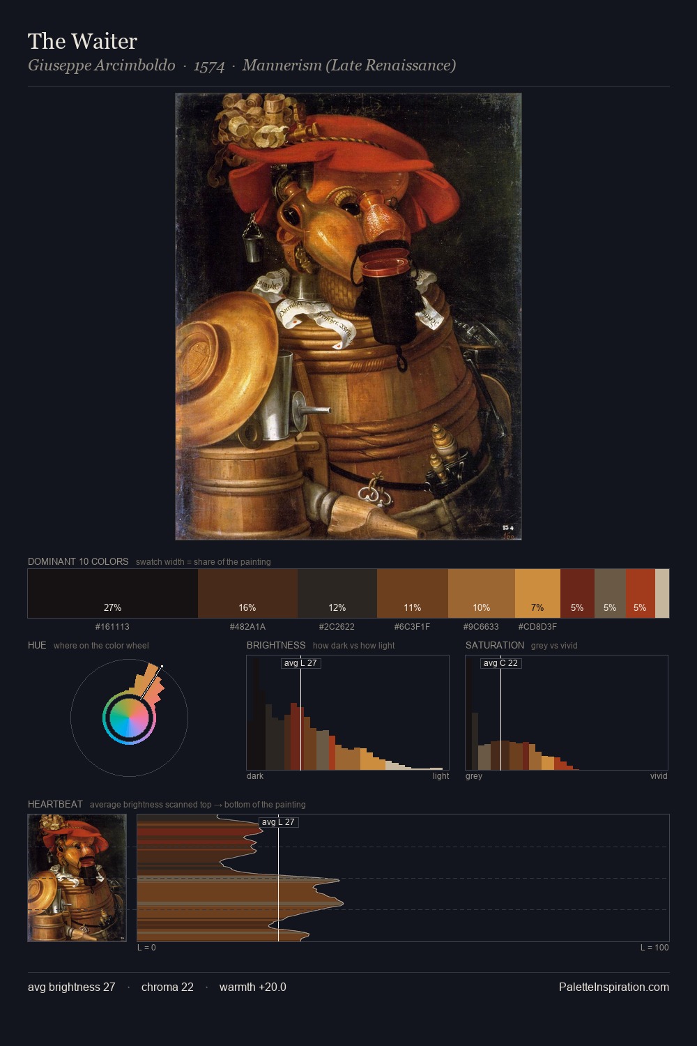
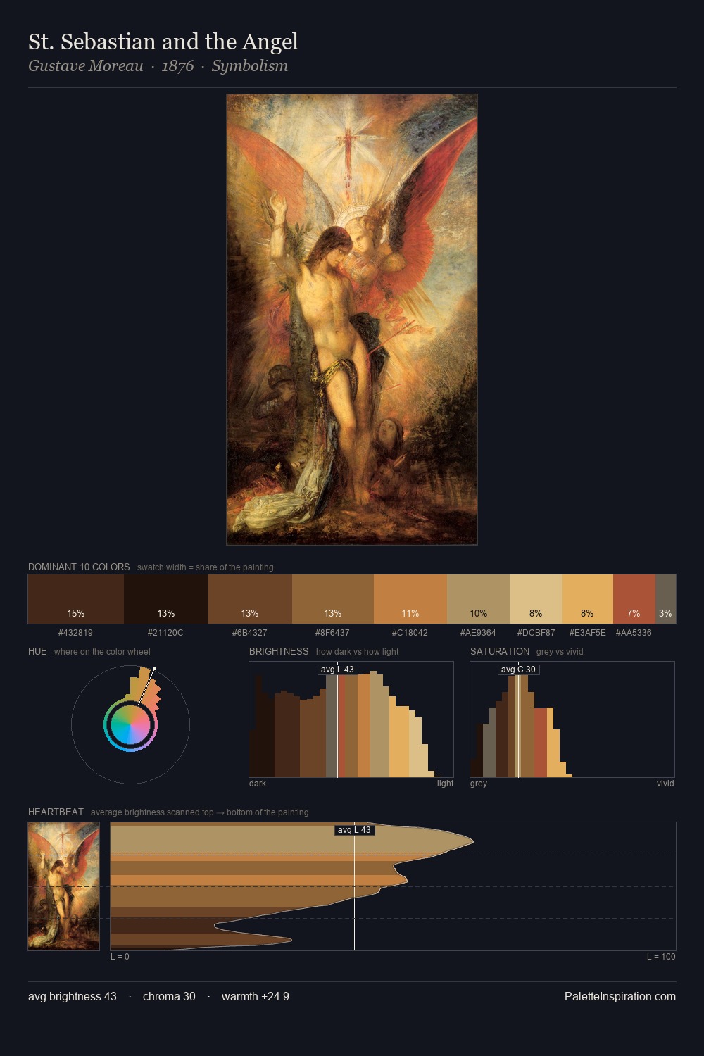
Rococo keeps values measured and balanced, a hallmark of tonal restraint. Warm hues command this palette; it favours the reds, oranges, and yellows of firelight and earth. Every colour is desaturated; the palette proceeds through near-neutrals and gently-coloured greys. At 27.2%, #1D1614 functions less as a colour accent and more as a complete atmospheric environment. The highest-chroma note - #CC9556 - appears at just 3.6%, deployed as a precision accent against the quieter ground. The palette spans 53 value units: a measured range that delivers coherence over drama.
Example use cases
- music labels
- luxury hospitality
- editorial photography
- leather goods
- premium streaming
I Love This!
Use This Palette
Copy, export, or download for your project
Copy, export, or download for your project
Copy:
Download:
Share: