Rococo Palette 35
Penumbral Bister
Penumbral Partial shadow - the transitional zone between light and full dark, soft-edged.
Bister Dark warm brown - a traditional ink and wash pigment made from wood soot.

Palette Analysis
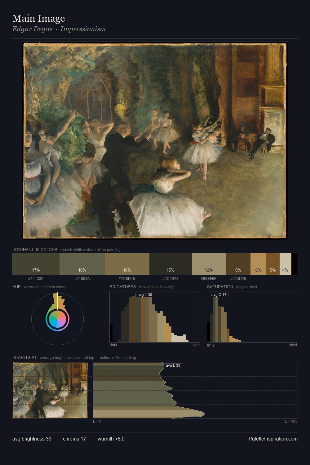
Rococo occupies the comfortable middle of the value scale, avoiding both extremes to hold the eye in a sustained middle grey. Blues and teal-greys govern the palette, lending it an aquatic or atmospheric quality. Chroma hovers near zero; colour declares itself through subtle shifts in hue rather than outright saturation. The most saturated colour, #AF8748, is reserved to 4.2% of the surface, where it acts as a focal punctuation. At 52 units across the value scale, the palette keeps contrast readable without letting it dominate. The mid-to-high key, cool bias, and moderate chroma point to outdoor observation - sky and diffused daylight as the dominant light source.
Example use cases
- theater design
- jewelry brands
- tobacco-adjacent retail
- event branding
- film & entertainment
I Love This!
Use This Palette
Copy, export, or download for your project
Copy, export, or download for your project
Copy:
Download:
Share: