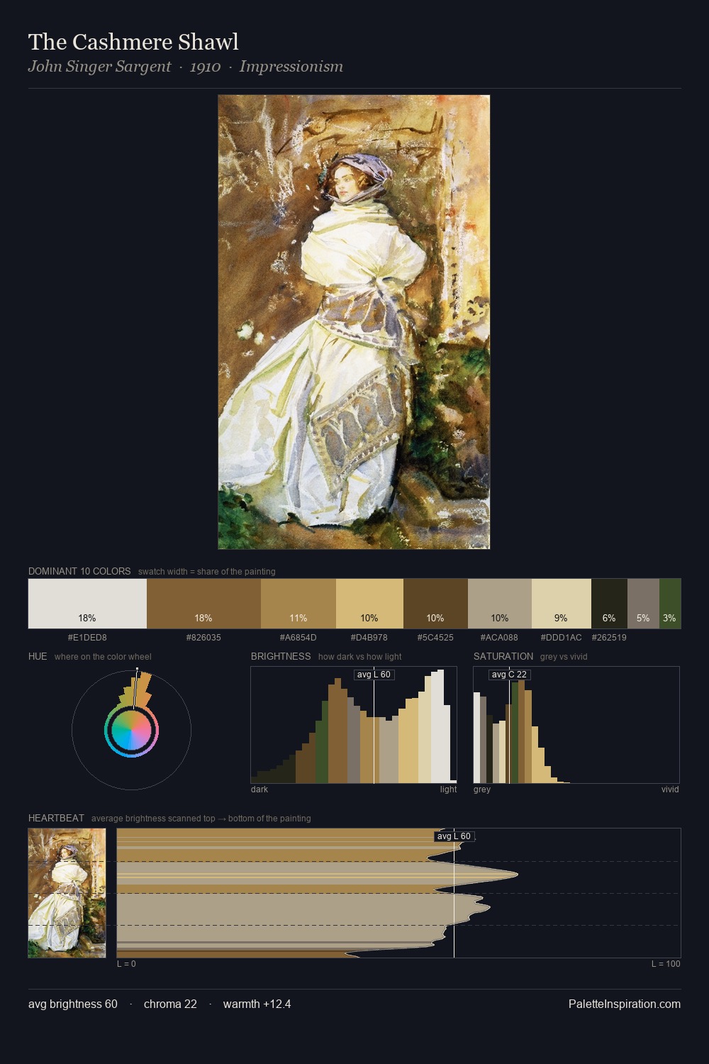
Rococo Palette 11
Veiled Caramel
Veiled Partially obscured light - mid-dark with a hazy, scrim-filtered quality.
Caramel Warm mid-brown - the color of cooked sugar, smooth and amber-toned.

Palette Analysis
Rococo distributes its values across the middle register, creating harmony without high contrast. The palette balances warm and cool with remarkable evenness, giving the composition its characteristic vibrancy. Chroma is held at a comfortable level - distinct colours, but no single hue is allowed to overwhelm. At 8.6%, #C9AD73 carries the palette's sharpest chromatic charge: an accent that earns its place precisely because it is withheld. At 51 units across the value scale, the palette keeps contrast readable without letting it dominate. The palette reads as an Impressionist one - light-biased, chromatically direct, and built on temperature contrast rather than value opposition.
Example use cases
- ceramics & pottery
- boutique hospitality
- menswear
- heritage food brands
- craft & artisan brands
I Love This!
Use This Palette
Copy, export, or download for your project
Copy, export, or download for your project
Copy:
Download:
Share: