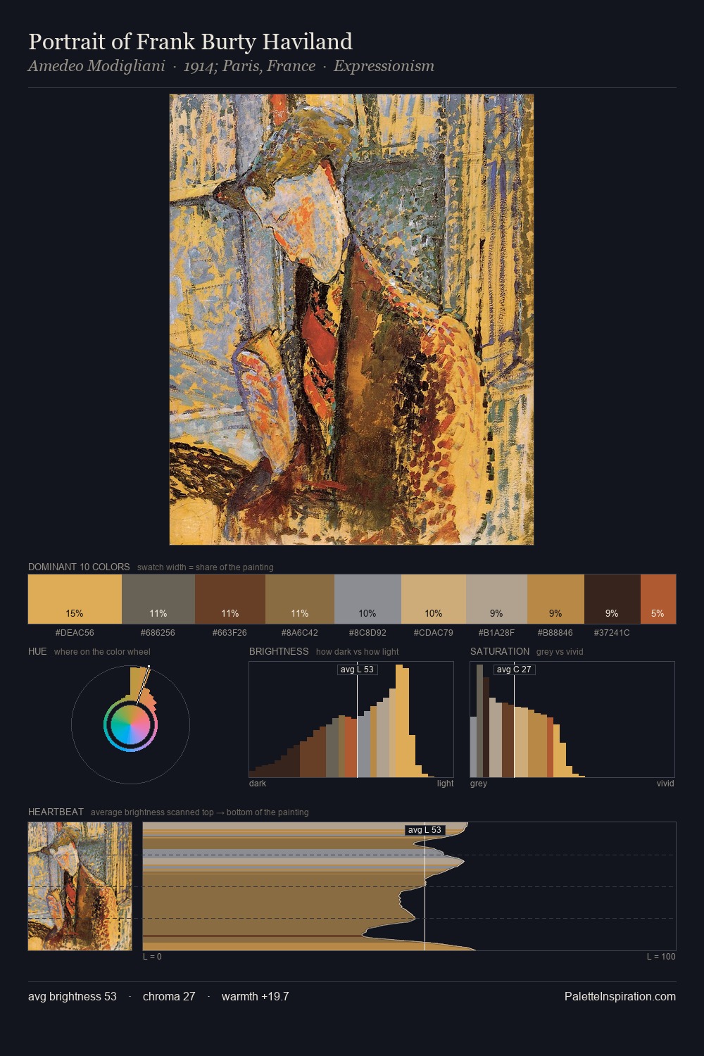
Rococo Palette 27
Shadowed Caramel
Shadowed Low-key - values weighted toward shadow, the palette of dim interiors and overcast skies.
Caramel Warm mid-brown - the color of cooked sugar, smooth and amber-toned.

Palette Analysis
Rococo sits in the centre of the value range, lending the palette a sense of even, sustained light. Warmth dominates - the palette leans heavily on the yellow-orange-red arc of the colour wheel. Saturation is measured and controlled, giving the palette presence without visual aggression. Only 5.1% is devoted to #A84928, yet that small allocation delivers the palette's entire chromatic tension. At 48 units across the value scale, the palette keeps contrast readable without letting it dominate.
Example use cases
- theater design
- jewelry brands
- tobacco-adjacent retail
- event branding
- film & entertainment
I Love This!
Use This Palette
Copy, export, or download for your project
Copy, export, or download for your project
Copy:
Download:
Share: