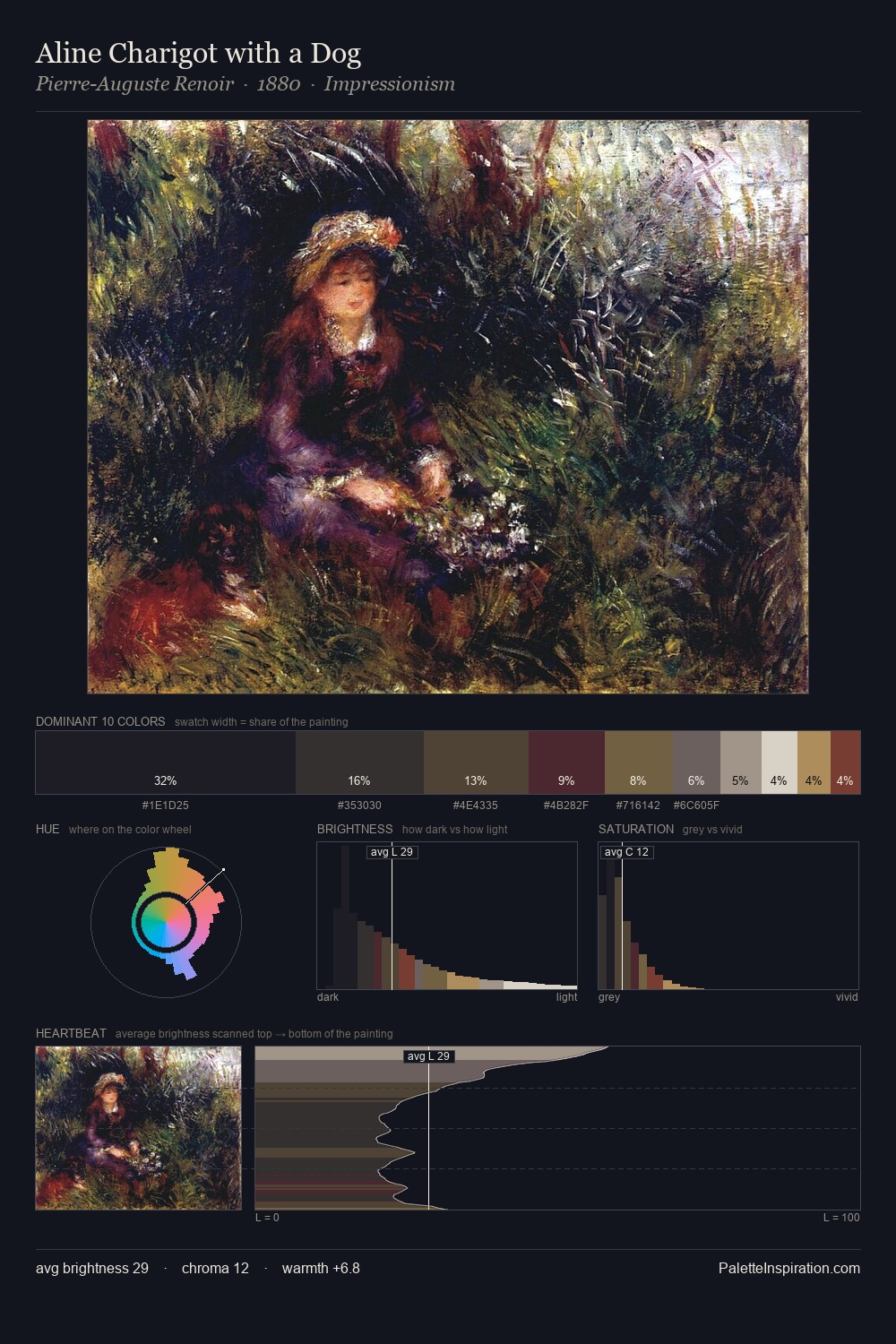
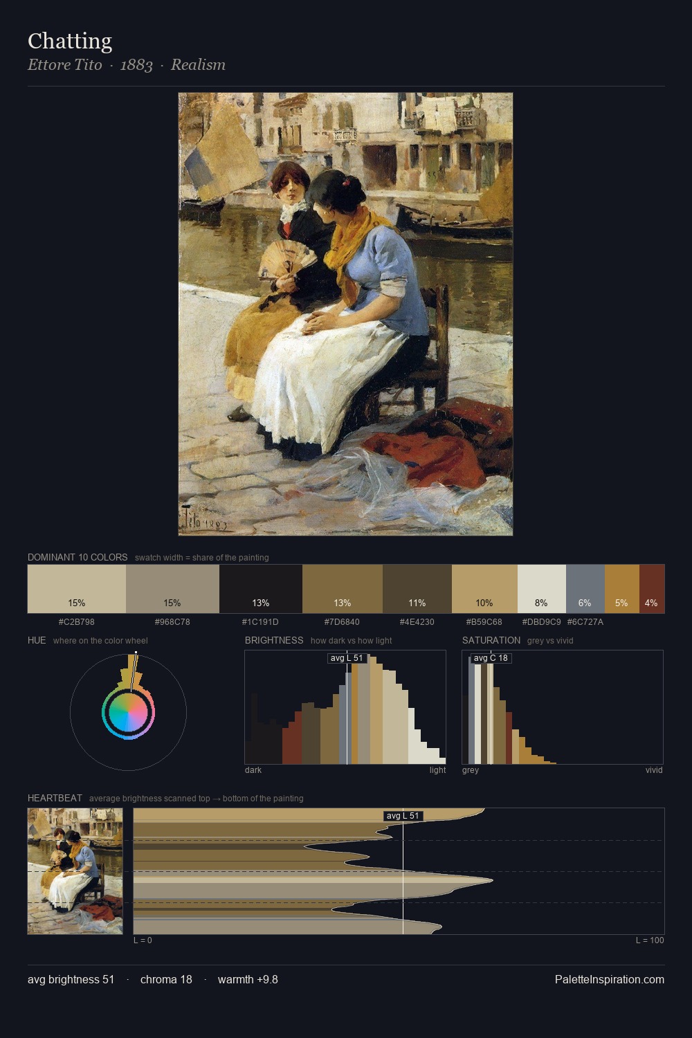
Rococo Palette 14
Veiled Tawny
Veiled Partially obscured light - mid-dark with a hazy, scrim-filtered quality.
Tawny Warm orange-brown - a traditional term for the color of tanned leather or lion fur.

Palette Analysis
Rococo occupies the comfortable middle of the value scale, avoiding both extremes to hold the eye in a sustained middle grey. Cool hues prevail: blues, greens, and greys anchor the palette's emotional temperature. Chroma hovers near zero; colour declares itself through subtle shifts in hue rather than outright saturation. #7C3F2C functions as the palette's exclamation mark: highest chroma, lowest percentage (2.7%). 65 units of value range underpin the palette's structural clarity: the eye always knows where light falls. The palette has the character of outdoor light: cool, mid-bright, with colour rendered faithfully rather than expressively.
Example use cases
- exhibition design
- foundation branding
- estate management
- art education
- museums & galleries
I Love This!
Use This Palette
Copy, export, or download for your project
Copy, export, or download for your project
Copy:
Download:
Share: