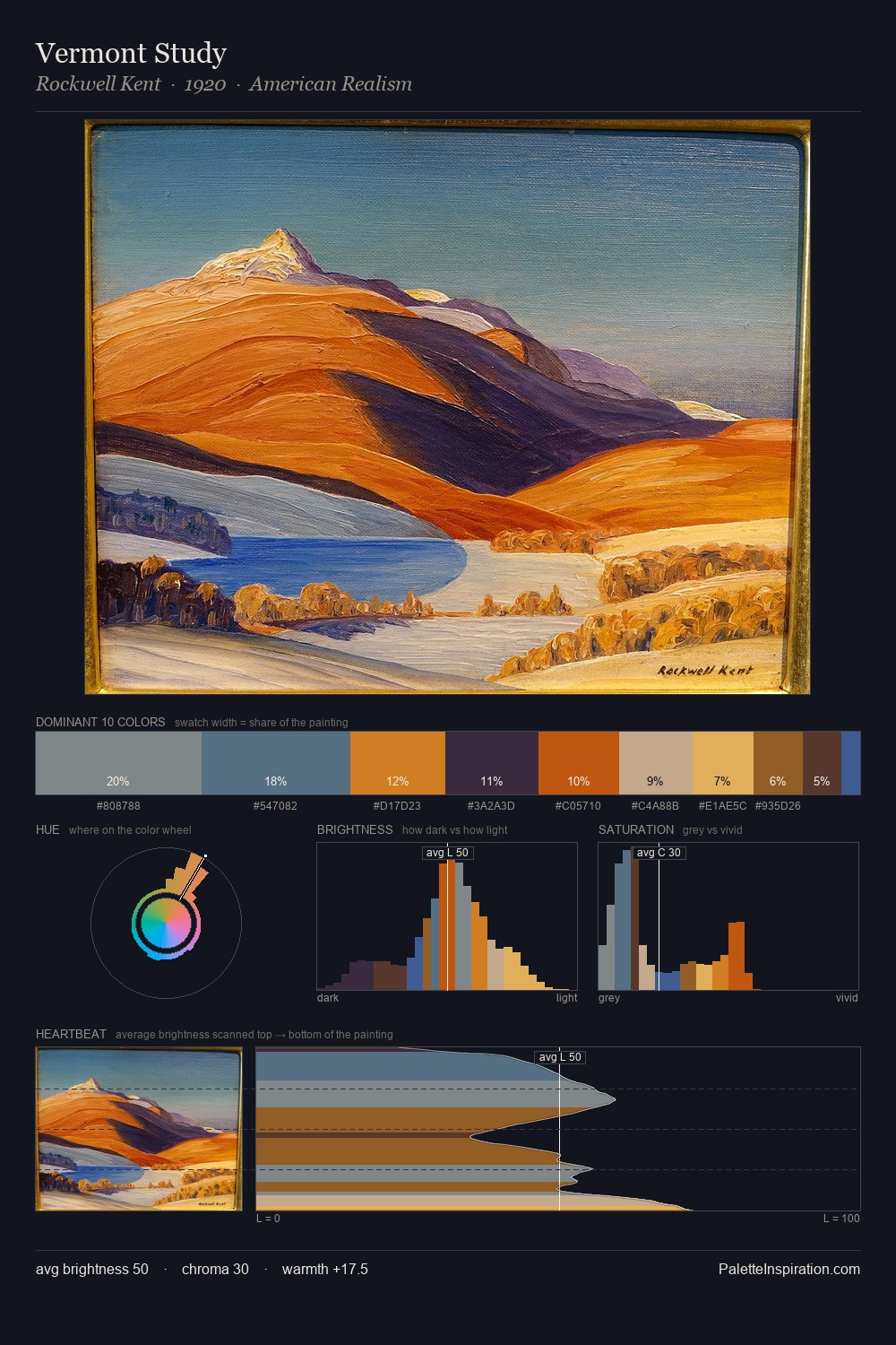
Rockwell Kent Palette 3
Muted Gamboge
Muted Deliberately desaturated - chroma pulled toward gray, the restraint of tonal painting.
Gamboge Deep golden yellow - a traditional warm pigment, rich amber-gold.

Palette Analysis
Rockwell Kent distributes its values across the middle register, creating harmony without high contrast. Temperature reads distinctly warm: the reds and earth tones from Rockwell Kent carry the compositional weight. Mid-saturation across the board: the palette has colour character without chromatic excess. The highest-chroma note - #E3AE63 - appears at just 5.0%, deployed as a precision accent against the quieter ground. Value range is moderate at 46 units - enough contrast for legibility, not so much as to fragment the tonal unity. Rockwell Kent's palette 3 carries its own internal logic while remaining in conversation with the artist's broader colour intelligence.
Example use cases
- ceramics & pottery
- boutique hospitality
- menswear
- heritage food brands
- craft & artisan brands
I Love This!
Use This Palette
Copy, export, or download for your project
Copy, export, or download for your project
Copy:
Download:
Share: