Robert Zund Palette 5
Penumbral Bisque
Penumbral Partial shadow - the transitional zone between light and full dark, soft-edged.
Bisque Pale warm beige - soft, slightly pinkish neutral, the color of unglazed ceramic.

Palette Analysis
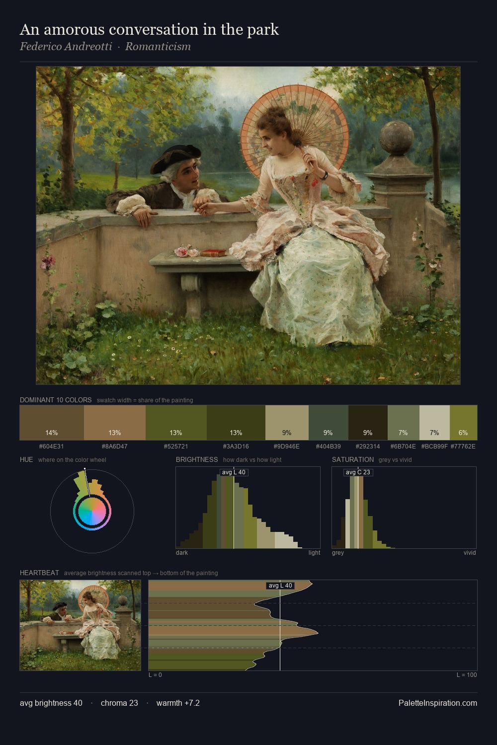
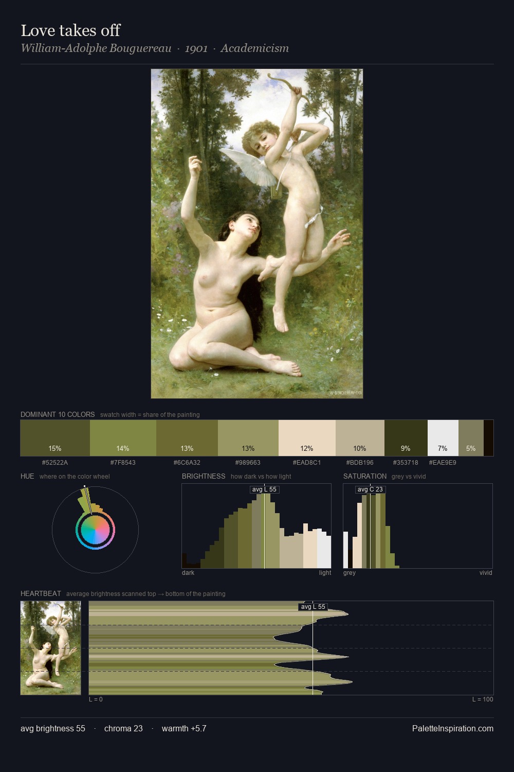
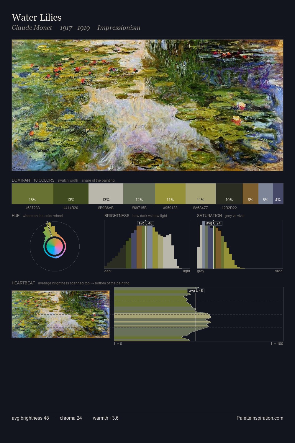
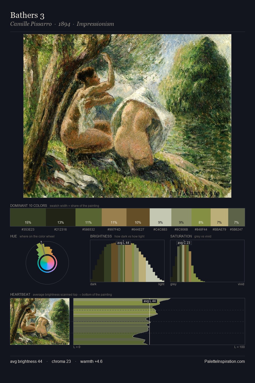
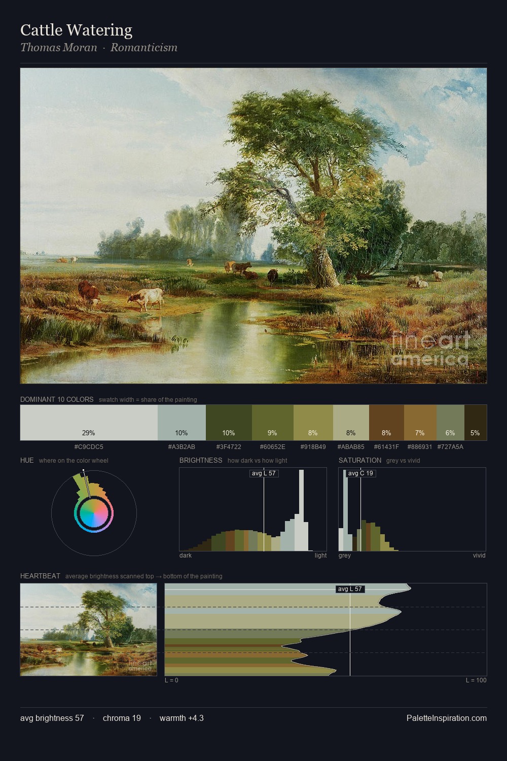
Robert Zund sits in the centre of the value range, lending the palette a sense of even, sustained light. Temperature is cool-dominant, with blue and green families claiming the largest areas. All colours lean toward grey, building depth through value rather than colour punch. The highest-chroma note - #808337 - appears at just 6.9%, deployed as a precision accent against the quieter ground. 51 units of value spread create a palette that is varied but unified - contrast in the service of harmony. The palette has the character of outdoor light: cool, mid-bright, with colour rendered faithfully rather than expressively. Palette 5 sits within the larger chromatic argument that Robert Zund's complete body of work advances.
Example use cases
- theater design
- jewelry brands
- tobacco-adjacent retail
- event branding
- film & entertainment
I Love This!
Use This Palette
Copy, export, or download for your project
Copy, export, or download for your project
Copy:
Download:
Share: