Robert Zund Palette 2

Palette Analysis
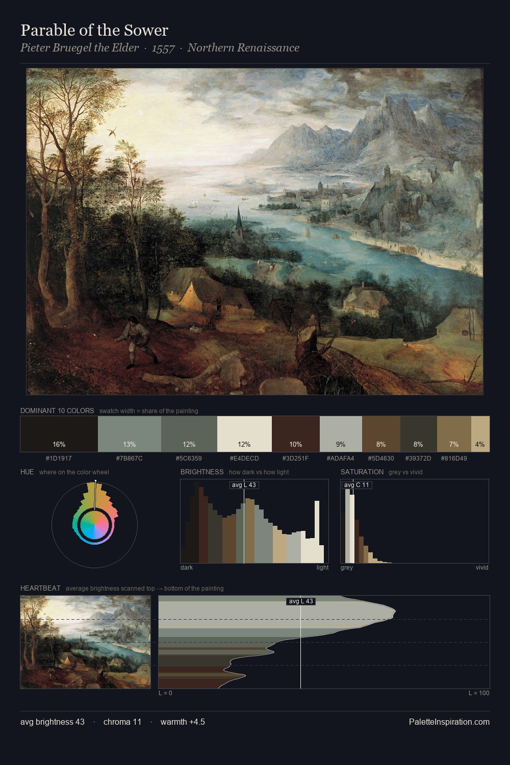
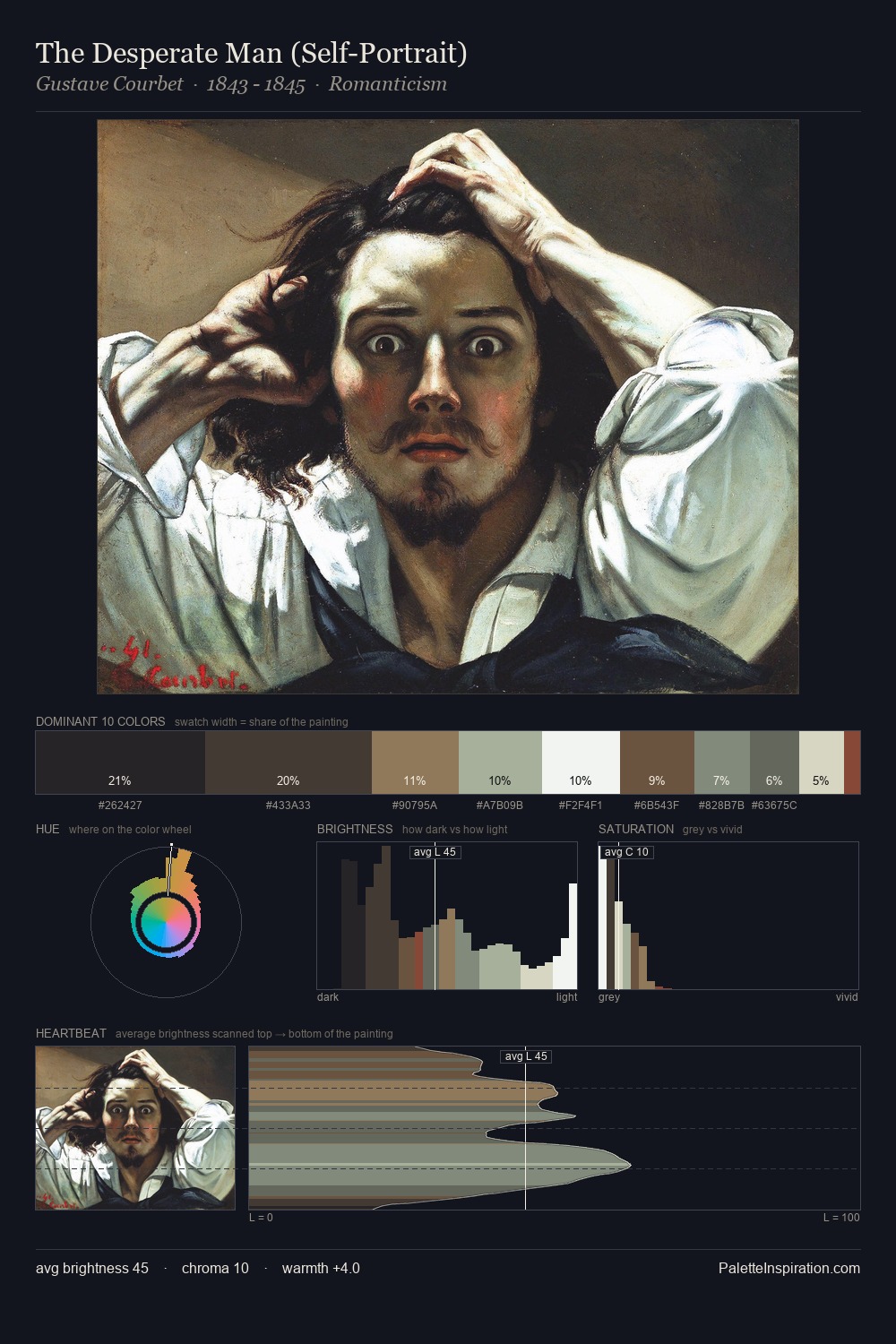
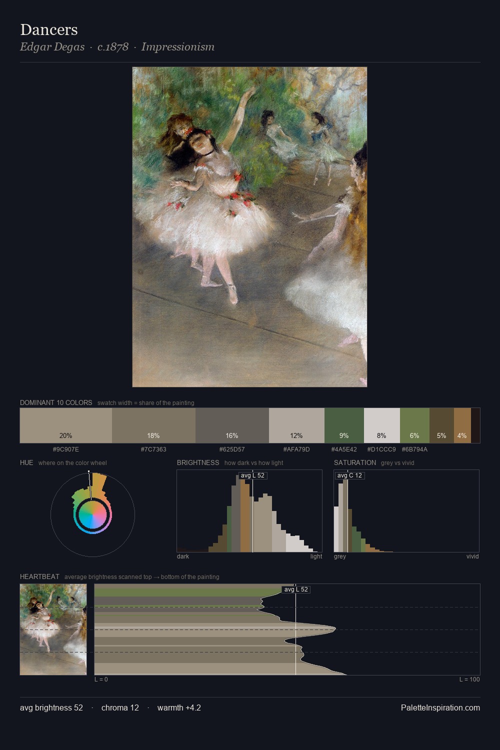
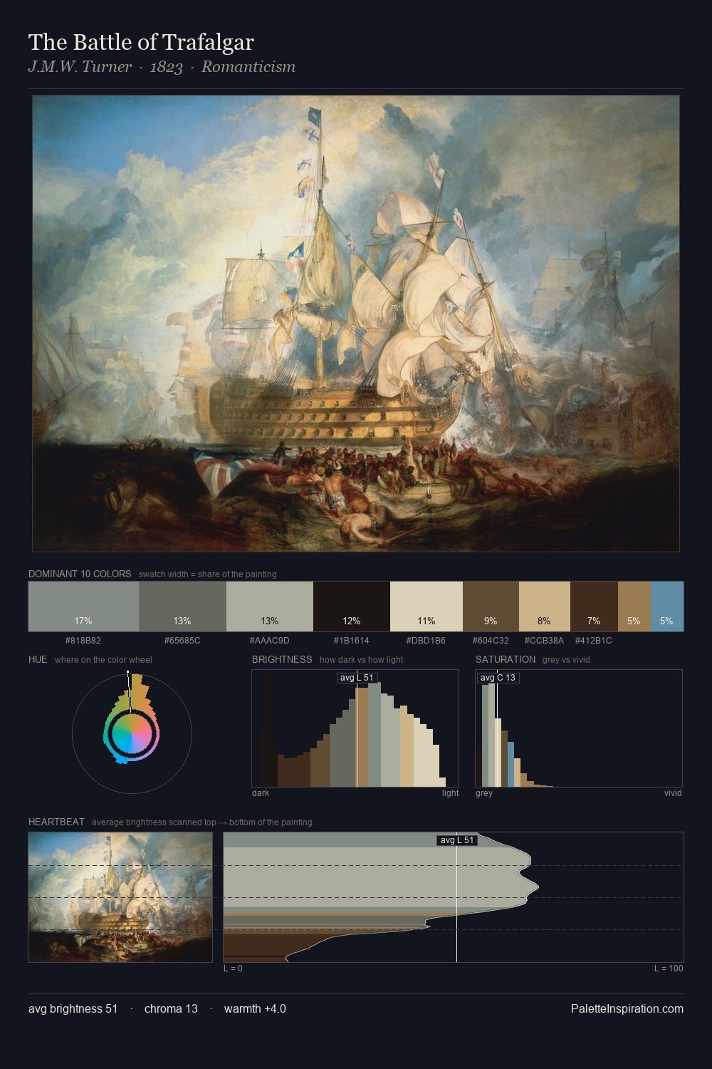
Robert Zund occupies the comfortable middle of the value scale, avoiding both extremes to hold the eye in a sustained middle grey. Blues and teal-greys govern the palette, lending it an aquatic or atmospheric quality. Chroma is kept low across all colours, producing the soft, enveloping quality that characterises tonal painting. #8F6B47 functions as the palette's exclamation mark: highest chroma, lowest percentage (7.1%). 66 units of value range underpin the palette's structural clarity: the eye always knows where light falls. The palette has the character of outdoor light: cool, mid-bright, with colour rendered faithfully rather than expressively. Palette 2 sits within the larger chromatic argument that Robert Zund's complete body of work advances.
Example use cases
- exhibition design
- foundation branding
- estate management
- art education
- museums & galleries
I Love This!
Copy, export, or download for your project