Raphael Kirchner Palette 7

Palette Analysis
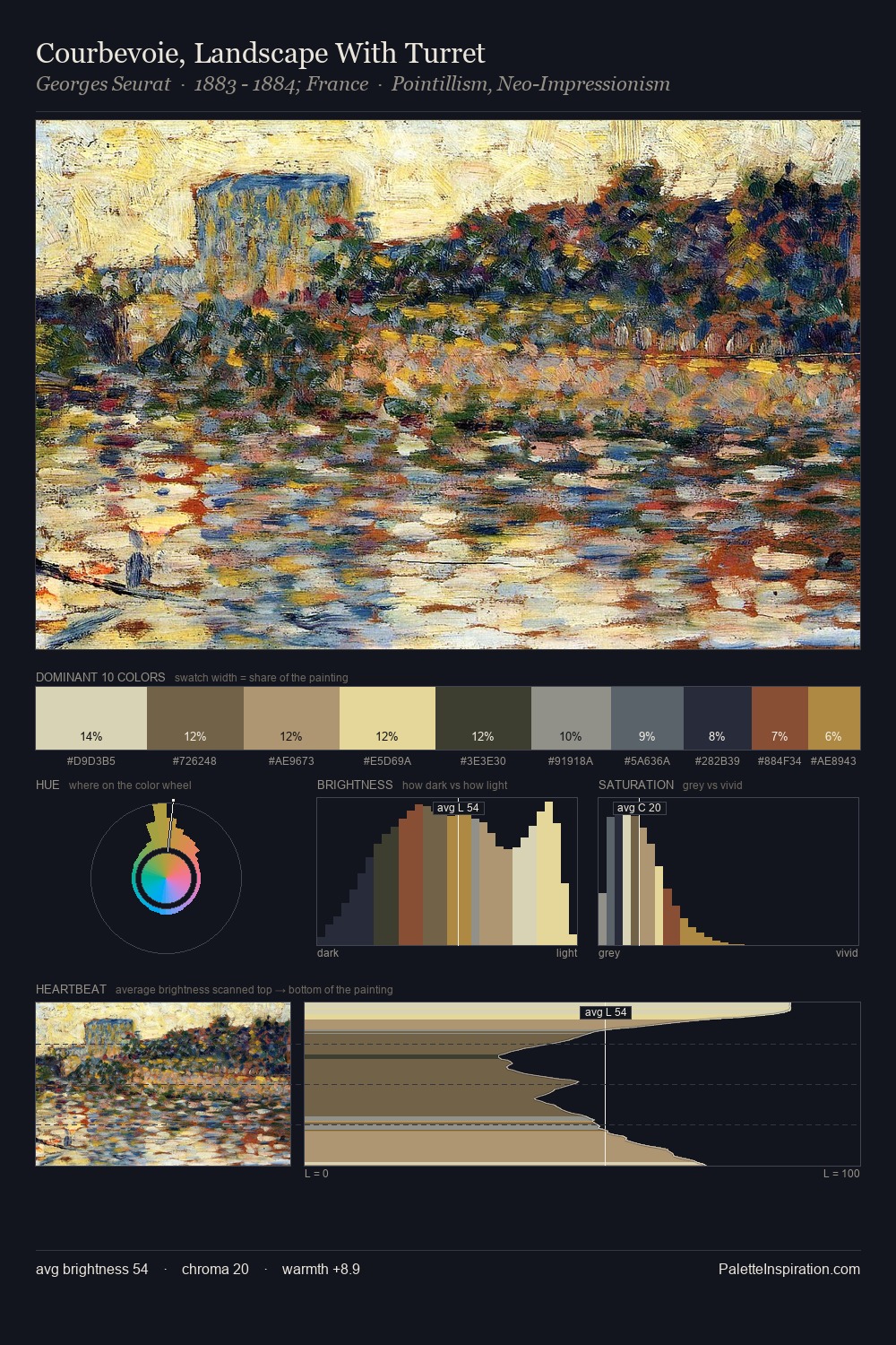
Raphael Kirchner is high in key: pale, luminous, and filled with optical air. Cool tones set the register here - the blues and greens easily outweigh any warm accents. Every colour is desaturated; the palette proceeds through near-neutrals and gently-coloured greys. At 33.8%, #F0DEC0 functions less as a colour accent and more as a complete atmospheric environment. Only 3.3% is devoted to #BB8842, yet that small allocation delivers the palette's entire chromatic tension. A value spread of 64 units gives the palette both depth and air - shadows are genuinely dark, lights genuinely light. The palette has the character of outdoor light: cool, mid-bright, with colour rendered faithfully rather than expressively. Palette 7 sits within the larger chromatic argument that Raphael Kirchner's complete body of work advances.
Example use cases
- publishing
- corporate identity
- consumer apps
- hospitality
- design agencies
I Love This!
Copy, export, or download for your project