Bruno Schulz Palette 2

Palette Analysis
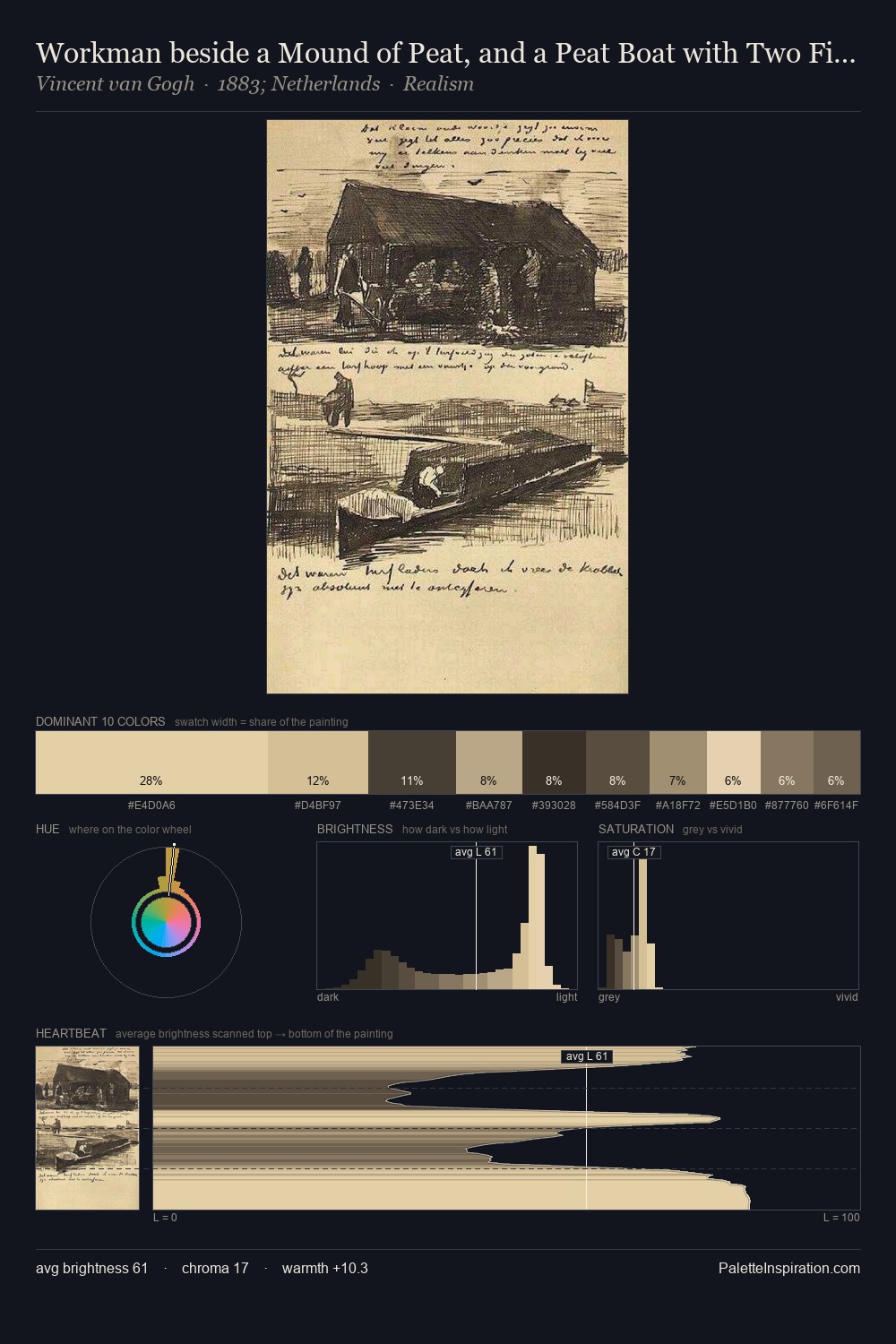
Light floods Bruno Schulz; the palette keeps values pale and airy across its range. Temperature is cool-dominant, with blue and green families claiming the largest areas. Muted throughout, the palette achieves its effects through value and temperature rather than chromatic force. A single dominant - #CEB793 at 39.2% - sets the character of the whole composition. The highest-chroma note - #685945 - appears at just 3.7%, deployed as a precision accent against the quieter ground. 60 units of value range underpin the palette's structural clarity: the eye always knows where light falls. The mid-to-high key, cool bias, and moderate chroma point to outdoor observation - sky and diffused daylight as the dominant light source. Palette 2 sits within the larger chromatic argument that Bruno Schulz's complete body of work advances.
Example use cases
- ceramics & pottery
- boutique hospitality
- menswear
- heritage food brands
- craft & artisan brands
I Love This!
Copy, export, or download for your project