Raphael Kirchner Palette 19

Palette Analysis
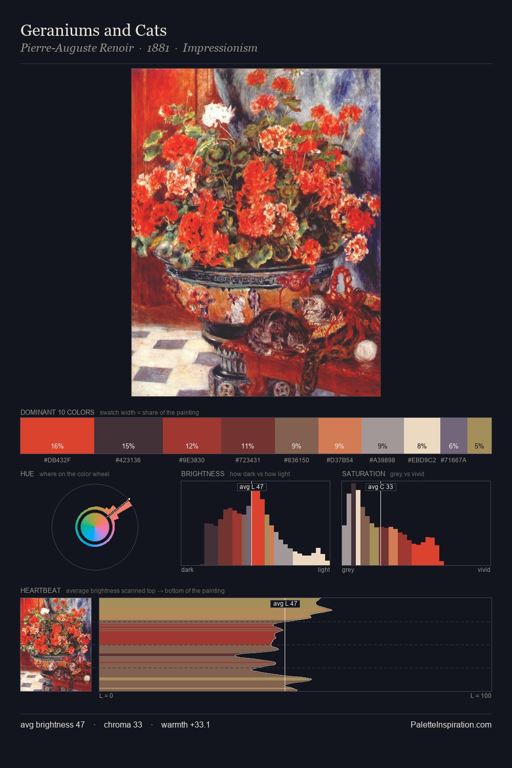
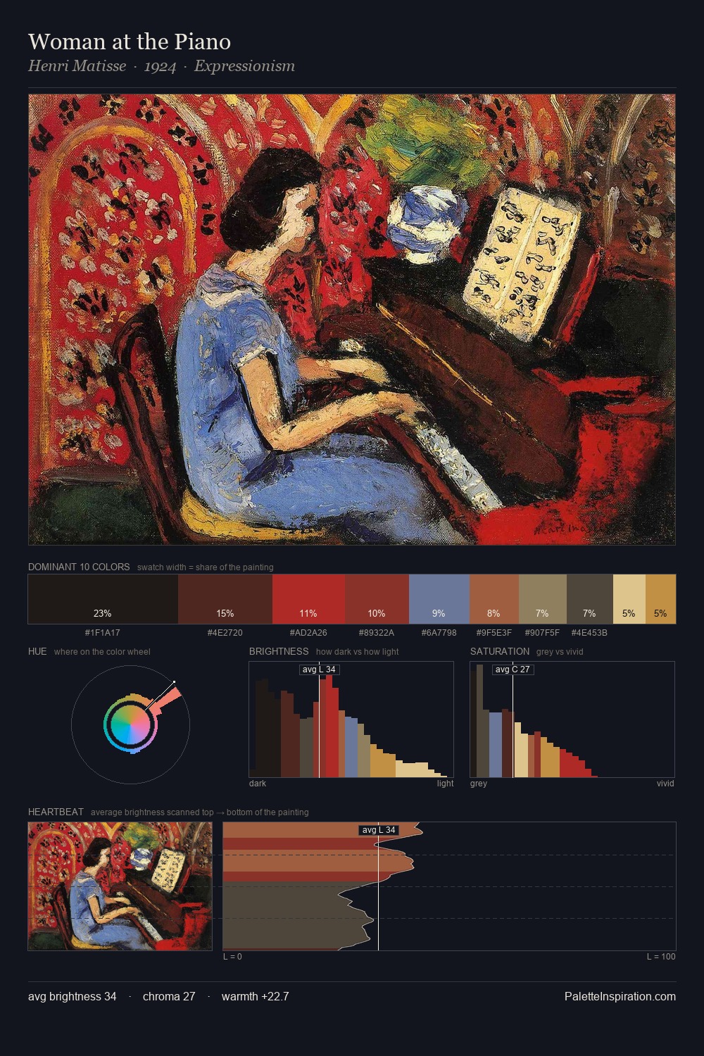
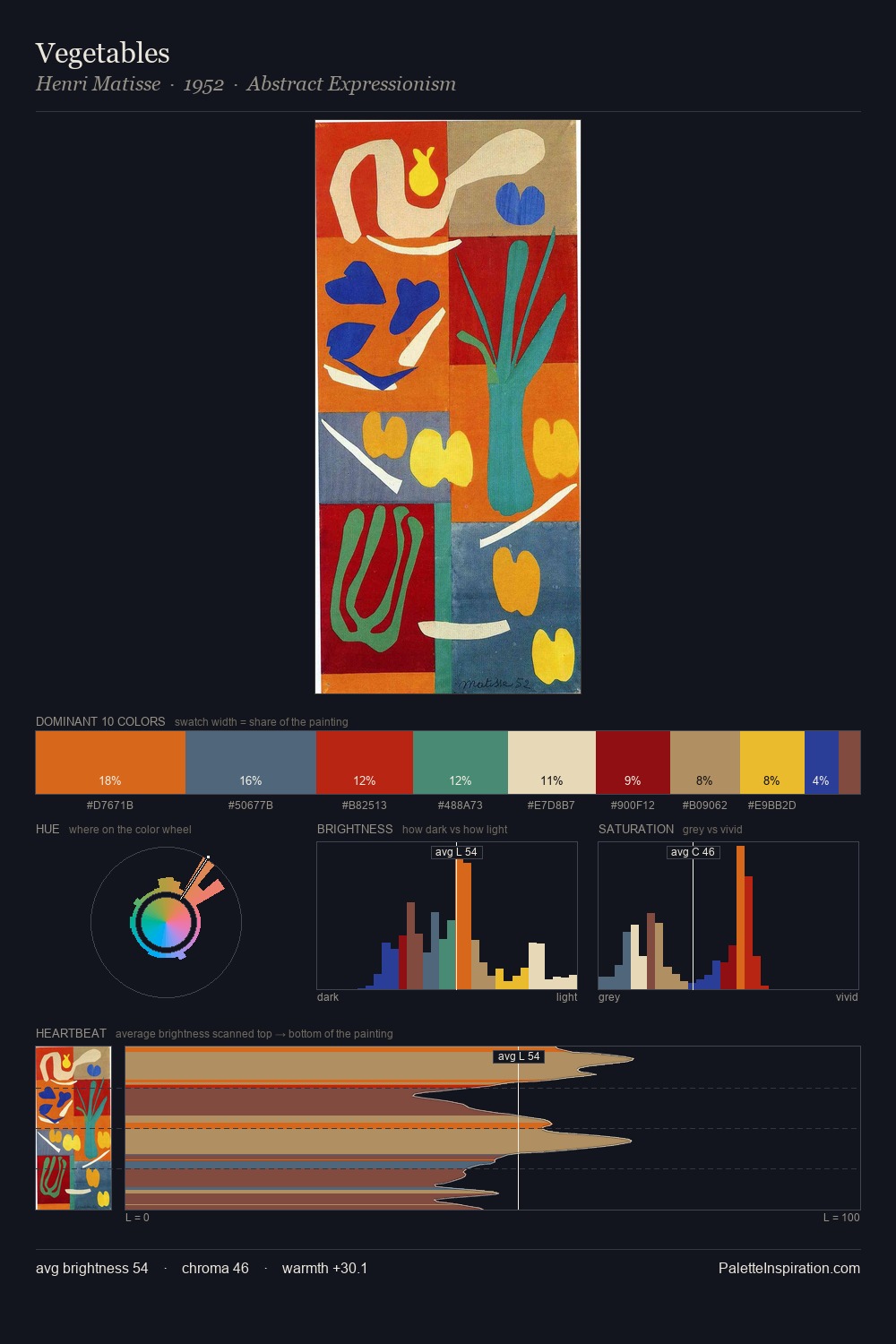
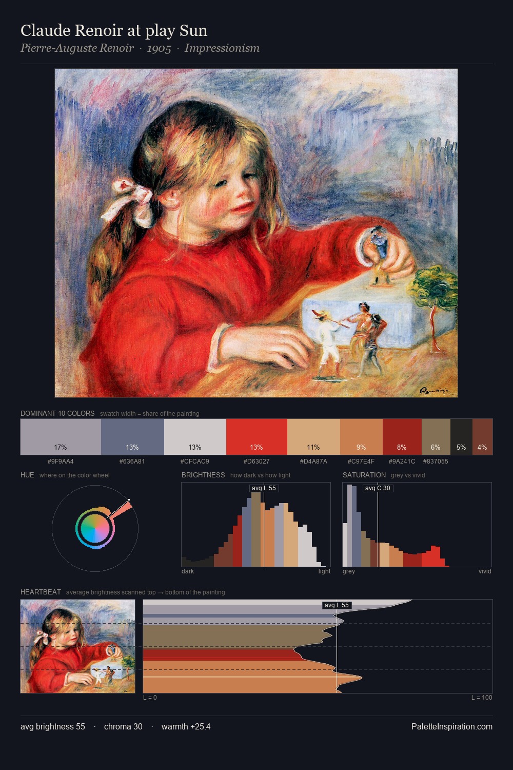
Light floods Raphael Kirchner; the palette keeps values pale and airy across its range. Warm and cool tones are held in careful balance - neither family dominates, creating tension and resolution simultaneously. Chroma is moderate: colours carry enough saturation to be read as colour, but the palette stops well short of garish intensity. The chromatic peak belongs to #D3202C, and at 20.9% it dominates, not decorates. 49 units of value spread create a palette that is varied but unified - contrast in the service of harmony. The palette reads as an Impressionist one - light-biased, chromatically direct, and built on temperature contrast rather than value opposition. In the context of Raphael Kirchner's full range of palettes, group 19 represents one movement in an ongoing chromatic dialogue.
Example use cases
- publishing
- corporate identity
- consumer apps
- hospitality
- design agencies
I Love This!
Copy, export, or download for your project