Pieter van Hanselaere Palette 3

Palette Analysis
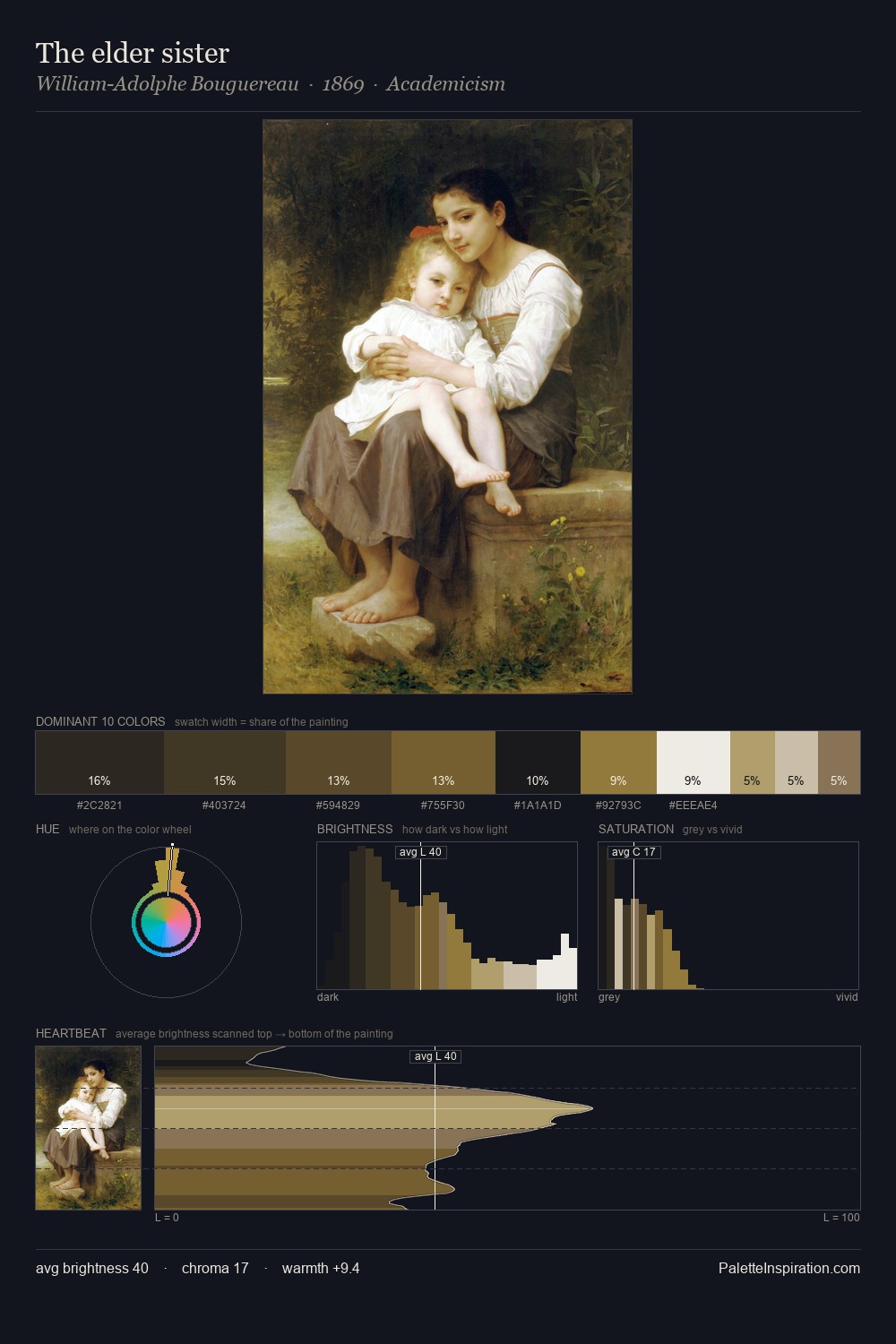
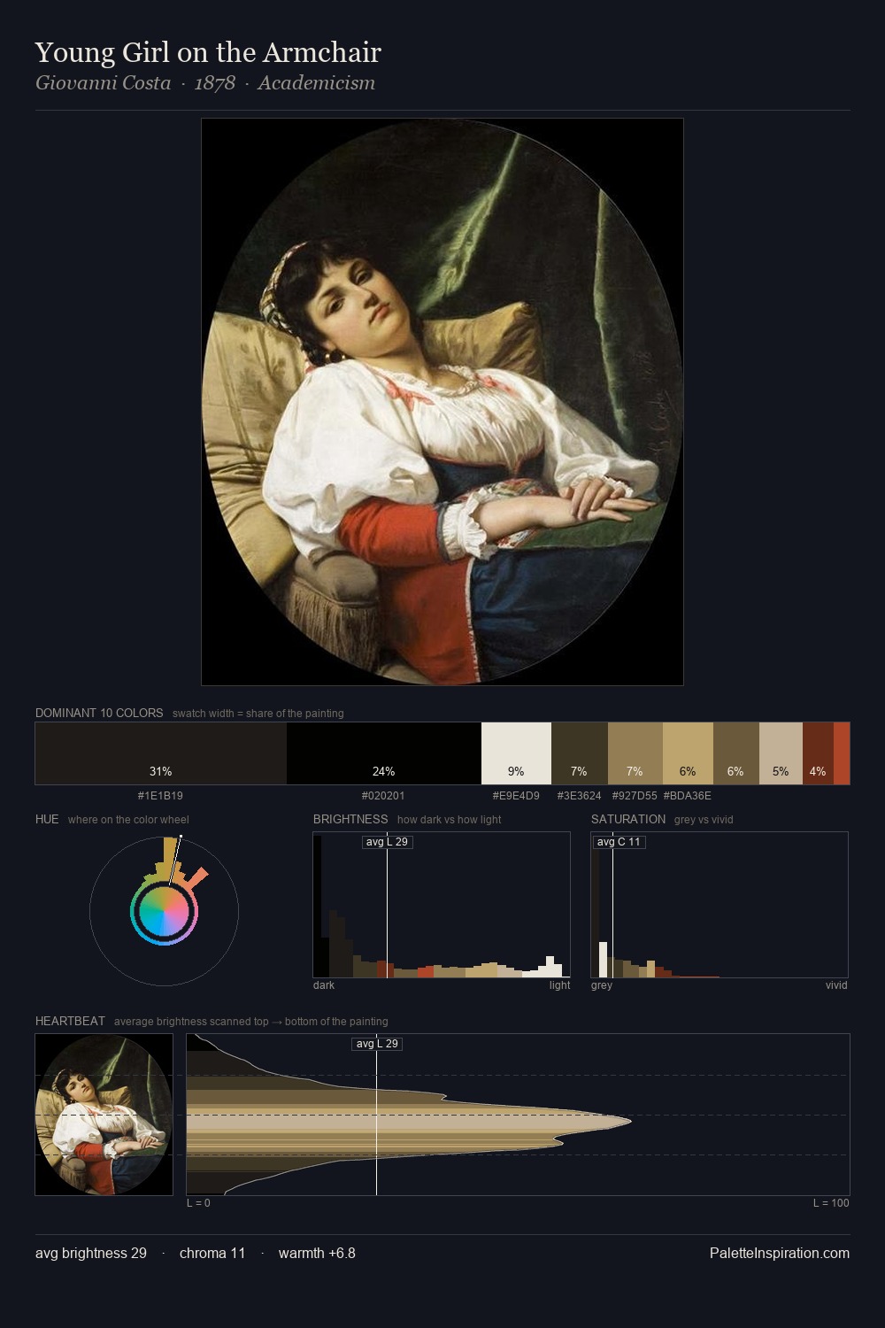
Pieter van Hanselaere occupies the comfortable middle of the value scale, avoiding both extremes to hold the eye in a sustained middle grey. Temperature is cool-dominant, with blue and green families claiming the largest areas. Muted throughout, the palette achieves its effects through value and temperature rather than chromatic force. The most saturated colour, #584626, is reserved to 13.2% of the surface, where it acts as a focal punctuation. 70 units of value range underpin the palette's structural clarity: the eye always knows where light falls. The palette has the character of outdoor light: cool, mid-bright, with colour rendered faithfully rather than expressively. Palette 3 sits within the larger chromatic argument that Pieter van Hanselaere's complete body of work advances.
Example use cases
- theater design
- jewelry brands
- tobacco-adjacent retail
- event branding
- film & entertainment
I Love This!
Copy, export, or download for your project