Pieter van Hanselaere Palette 1

Palette Analysis
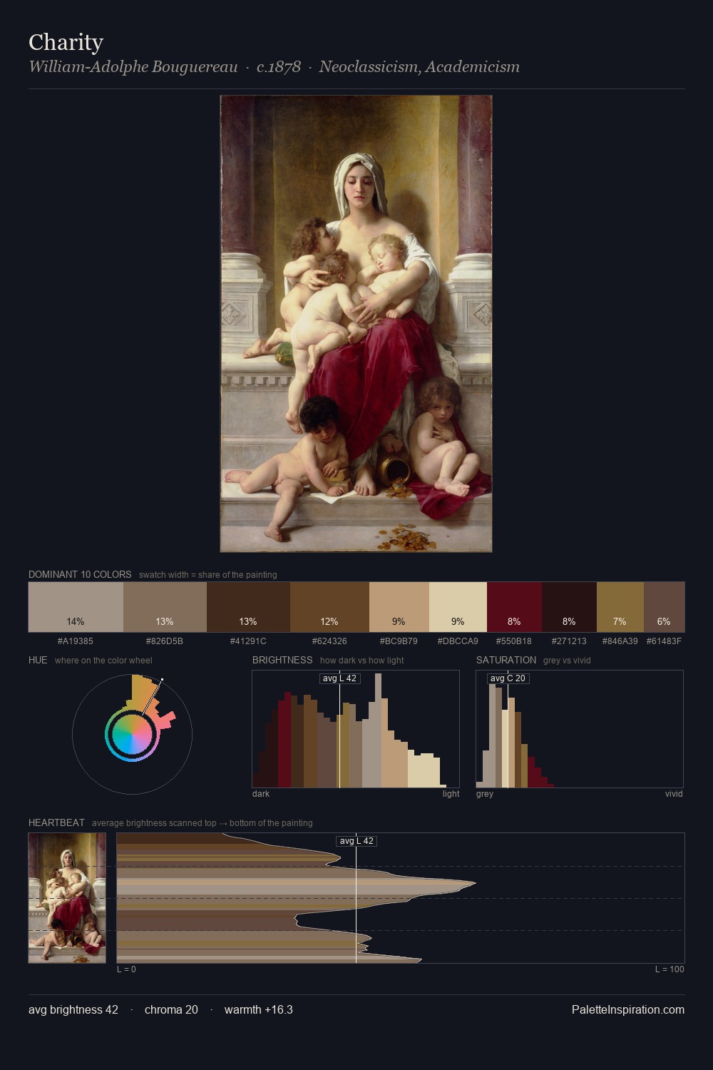
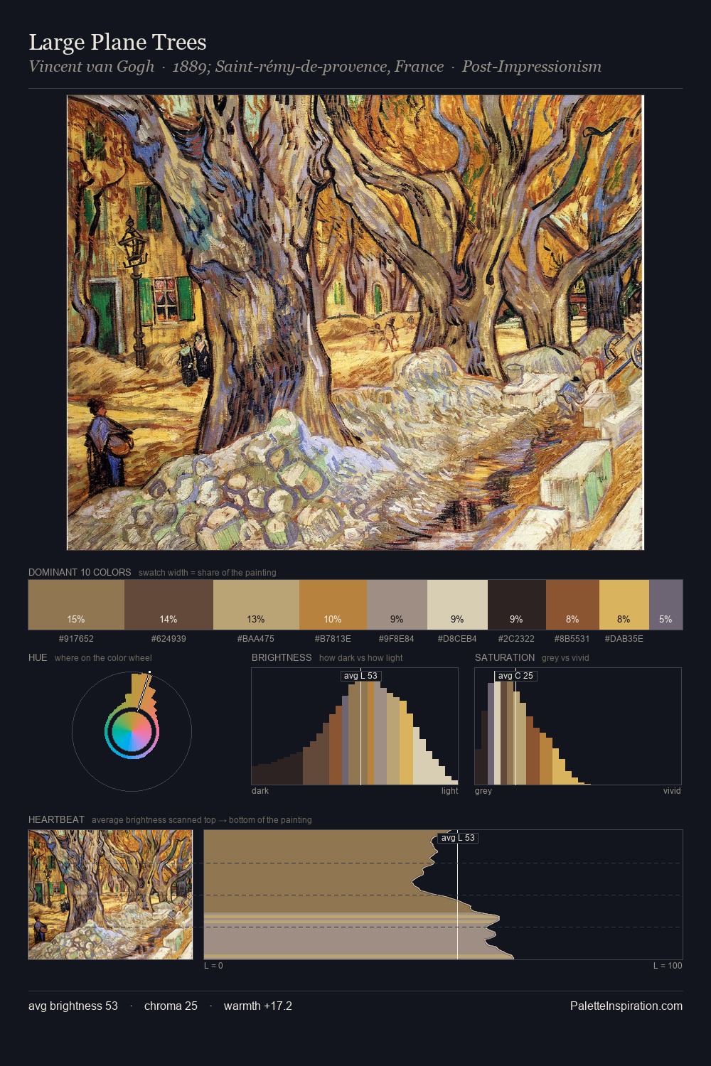
Mid-key values give Pieter van Hanselaere its characteristic quietness - nothing blazes, nothing disappears. Temperature reads distinctly warm: the reds and earth tones from Pieter van Hanselaere carry the compositional weight. Chroma is kept low across all colours, producing the soft, enveloping quality that characterises tonal painting. At 26.0%, #322215 functions less as a colour accent and more as a complete atmospheric environment. The highest-chroma note - #D9D2AE - appears at just 3.0%, deployed as a precision accent against the quieter ground. 63 units of value range underpin the palette's structural clarity: the eye always knows where light falls. This is palette 1 of Pieter van Hanselaere's sequence - a single chapter in a chromatic story told across many works.
Example use cases
- theater design
- jewelry brands
- tobacco-adjacent retail
- event branding
- film & entertainment
I Love This!
Copy, export, or download for your project