Pieter Jansz. Quast Palette 2

Palette Analysis
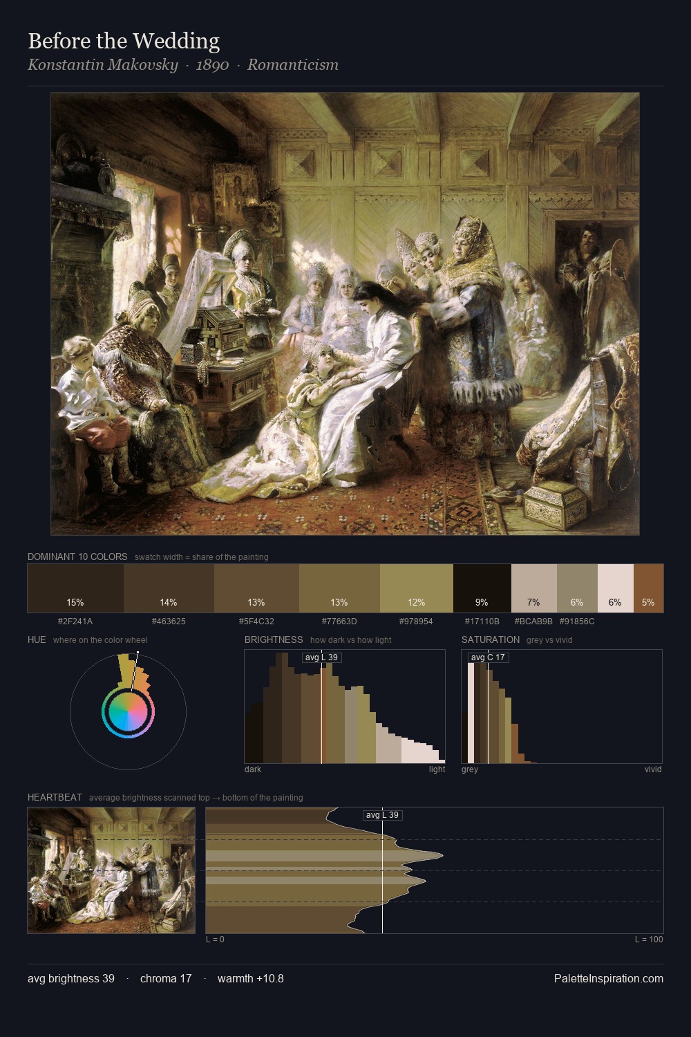
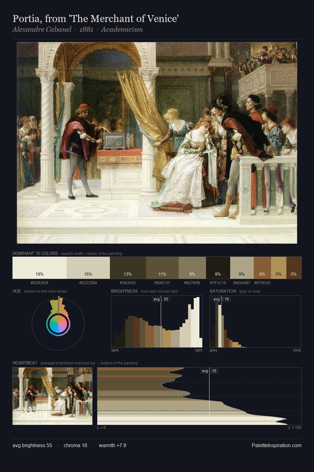
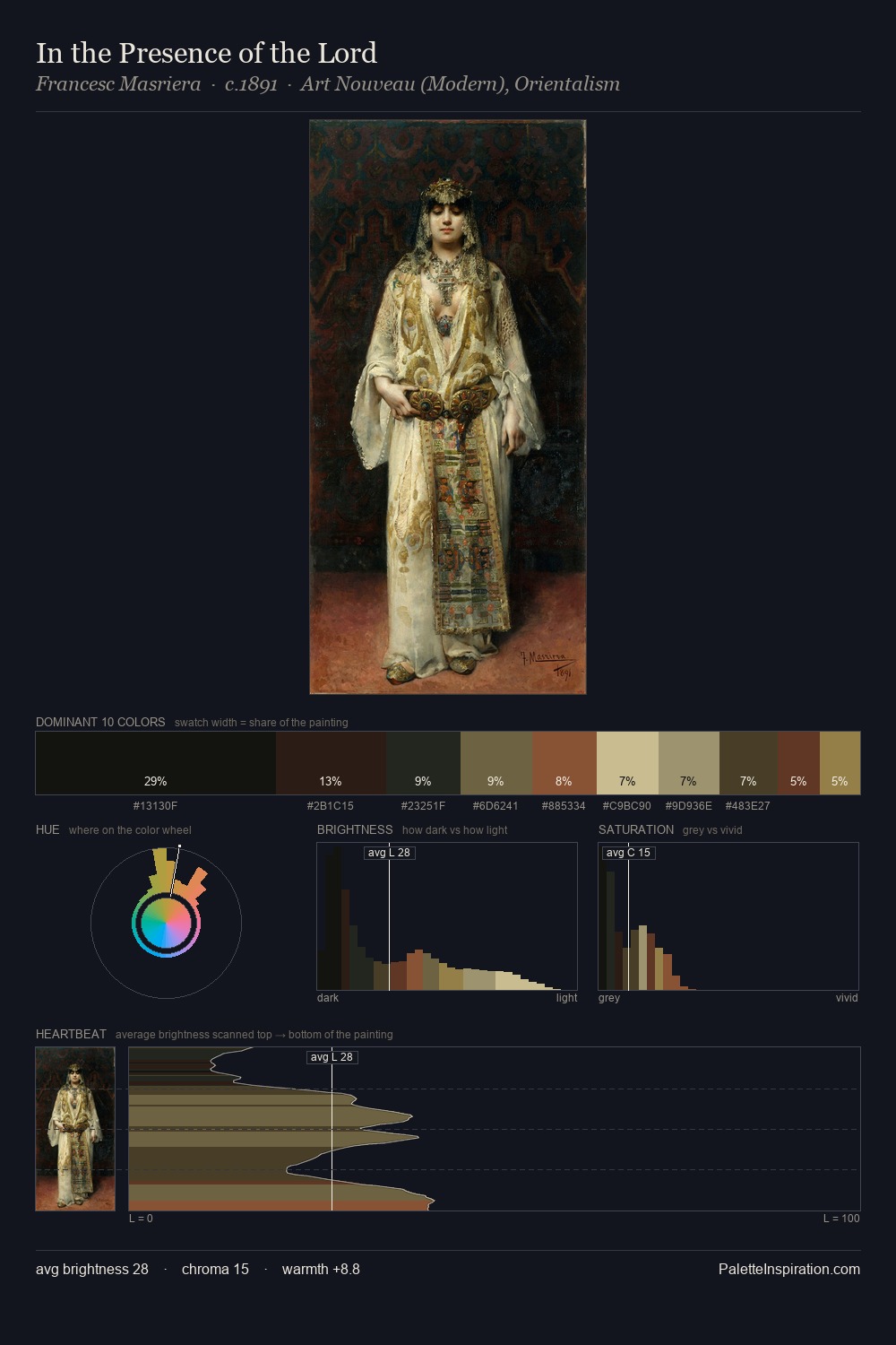
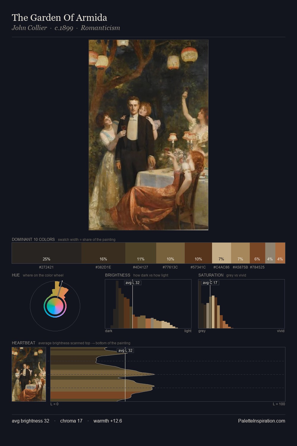
Values in Pieter Jansz. Quast rest in the mid-range - neither dramatically lit nor steeped in shadow. Pieter Jansz. Quast orchestrates warmth above all else - reds, ambers, and siennas take the lead. Saturation is deliberately withheld - the beauty here lies in the near-monochromatic gradations rather than colour difference. #25211D claims 28.7% of the surface, functioning as the work's tonal foundation. At 3.0%, #5E3824 carries the palette's sharpest chromatic charge: an accent that earns its place precisely because it is withheld. 52 units of value spread create a palette that is varied but unified - contrast in the service of harmony. Pieter Jansz. Quast's palette 2 carries its own internal logic while remaining in conversation with the artist's broader colour intelligence.
Example use cases
- theater design
- jewelry brands
- tobacco-adjacent retail
- event branding
- film & entertainment
I Love This!
Copy, export, or download for your project